Olympic Logo Flap
Being the huge Olympics fan that I am ( ;) ), I have taken an interest in the flap over the recently unveiled London 2012 logo:
 Some comments: Conservative MP Philip Davies described the design as "childish and ridiculous" and "a pathetic attempt to appear trendy". Labour MP Stephen Pound said the emblem should be replaced after complaints it had led to epileptic seizures. And one site had a few nicknames for the logo, including Gay Swastika Puzzle and Lisa Simpson Giving Head (cue Nelson: Ha Ha!). So, I guess the BBC had a competition to suggest alternatives to the logo, and this one somehow made it through and was shown on TV, I believe. It has since been pulled, although as one site suggested, "It's actually not a bad choice, given that hosting an Olympics games is an experience much like being sodomized by a battering ram." WARNING - there's nothing wrong with what's below, but no one how doesn't know what this is based on should go looking for the real thing - WARNING 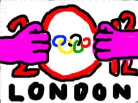 Sean Stayte: "Here is my design for the Olympic logo. It is very simple and so memorable. The hands represent Britain pulling together to reveal the Olympics." |
The Sun newspaper also did examples, including one by a trained monkey.
|
That alternate logo is the greatest olympic logo in the history of the universe
|
Quote:
 Can't tell if that's real or photoshopped. |
No, I believe there are clips of it being aired on youtube.com.
|
I kind of like the official one.
|
Quote:
Ping: Karl Pilkington |
Here is the clip
hxxp://www.youtube.com/watch?v=tsNqA6fbwR8 |
Quote:
You would, you puzzle-loving gay Nazi. :) |
Actually, I think he's a Simpson's fan.
|
Quote:
Now that's funny!! |
Quote:
Fixed. |
Quote:
Someone should make a movie about the life of a puzzle-loving gay Nazi and how he gets through life. Maybe he befriends a handsome young Jewish man that excels in the art of handcrafting superb wooden jigsaw puzzles. I think it would be fascinating. |
Quote:
Let's get Izulde right on this. |
Quote:
|
Quote:
I only posted that in passing and didn't read thoroughly..What'd I miss and how rediculously did I miss it? =) |
Quote:
I find this to be the most accurate description of this logo. It's really bad. |
Quote:
One word: goatse Google it at your own risk. |
Quote:
I will NOT fall victim to THAt little trick again! MUhahahahaha |
Quote:
Fixed. |
I just don't see what's so awful about it. I mean, it's not really good but marketing is so hit and miss that I don't see what's so bad about it.
SI |
That logo would have been good, say around 1985ish...
|
Very bad design. Not pleasant to look at, plus it took me like 5 minutes to figure out what it was actually supposed to be (am I alone on that?).
|
Well, that's Lisa's head in the upper right, her bent knees on the bottom right, and right in the middle, going into her mouth...
|
Quote:
Umm. It's supposed to be something? I mean, really, not Lisa-swallowing-Nelson's-DNA, but something pertaining to London and/or the Olympics? :confused: I don't see it. |
Quote:
20 12 |
Quote:
I wouldn't have noticed that in a million years if you hadn't pointed it out. |
Quote:
I didn't realize it until I saw the goatse version where you can clearly make out the 2012. |
Quote:
I originally thought it was some terrible geometric abstraction of eurasia--kinda looks like England in the corner. |
Quote:
+1 |
hxxp://img9.imagepile.net/img9/12224olympicgschpunken.gif
Possibly NSFW, I guess. A real RIP for subtlety. |
| All times are GMT -5. The time now is 07:29 AM. |
Powered by vBulletin Version 3.6.0
Copyright ©2000 - 2026, Jelsoft Enterprises Ltd.