Your opinion. Logo for our co.
Which one do you like?
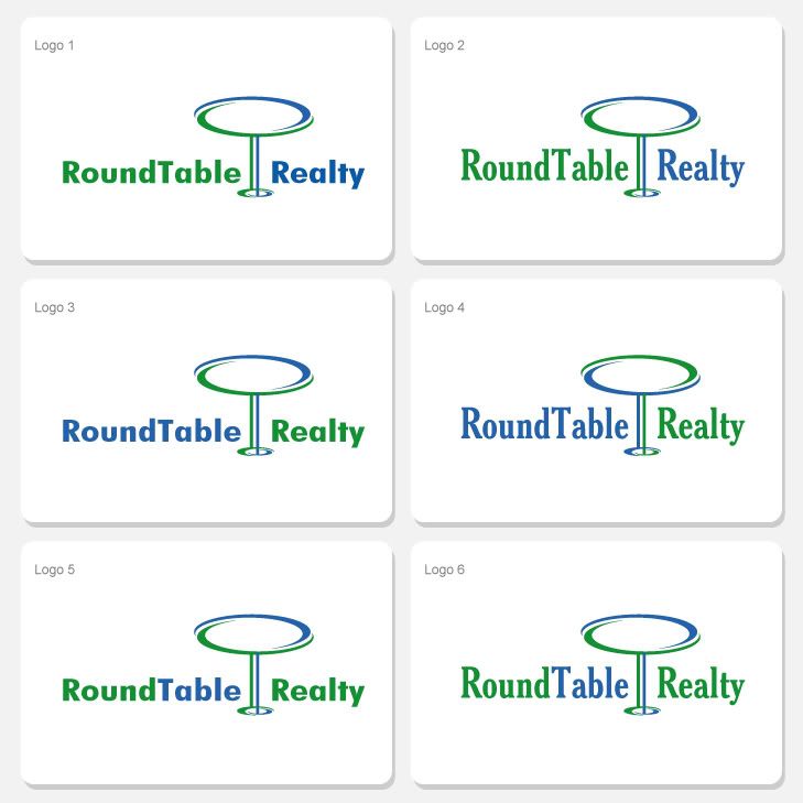 |
I liked option 3 the best. Blue text on left is better, and I preferred the smaller lettering.
|
I went with 4, could live with 3. I think the #4 font will look better on physical signage.
I'm going to make a suggestion here (if you haven't done so already), make sure you look at the logos in black & white before selecting. I have to think that eventually you'll end up doing some print advertising (I can't think of a realtor/real estate group that doesn't) & often the cost will force you to b&w over full color. Occasionally what looks best in color doesn't come across as well in b&w and if the margin for picking one over the other is close then that might help with a final decision (at worst, you won't be surprised when you see it minus color). |
good call. email sent.
|
I gave this to my 5 year old to tell me which 2 are exactly alike, and now she's gone into some sort of seizure. Thanks.
|
No offense, but it looks like a martini glass instead of a table to me.
|
This looks more like a spot the differences game!
|
Quote:
The left boob is MUCH bigger than the right boob. |
I actually much prefer the green text on the left. Start off with the organic color and be pulled to the right with the blue. I also very much like smoothness of the smaller font in #1 and #3. Goes well with the logo I think. Thus why I picked #1.
|
The Seahawks represent mediocrity.
|
I went with trout. I did so because I'm not a fan of the logo in general. I think, for one, the balance is a little off. It's a bit wide with the lettering with the "table" being significantly taller than the rest. It's also, really, a bit generic.
Having said that, if I had to choose I would definitely go with one of the sans-serif options. The serif, in my opinion, contrasts too much with the sweeping, curved lines of the table. I would go with 3, because the colors of the text are opposite of the table. I think it's a little too much green/blue in #1 where the text runs into the line on the table and it is the same color. I also like #5, except that it makes it appear that somehow "Table" is more important because it is a different color. I assume that "Realty" is probably the most important of the three words. Quote:
I'm rather certain that all of the sans-serif options are the same size as each other, and all of the serif options are the same size as each other. :) |
I like the ones with the bigger fonts, the smaller font logos makes it look like your name is trying to hide.
|
Maybe put the words inside the "table" and eliminate the table legs.
|
Quote:
Please stop causing problems. EDIT: Oh, I picked #2. |
I picked #4, I could live with #3. I hate #5 and 6 since Round Realty sticks out and then you are just naming the object.
|
I think I know one of the reasons I'm not fond of it.. the table just looks like clip art from 1996 to me.
|
LS do you do designs? If so do you want to take a stab at something? Seriously.
|
I like the font on 2 and 4 the best.
|
Quote:
Let's see if I can remember exactly what I typed in the PM :) Unfortunately I am just a critic. I dropped the design hat years ago when I decided to focus only on development. Instead I just feel like I know what's good and what isn't, even though I can't do it myself. |
Honestly, none of these logos really make me want to buy sweet tea. They'd be better used for some sort of real estate company.
|
Table looks oval to me.
|
Maybe work King Arthur in there somehow?
|
The logo needs Knights!!! Perhaps the Black Knight from the Holy Grail.
|
1 Attachment(s)
Something along the lines of this:
|
Actually the question were having now is...
Is the logo any good, good enough to build our brand around at all. We need to be able to use this in small mediums like business cards but then large mediums like yard signs. We need it to be proud yet accessible, we need it to pop without it being intimidating, we need it to be accessible without being too simple. We're wracking our brains over this. LS was kind enough to send us some sites where you can put the project out there, receive the concepts and project and then pay the 'winner'. This may be best for us when were having a hard time coming up with the initial concept to begin with. Anyone on here wanna take a shot? Icy? |
Quote:
A couple of friends starting a business went that route Flasch and were very happy with how it ended up. |
Quote:
|
1 Attachment(s)
.
|
Quote:
Now please don't take it that I'm knocking anybody's work here, especially since I saw the Arthurian roundtable image that seems to have been an inspiration for this but ... my first reaction to that logo is "sunburst" not "roundtable". |
Cuervo thats really cool, Im taking it to the partners tomorrow (ive already emailed it) if they go with it Ill send you the $ we'd have spent elsewhere (via paypal)
|
Also, maybe I've missed something here, but isn't the "Roundtable" reference meant in a "roundtable discussion" modern use of the word rather than the "Knights of the Roundtable" historical sense of the word?
|
yes, its collaborative, team oriented, however on Halloween's and April Fool's day we may play off of it.
|
Quote:
M'kay, I thought so but I think that was also my impressing that intent on it strictly based on how I reacted to it. FWIW, I like the company approach that name choice indicates is a priority, should be a good selling point for customers & especially those who tend to feel intimidated by the buying/selling process. |
Use one of the first logos and change company name to Martini Realty, and add an olive in the glass.
|
I actually like 4 the best.
|
I like Cuervo's a lot, except for the concern jimga brings up. I also may be influenced by the earlier image, that's why I don't see the sunburst. But I think the key is for someone to see it and say "Round Table Realty" like the apple apple, the Microsoft window, AT&T's globe, etc.
Now that I look again, I'm probably largely influenced by the earlier picture. But I definitely like it better than the martini glass version. :) RainMaker: I sent him 99designs and crowdspring. |
|
I like cuervo's logo, except the sunburst confusion others mentioned... and I also think Realty should be capitalized.
|
I like Cuervo's logo. Even if it is confused with a sunburst, it's Florida, so it still fits! :)
|
Quote:
Yeah, there's a bit of that. Possibly too many houses, or maybe something with the house to table size ratio. Really just went with the table idea and tried to knock something out quickly (and wanted to keep it uncluttered). Though for FL, maybe JediKooter has a point. ;) |
Quote:
Hey thanks a lot for allowing us to see that. I think that might be the convincing factor for the partners to spend more on this and go that route. I like Cuervo's too, you should see it on a black background. Looks great there. This message board once again proves to me why it is the best msg board family on the web. |
Quote:
Exactly. |
Tomorrow will be the meeting about branding and one of the partners wants to go the designer route, one on one with a designer to develop something. Ill be pushing for the 99 site route since I think we need more concepts to look at, not one designer working at a premium. Hopefully I win.
|
I have a craving for pizza
|
Is this a Where's Waldo puzzle?
|
Not really liking any of them a lot sorry, also look to me like a cheap clipart with some random fonts applied for the company name.
I guess i would go with #3 but making the text taller as the table is too tall in comparison. When talking about logos i'm more of a critic than a good designer, i find original logo designing really challenging, as you need to represent the company in a simple but eye catching design, it will usually last for a few years and you will expend good money on printing, branding etc, so you can't afford to go wrong. I don't usually design logos because that, it either jumps into my brain quickly or i need top expend a lot of time on different versions and ideas, and as i'm too critic and perfectionist, i end losing a lot of time and not being profitable. I'm also a self trained web designer with no arts school background, and for something like logo designs, those who have studied in art schools would be my first choice of designer because the training they received to open their mind for original ideas. If you are totally serious about this, Imho the designer must know a lot about the company, what they want to show there and then to have a great vision. He should also provide you a few totally different ideas to start with, you chose a couple for example and he gives you a few more mockups based on those two, then you chose one of those and he works again on a few versions. Right now you just have 6 font versions of the same thing. If you don't want to work and pay an expensive designer, go with sites like that 99 designs one, where you will get a ton of different views and versions that will open your mind a lot about what you want, i see some really good ones for that Chicagosushi.com |
Quote:
I agree, although I thought 1 was the best. |
2 Attachment(s)
Mixing together a couple of other ideas I had. The first admittedly is probably too busy with the color changes.
Either way, I agree that it's probably a good idea to either go the 99 route or actually hire a real designer. |
Hey Cuervo thanks!
It looks like were going the designer route. He cut us a really good deal on the price of the initial logo development if we'll seriously consider developing the brand and printing through him if we like the results. {shrug} so here we are. Thanks for the advice, criticism, and guidance. |
Good luck!
If it's a designer you know will do a good job, it could be the right decision. 99 designs is a TERRIBLE route for a designer, because there are so many that don't get picked and therefore make nothing for their work. Because of that, I imagine some better designers don't do it. If you get a quality designer that you can work closely with, I wouldn't worry that you made a bad decision. |
| All times are GMT -5. The time now is 11:16 AM. |
Powered by vBulletin Version 3.6.0
Copyright ©2000 - 2025, Jelsoft Enterprises Ltd.