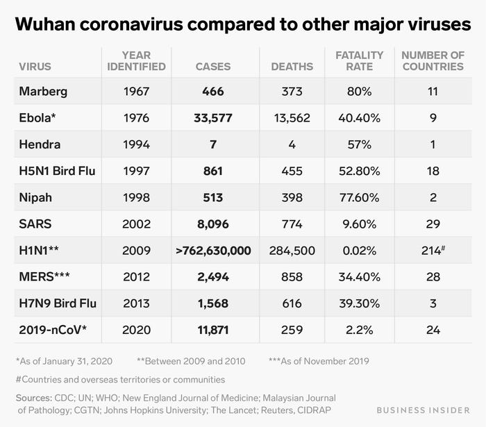
Another graphic to put things into perspective. The chart is as of Jan 31 and I believe the infected nos. are much greater now.
FWIW, I never realized the H1N1 "swine flu" was that widespread and cause that many deaths.
How The New Coronavirus Compares to Past Zoonotic Outbreaks, in One Simple Chart
So what I don't get is - unless I'm mistaken, the drastic measures of city(ies) quarantine, restriction on border crossing, and flight embargoes didn't happen this extensively on the other outbreaks ... so why on this one?