
|
|||||||
| View Poll Results: Which is your favorite? | |||
| 1 |
|
19 | 40.43% |
| 2 |
|
23 | 48.94% |
| Seriously, where is the Trout? |
|
5 | 10.64% |
| Voters: 47. You may not vote on this poll | |||
 |
|
|
Thread Tools |
 04-22-2010, 07:16 PM
|
#1 | ||
|
Coordinator
Join Date: May 2002
Location: Jacksonville, FL
|
Logos for the New Business...another round.
Thanks for all who are taking the time to help. Here is another concept from a different designer. Let me know your thoughts and vote on your favorite. there are also some further down that didnt make it in the poll but wed like opinions on.
1 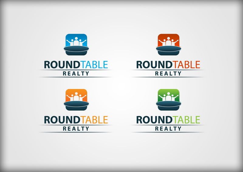 2 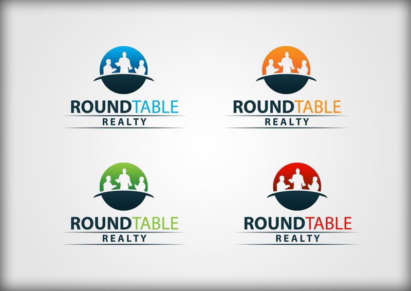 Scroll down to see other options not included in the poll!
__________________
Jacksonville-florida-homes-for-sale Putting a New Spin on Real Estate! ----------------------------------------------------------- Commissioner of the USFL USFL Last edited by Flasch186 : 04-22-2010 at 07:55 PM. |
||

|

|
|
04-22-2010, 07:19 PM
|
#2 |
|
Hall Of Famer
Join Date: Oct 2002
Location: Massachusetts
|
i like the flat table from the top ones with the sitting and standing people from the bottom ones.
as far as colors - have you done any reading up at all on what emotions and such different colors bring up in people? you probably want to be conscious of that (green=money=success, etc)
__________________
If I've ever helped you and you'd like to buy me a coffee, or just to say thanks, I have my Bitcoin and Ethereum addressed listed below :) BTC: bc1qykhsfyn9vw4ntqfgr0svj4n9tjdgufryh2pxn5 ETH: 0x2AcdC5cd88EA537063553F5b240073bE067BaCa9 |
|
|
|
|
04-22-2010, 07:25 PM
|
#3 |
|
Head Coach
Join Date: Oct 2000
Location: NYC
|
I like 1 better, as I think the depth of the table gives it that "your looking at this from your seat" perspective that you're going for.
But I like both much more than the original. |
|
|
|
|
04-22-2010, 07:26 PM
|
#4 |
|
Hall Of Famer
Join Date: Nov 2000
Location: Behind Enemy Lines in Athens, GA
|
Better IMO.
My own strictly personal preference at first blush was the square logo version but my professional preference is pretty strongly to the round version within 60 seconds of starting at them. The square looks too much like an app button while the round is more traditional & I want stable if I'm looking for help with real estate. I hate the light green, I dislike the orange almost as much. Both colors tend to wash out visually in sunlight & especially in shades as light as these, they also don't hold usually up as well over time (I'm assuming you're going to reuse yard signs for as long as they look good). A darker blue would probably have won me over but it's also a little light for my taste, so that leaves the round red one as my pick. A couple of things though, make sure he shows you a b&w version as well (is he planning to just all black the text or is he going to set off the "table" portion somehow in the b&w rendition as well?). Also, I'd probably want to see an all-black text version with the red logo as well, just to see how it strikes you when you mock it up onto signs & such. Might also consider a ROUNDTABLE (all black), Realty (in red) variation as well.
__________________
"I lit another cigarette. Unless I specifically inform you to the contrary, I am always lighting another cigarette." - from a novel by Martin Amis |
|
|
|
|
04-22-2010, 07:28 PM
|
#5 | |
|
Head Coach
Join Date: Oct 2000
Location: NYC
|
Quote:
That's a pretty good point. |
|
|
|
|
|
04-22-2010, 07:33 PM
|
#6 |
|
Coordinator
Join Date: May 2002
Location: Jacksonville, FL
|
im trying to add a 3rd totally different one that has a lot fans too.
__________________
Jacksonville-florida-homes-for-sale Putting a New Spin on Real Estate! ----------------------------------------------------------- Commissioner of the USFL USFL |
|
|
|
|
04-22-2010, 07:37 PM
|
#7 |
|
Coordinator
Join Date: Oct 2000
|
Much better.
I like #1 better. As Jon mentioned, it looks kind of like an app and, to me, it seems a bit more tidy and (obviously) more welcome (due to the open arms and table perspective). I actually like the green one the best. |
|
|
|
|
04-22-2010, 07:40 PM
|
#8 |
|
Coordinator
Join Date: May 2002
Location: Jacksonville, FL
|
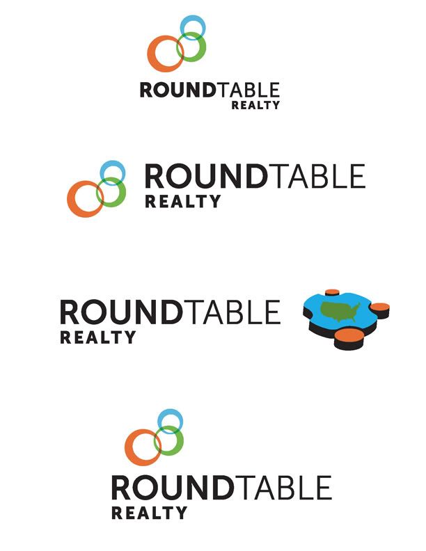
Were also considering the first, second or fourth one here out of these...
__________________
Jacksonville-florida-homes-for-sale Putting a New Spin on Real Estate! ----------------------------------------------------------- Commissioner of the USFL USFL |
|
|
|
|
04-22-2010, 07:41 PM
|
#9 |
|
Hall Of Famer
Join Date: Nov 2000
Location: Behind Enemy Lines in Athens, GA
|
Incidentally, what's the primary target age group for the business (everything else about FL real estate seems to be very specific to the area so I'm not even going to try to guess).
Whatever answer you give me, I'd see if I could show the logo to at least 10 women in that age demo who have no vested interest in the process & see if they've got a strong opinion . Women drive real estate & you need to appeal to them most critically. 6-4 on a micro impromptu focus group would mean diddly squat, a 10-0 answer on the other hand would give me some pause about my choice either way.
__________________
"I lit another cigarette. Unless I specifically inform you to the contrary, I am always lighting another cigarette." - from a novel by Martin Amis |
|
|
|
|
04-22-2010, 07:43 PM
|
#10 |
|
Hall Of Famer
Join Date: Oct 2002
Location: Massachusetts
|
Jon's got a good point there
And the "3 round circles" thing just doesn't...excite me at all. very neutral
__________________
If I've ever helped you and you'd like to buy me a coffee, or just to say thanks, I have my Bitcoin and Ethereum addressed listed below :) BTC: bc1qykhsfyn9vw4ntqfgr0svj4n9tjdgufryh2pxn5 ETH: 0x2AcdC5cd88EA537063553F5b240073bE067BaCa9 Last edited by DaddyTorgo : 04-22-2010 at 07:43 PM. |
|
|
|
|
04-22-2010, 07:43 PM
|
#11 |
|
Hall Of Famer
Join Date: Nov 2000
Location: Behind Enemy Lines in Athens, GA
|
Mostly just meh to the second batch, not horrible & I could even see the colors having a certain "Florida feel" to them but the best thing about them is that they reminded me how much I disliked rectangular logos for your purposes and how much insight about compatibility with likely uses the square format of the new ones showed on the part of the second designer.
__________________
"I lit another cigarette. Unless I specifically inform you to the contrary, I am always lighting another cigarette." - from a novel by Martin Amis |
|
|
|
|
04-22-2010, 08:58 PM
|
#12 |
|
Coordinator
Join Date: Oct 2000
Location: The Black Hole
|
I don't like any of the ones in post #8. The circles don't do anything for me, and do you really offer real estate across the entire continental U.S.?
Anyhow, I really like the blue logo in #2 in the first post. The green looks like it's too..."green" (i.e. Earth Day). The red looks too angry. Orange doesn't look good either. I'd go with Jon and make it be a darker blue and it'd be perfect. They look modern and eye-catching. |
|
|
|
|
04-22-2010, 09:20 PM
|
#13 |
|
Coordinator
Join Date: Oct 2000
|
Of the set in post #8, I like #2 pretty well. I think it is a pretty sharp logo, actually, but I still like the first set better for your profession.
|
|
|
|
|
04-23-2010, 07:58 AM
|
#14 |
|
Coordinator
Join Date: May 2002
Location: Jacksonville, FL
|
Bump for day crowd since Were coming to decision time
I actually want to boil it down to 2, revote & take it to more people for input ie. A market study. ..a brief one. One of the above vs. The rings on 8.
__________________
Jacksonville-florida-homes-for-sale Putting a New Spin on Real Estate! ----------------------------------------------------------- Commissioner of the USFL USFL Last edited by Flasch186 : 04-23-2010 at 08:05 AM. |
|
|
|
|
04-23-2010, 08:32 AM
|
#15 |
|
General Manager
Join Date: Aug 2001
Location: Kansas City, MO
|
None of the logos in #8 do it for me at all. I preferred #1 at the top, but I think either one of the top two selections would work for you.
|
|
|
|
|
04-23-2010, 08:33 AM
|
#16 | |
|
lolzcat
Join Date: May 2001
Location: williamsburg, va
|
I'm not sure why everyone likes the square logos in post #1, to me the round ones are far nicer and more professional looking. The table in the square one looks really cheap and cheesy to me.
__________________
Text Sports Network - Bringing you statistical information for several FOF MP leagues in one convenient site Quote:
|
|
|
|
|
|
04-23-2010, 08:43 AM
|
#17 |
|
Head Coach
Join Date: Sep 2004
|
I don't like the #8 logos at all.
The roundedness of #2 looks better and better the more I look at it.
__________________
2006 Golden Scribe Nominee 2006 Golden Scribe Winner Best Non-Sport Dynasty: May Our Reign Be Green and Golden (CK Dynasty) Rookie Writer of the Year Dynasty of the Year: May Our Reign Be Green and Golden (CK Dynasty) |
|
|
|
|
04-23-2010, 09:52 AM
|
#18 | |
|
Pro Starter
Join Date: Oct 2005
Location: Washington, DC
|
Quote:
this.
__________________
Sixteen Colors ANSI/ASCII Art Archive "...the better half of the Moores..." -cthomer5000 |
|
|
|
|
|
04-23-2010, 09:59 AM
|
#19 |
|
Head Coach
Join Date: Oct 2000
Location: North Carolina
|
I like these logos better than any of the ones you have shown before.
I like the round ones a lot better than the square ones. And I like the green color the best. Soothing and associated with money. Jon makes a good point about it maybe being washed out in the sun on an outdoor sign. But, just looking at it on the screen, I like it best. |
|
|
|
|
04-23-2010, 10:01 AM
|
#20 |
|
Head Coach
Join Date: Oct 2000
Location: North Carolina
|
dola
My general impression: blue/green = more soothing, professional. red/orange = Burger King. |
|
|
|
|
04-23-2010, 10:08 AM
|
#21 |
|
Pro Starter
Join Date: Oct 2005
Location: Washington, DC
|
After looking at the logos a few times the round ones give a vaguely Obama vibe, but I'm probably reading too much into it.
__________________
Sixteen Colors ANSI/ASCII Art Archive "...the better half of the Moores..." -cthomer5000 |
|
|
|
|
04-23-2010, 10:29 AM
|
#22 |
|
Resident Alien
Join Date: Jun 2001
|
I don't like the ones where the guy in the middle is standing. It looks like he's doing some strange dance. I like the top left option the best.
|
|
|
|
|
04-23-2010, 10:50 AM
|
#23 | |
|
Head Coach
Join Date: Dec 2002
Location: Maryland
|
Quote:
That was my first impression too. Also looked like a logo NBC News used on Earth Day (can't find it, but it was an 'e' where the center bar was extended to form a horizon). I don't like the execution of the table in the square logos at all. The tabletop seems...forced. The button itself actually reminded me of an icon I made for a prospective site redesign though.
__________________
null |
|
|
|
|
|
04-23-2010, 10:54 AM
|
#24 |
|
Resident Alien
Join Date: Jun 2001
|
I don't really like the arms in the logos. I like cuervo's better.
The raised arms almost make them look like Nazi's to me.  Last edited by Kodos : 04-23-2010 at 10:56 AM. |
|
|
|
|
04-23-2010, 12:11 PM
|
#25 | |
|
Pro Starter
Join Date: Oct 2005
Location: Washington, DC
|
Quote:
The table in the square ones are a definite deal breaker for me. I like the flow of the circle and table in the round ones.
__________________
Sixteen Colors ANSI/ASCII Art Archive "...the better half of the Moores..." -cthomer5000 |
|
|
|
|
|
04-23-2010, 12:28 PM
|
#26 | ||
|
Pro Starter
Join Date: Mar 2004
Location: Oakland, CA
|
I really like the blue. All the colors are soft and inviting, however.
__________________
Quote:
Quote:
|
||
|
|
|
|
04-23-2010, 02:09 PM
|
#27 |
|
Pro Starter
Join Date: Sep 2003
Location: Toledo - Spain
|
I like the 2nd group in the first post, the table in the first group seems like just pasted there not blending properly. About color... your choice, i wouldn't chose orange myself for a company logo.
__________________
|
|
|
|
|
04-23-2010, 02:30 PM
|
#28 |
|
Hall Of Famer
Join Date: Dec 2003
Location: the yo'
|
The 1st set in post one definitely has the Heil! vibe to it.
The 2nd one, the guy in the center looks like he's breaking it down doing the robot, and the guys on the outside are clapping and chanting Go! Then again, all of these are better than this place around here called Kutlick realty. Every time I see their sign I do a double take and think it says something else. |
|
|
|
|
04-23-2010, 02:43 PM
|
#29 |
|
Dark Cloud
Join Date: Apr 2001
|
If you're looking for a designer who'll charge you a fair price and give you much better quality than those cookie cutter design contest sites that it (appears?) you're using, check out the guy who did the logo for my company sites a few years back.
Skye Design Studios | Home |
|
|
|
|
04-23-2010, 03:01 PM
|
#30 |
|
Grizzled Veteran
Join Date: Oct 2000
Location: Wisconsin
|
I still want to know why the designer is insisting that ROUND be highlighted in every case.
__________________
You, you will regret what you have done this day. I will make you regret ever being born. Your going to wish you never left your mothers womb, where it was warm and safe... and wet. i am going to show you pain you never knew existed, you are going to see a whole new spectrum of pain, like a Rainboooow. But! This rainbow is not just like any other rainbow, its... |
|
|
|
|
04-23-2010, 03:15 PM
|
#31 | |
|
Hall Of Famer
Join Date: Nov 2000
Location: Behind Enemy Lines in Athens, GA
|
Quote:
Curiosity overwhelmed me, so I Googled
__________________
"I lit another cigarette. Unless I specifically inform you to the contrary, I am always lighting another cigarette." - from a novel by Martin Amis |
|
|
|
|
|
04-23-2010, 03:17 PM
|
#32 | |
|
Hall Of Famer
Join Date: Nov 2000
Location: Behind Enemy Lines in Athens, GA
|
Quote:
Actually, unless I got really confused somewhere along the way, they didn't go with the design bidding site & these are actually coming from specific people/firms they're letting make proposals.
__________________
"I lit another cigarette. Unless I specifically inform you to the contrary, I am always lighting another cigarette." - from a novel by Martin Amis |
|
|
|
|
|
04-23-2010, 03:37 PM
|
#33 |
|
Coordinator
Join Date: May 2002
Location: Jacksonville, FL
|
Yes. This. We only used one discount. Now we've used a designer and then the one at the top of this thread was a freebie from a different designer. We're looking more intently on the rings in 8. The designer who did that will be back from a wedding on Mon to pursue its path.
__________________
Jacksonville-florida-homes-for-sale Putting a New Spin on Real Estate! ----------------------------------------------------------- Commissioner of the USFL USFL |
|
|
|
|
04-23-2010, 03:38 PM
|
#34 | |
|
Hall Of Famer
Join Date: Dec 2003
Location: the yo'
|
Quote:
Not so much the logo, I just really want to throw an "N" in there somewhere strategically. |
|
|
|
|
|
04-23-2010, 04:01 PM
|
#35 | |
|
Pro Starter
Join Date: Apr 2003
Location: Las Vegas
|
Quote:
The Mississippi Mudcats logo is F'n Bad ass. I love it.
__________________
Xbox Live Gamertag: k0ruptr My Favorite Teams : Chicago White Sox - Carolina Panthers - Orlando Magic - Phoenix Suns - Anaheim Ducks - Hawaii Warriors - Oregon Ducks |
|
|
|
|
|
04-23-2010, 05:00 PM
|
#36 | |
|
Hall Of Famer
Join Date: Nov 2000
Location: Behind Enemy Lines in Athens, GA
|
Quote:
Yeah, I got where your mind was going with it, I just wanted to see the logo to see how much it lent itself to that kind of mental editing.
__________________
"I lit another cigarette. Unless I specifically inform you to the contrary, I am always lighting another cigarette." - from a novel by Martin Amis |
|
|
|
|
|
04-23-2010, 11:29 PM
|
#37 | |
|
Pro Starter
Join Date: Oct 2000
Location: Kansas City, MO
|
Quote:
 |
|
|
|
|
|
04-23-2010, 11:57 PM
|
#38 |
|
College Starter
Join Date: Oct 2000
Location: san jose CA
|
I like the #1 set quite a bit. Tweaking the people a bit to break up the symmetry might help.
It looks like those people in the #2 set are sitting in a big hat. Last edited by Bad-example : 04-24-2010 at 12:02 AM. |
|
|
|
|
04-24-2010, 06:24 AM
|
#39 | ||
|
lolzcat
Join Date: May 2001
Location: williamsburg, va
|
Quote:
No offense, but why are you looking more intently at one of the worst logos you've presented?
__________________
Text Sports Network - Bringing you statistical information for several FOF MP leagues in one convenient site Quote:
|
||
|
|
|
|
04-24-2010, 06:35 AM
|
#40 |
|
College Starter
Join Date: Dec 2006
|
In the first set of logos I like the round versions, and prefer the blue color. I also agree with the comments on the people in the square logos looking like Nazis.
In the second group...I actually like the table with the terrain map but would think it more appropriate to have just the state of Florida (unless you you also offer services into Georgia). If that's the case...then I would do county map views for the areas you cover between FL/GA. |
|
|
|
|
04-24-2010, 07:58 AM
|
#41 | |
|
Coordinator
Join Date: May 2002
Location: Jacksonville, FL
|
Quote:
because Im not the only one making this decision and we're also considering a lot of opinions. When I say 'looking intently' that also means asking the designer to focus their attentions on developing that more as opposed to spending more time in another direction, ie. the table and dots.
__________________
Jacksonville-florida-homes-for-sale Putting a New Spin on Real Estate! ----------------------------------------------------------- Commissioner of the USFL USFL |
|
|
|
|
|
04-26-2010, 12:28 PM
|
#42 | |
|
Pro Starter
Join Date: Oct 2005
Location: Washington, DC
|
Quote:
We have a "Central Union Mission" here.
__________________
Sixteen Colors ANSI/ASCII Art Archive "...the better half of the Moores..." -cthomer5000 |
|
|
|
|
|
04-26-2010, 12:40 PM
|
#43 |
|
High School Varsity
Join Date: Oct 2002
Location: Colorado
|
I thought this site was pretty interesting for logo designs. You post your design project and how much you'll pay and many different designers try to win the money.
http://99designs.com/ Here's an example of a software company that needed a logo and is paying $295 for the winning entry.
__________________
BALLERZ YO, fo shizzle. - QuikSand |
|
|
|
|
04-26-2010, 01:36 PM
|
#44 | |
|
Pro Starter
Join Date: Oct 2005
Location: Washington, DC
|
Quote:
We've gone over this several times.  But good suggestion! But good suggestion!
__________________
Sixteen Colors ANSI/ASCII Art Archive "...the better half of the Moores..." -cthomer5000 |
|
|
|
|
|
04-26-2010, 02:22 PM
|
#45 |
|
Pro Starter
Join Date: Dec 2003
Location: At the corner of Beat Street and Electric Avenue
|
Okay, I like the red logo in the 2nd batch, but I don't like the curved table. If it were straightened out, that may make for a better logo. The 2nd batch in post #1 has a way more professional feel than the other presented.
__________________
"I'm ready to bury the hatchet, but don't fuck with me" - Schmidty "Box me once, shame on Skydog. Box me twice. Shame on me. Box me 3 times, just fucking ban my ass...." - stevew |
|
|
|
|
04-26-2010, 02:36 PM
|
#46 | |
|
High School Varsity
Join Date: Oct 2002
Location: Colorado
|
Quote:
Crap. Sorry...I should've known this had already been mentioned.
__________________
BALLERZ YO, fo shizzle. - QuikSand |
|
|
|
|
|
04-29-2010, 07:32 AM
|
#47 |
|
Coordinator
Join Date: May 2002
Location: Jacksonville, FL
|
after all of that, this is what we're going with.
Thanks for all of the input FOFC and here's to the new endeavor and our intended launch 6/1. For me I like that the middle ring is bringing the other two rings together. I think the colors are basic and rich and will look good on a white background and its signage. In B&W it looks good as well. 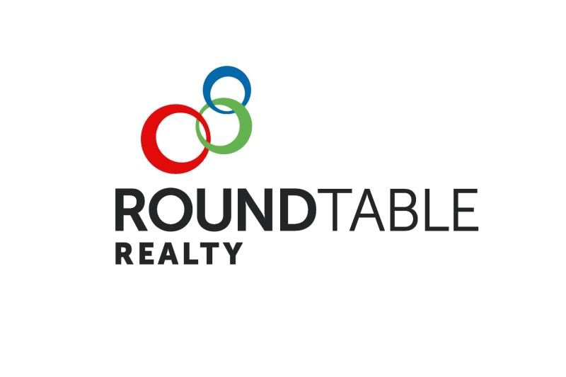
__________________
Jacksonville-florida-homes-for-sale Putting a New Spin on Real Estate! ----------------------------------------------------------- Commissioner of the USFL USFL Last edited by Flasch186 : 04-29-2010 at 07:36 AM. |
|
|
|
|
04-29-2010, 07:41 AM
|
#48 |
|
General Manager
Join Date: Jun 2006
Location: Chicago, IL
|
I like #2 in blue and/or red.
#1 is good too and may actually make it easier on you to put on golf shirts or something that you may wear. The characters are more generic which makes that easier. I like the 2nd logo in #3, although I don't like those colors that much. Has kind of a Caribbean vibe to me. They are all really good though. I don't think you can go wrong with any. |
|
|
|
|
04-29-2010, 07:46 AM
|
#49 |
|
Coordinator
Join Date: May 2002
Location: Jacksonville, FL
|
how about the one right above your post....since that's what we went with.
__________________
Jacksonville-florida-homes-for-sale Putting a New Spin on Real Estate! ----------------------------------------------------------- Commissioner of the USFL USFL |
|
|
|
|
04-29-2010, 08:01 AM
|
#50 |
|
Head Coach
Join Date: Oct 2000
Location: North Carolina
|
Congrats on getting a logo! Now just hope that you don't get sued by the Olympics for copyright infringement (I kid, I kid). I think that you picked a good logo that will stand up well over time.
Now, in 250 words or less, what is it that your company will do? How will you differ from a typical real estate agent? I'm still a bit confused on that point. Oh, and really good luck, of course. |
|
|
|
|
| Currently Active Users Viewing This Thread: 1 (0 members and 1 guests) | |
| Thread Tools | |
|
|


