
 11-30-2006, 06:45 PM
|
#51 | |||
|
Hall Of Famer
Join Date: Nov 2002
Location: New Jersey
|
Quote:
I like this as well. Hmm. Decisions decisions...
__________________
Retired GM of the eNFL 2007 Super Bowl Champion Philadelphia Eagles (19-0 record.) GM of the WOOF 2006 Doggie Bowl Champion Atlantic City Gamblers. GM of the IHOF 2019 and 2022 IHOF Bowl Champion Asheville Axemen. |
|||

|
|
11-30-2006, 07:02 PM
|
#52 | |
|
Hall Of Famer
Join Date: Nov 2002
Location: New Jersey
|
Quote:
I want to use this logo with the Red cards being A's and the Black Card being C's. Thanks again for the time put forth working on this. |
|
|
|
|
11-30-2006, 07:44 PM
|
#53 | ||
|
lolzcat
Join Date: May 2001
Location: williamsburg, va
|
Quote:
Cool. I've noticed some flaws in the "crispness" that bother me.. probably won't bother you, but I'm probably going to redo it anyways because i'm somewhat of a perfectionist (as much as I'm capable) with this stuff. What are you thoughts on color? I'm going to have to figure out the "right" way to change colors at some point anyways, still want your USC colors?
__________________
Text Sports Network - Bringing you statistical information for several FOF MP leagues in one convenient site Quote:
|
||
|
|
|
11-30-2006, 07:55 PM
|
#54 | |
|
Hall Of Famer
Join Date: Nov 2002
Location: New Jersey
|
Quote:
Yes, please. |
|
|
|
|
11-30-2006, 08:02 PM
|
#55 |
|
College Starter
Join Date: Jun 2001
Location: The Dirty
|
Do we have to put our logos on helmets? If so, is there a template, or can I somehow get somebody to put that 3rd kodiak logo on a silver helmet (or white if it looks better). If not, I can see about adding a Bozman Kodiaks somehwere on that picture.
|
|
|
|
11-30-2006, 08:15 PM
|
#56 |
|
College Starter
Join Date: Oct 2002
|
Wade, with the influx of red/gold wanna be's, would it be easier if I went with Red, Pewter, and Black?
  I want to add I take no credit for the madden photo or edits to the original logo. Those were the magical work of Argot (Madden pic) and ShaneTheMaster at the WAFL. Last edited by RedKingGold : 11-30-2006 at 08:17 PM. |
|
|
|
11-30-2006, 08:17 PM
|
#57 | |
|
lolzcat
Join Date: May 2001
Location: williamsburg, va
|
Ok.
Lowcountry Gators 256x256 Logo:  Lowcountry Gators 256x256 Helmet Logo: 
__________________
Text Sports Network - Bringing you statistical information for several FOF MP leagues in one convenient site Quote:
Last edited by Ben E Lou : 12-03-2006 at 07:24 AM. |
|
|
|
|
11-30-2006, 08:20 PM
|
#58 | ||
|
lolzcat
Join Date: May 2001
Location: williamsburg, va
|
Quote:
I don't know that we "have" to. Some leagues have used it as the standard avatar on their message board, but i'm also a pretty big fan of the avatars used over at FOFL. So I figure making the logo is the important part at first. After that, I think cuervo put some pretty good instructions on how to put the logos on a helmet with the right effects and the template and posted them on the IHOF message board. I'm not 100% sure about that. But, if he didn't, I'll probably ask him about how to do it. I think I'd like to see these on helmets eventually, so I'll look for those directions, but I don't think it's really a must-have at this stage as much as just the set of logos.
__________________
Text Sports Network - Bringing you statistical information for several FOF MP leagues in one convenient site Quote:
|
||
|
|
|
11-30-2006, 11:19 PM
|
#59 | |
|
lolzcat
Join Date: May 2001
Location: williamsburg, va
|
EF has seen this privately, but here is what I did for EF...
EF - I know we talked about a white helmet/background. I did up a few different colors so you could see how they look and pick.    
__________________
Text Sports Network - Bringing you statistical information for several FOF MP leagues in one convenient site Quote:
|
|
|
|
|
11-30-2006, 11:22 PM
|
#60 | |
|
lolzcat
Join Date: May 2001
Location: williamsburg, va
|
RKG: I'm not going to be the color nazi. I just want to put it together so that people can decide for themselves. I personally like variety, but I'm not gonna be the guy that tells someone that can't use certian colors. Hell, I made myself like the 3rd or 4th red/black team in the IHOF when I changed my team name/colors.
That being said, I do like those colors.
__________________
Text Sports Network - Bringing you statistical information for several FOF MP leagues in one convenient site Quote:
|
|
|
|
|
11-30-2006, 11:44 PM
|
#61 | |
|
lolzcat
Join Date: May 2001
Location: williamsburg, va
|
Narcizo - Here's a stab at yours. I pretty much went with what you were trying to do. I can't say that I'm that happy with it, especially since for some reason the inner ellipses get less rounded and I don't know why... Let me know what you think...

__________________
Text Sports Network - Bringing you statistical information for several FOF MP leagues in one convenient site Quote:
|
|
|
|
|
11-30-2006, 11:56 PM
|
#62 | ||
|
lolzcat
Join Date: May 2001
Location: williamsburg, va
|
Quote:
I'm about to crash, but I was looking for a cleaner version of this logo and found a few other silverbacks logos...    
__________________
Text Sports Network - Bringing you statistical information for several FOF MP leagues in one convenient site Quote:
|
||
|
|
|
11-30-2006, 11:57 PM
|
#63 | |
|
lolzcat
Join Date: May 2001
Location: williamsburg, va
|
I hope to get the chance to work on the Silverbacks and the Admirals tomorrow.
So Troy, let me know if you'd like one of these better than the one from the team you know of.
__________________
Text Sports Network - Bringing you statistical information for several FOF MP leagues in one convenient site Quote:
|
|
|
|
|
12-01-2006, 01:55 AM
|
#64 |
|
Pro Rookie
Join Date: Jan 2006
|
That's great Wade, thanks a lot. The only problem I have is that I was thinking about that in terms of being a helmet, I wasn't thinking in terms of an overall logo. (I completely forgot about that, I was probably thinking of WAFL where they have the helmets as logos). The implementation is great but I'm thinking the concept might not stand up in the super-huge logo area in 2007. Still, it's better than anything else I can come up with.
Anyway, I've changed the colours to be more in line with the British flag and, those are the colours I have in mind in terms of team colours, with dark blue the Primary, dark red the Secondary and white the Tertiary.  *Edit: Actually looking at it more, it does look pretty groovy. I'll see if I can come up with anything better but you've really done a good job and I think it will be fine as a team logo. Last edited by Narcizo : 12-01-2006 at 01:57 AM. |
|
|
|
12-01-2006, 03:21 AM
|
#65 |
|
College Prospect
Join Date: May 2004
Location: Nuremberg, Germany
|
I'd like my logo to be inspired from the gladiator on this banner:
 As for team colors, I think the dark red/orange/white combination could be good for me. |
|
|
|
12-01-2006, 04:17 AM
|
#66 | |
|
College Benchwarmer
Join Date: Sep 2003
Location: Back in Norway
|
Quote:
Why not combine the city flag, the city seal and the gladiator for the team logo |
|
|
|
|
12-01-2006, 05:36 AM
|
#67 | ||
|
lolzcat
Join Date: May 2001
Location: williamsburg, va
|
Quote:
I'll clean mine up with the darker colors, I was just using the colors you had in your prevous post. I'm not sure what you're using to modify these, but the quality gets degraded inw hatever process you're using. As for the whole logo vs. helmet logo vs. whatever.... I'm just using the model that VPI/Cuervo laid out in the IHOF. Make the logo in 256x256. That logo can then be shrunk and used elsewhere - in the helmet, in madden, incorporated for a banner, etc. So my thought would be that when we start talking about in-game banner, someone could take these logos, and work some voodoo magic to make the in-game logos. In fact, that makes me realize I should be keeping copies of these without backgrounds for anyone that wants them for this purpose.
__________________
Text Sports Network - Bringing you statistical information for several FOF MP leagues in one convenient site Quote:
|
||
|
|
|
12-01-2006, 05:52 AM
|
#68 | |
|
College Starter
Join Date: Oct 2002
|
Quote:
I slept on it and the more I think about it, the more I like the red/pewter/black combo. Is there anyway you can clean up my sample a little bit? (It was edited in ms paint in case you couldn't tell). |
|
|
|
|
12-01-2006, 06:03 AM
|
#69 | |
|
Morgado's Favorite Forum Fascist
Join Date: Oct 2000
Location: Greensboro, NC
|
Quote:

__________________
The media don't understand the kinds of problems and pressures 54 million come wit'! |
|
|
|
|
12-01-2006, 06:13 AM
|
#70 | |
|
Pro Rookie
Join Date: Jan 2006
|
Quote:
Aye. I've only got Paint on this computer, which is a pile of pish. So that would be greatly appreciated. |
|
|
|
|
12-01-2006, 06:33 AM
|
#71 | ||
|
lolzcat
Join Date: May 2001
Location: williamsburg, va
|
Quote:

__________________
Text Sports Network - Bringing you statistical information for several FOF MP leagues in one convenient site Quote:
|
||
|
|
|
12-01-2006, 06:34 AM
|
#72 | ||
|
lolzcat
Join Date: May 2001
Location: williamsburg, va
|
Quote:
Yeah, I'll work on it. I'm still not doing this the "right" way, but I'm getting better at doing it my jerry-rigged way.
__________________
Text Sports Network - Bringing you statistical information for several FOF MP leagues in one convenient site Quote:
|
||
|
|
|
12-01-2006, 06:40 AM
|
#73 | ||
|
lolzcat
Join Date: May 2001
Location: williamsburg, va
|
Quote:
Do you know what this actual logo is from? I'd like to try and find a higher quality version. I'm not sure if you specifically wanted this logo for a reason, but would you have any interest in the Razorbacks logo? 
__________________
Text Sports Network - Bringing you statistical information for several FOF MP leagues in one convenient site Quote:
|
||
|
|
|
12-01-2006, 06:43 AM
|
#74 | |
|
Pro Starter
Join Date: Oct 2000
Location: Cary, NC
|
Quote:
http://www.getpaint.net/index2.html
__________________
-- Greg -- Author of various FOF utilities |
|
|
|
|
12-01-2006, 06:46 AM
|
#75 | |
|
Pro Rookie
Join Date: Jan 2006
|
Quote:
Cool! I don't want to seem like a surly git and I'm very grateful for, well, you doing this, but is there any reason the red and white ellipses aren't even? If you think it looks better that way, or you couldn't fit the text in otherwise or whatever then that's cool. Just wondering if it would look better more even. And I was wondering if there's any way to add some toning or shading or adding a button effect, something to it to make it look less flat as a logo. Honestly, you've done more than enough already though so if I'm out of line at all just ignore me and I'll shut up.  |
|
|
|
|
12-01-2006, 06:49 AM
|
#76 | |
|
Pro Rookie
Join Date: Jan 2006
|
Quote:
Cheers. I'll have a play around with that. With my 1337 artistic skills it can only turn out well. :o |
|
|
|
|
12-01-2006, 07:38 AM
|
#77 | ||
|
lolzcat
Join Date: May 2001
Location: williamsburg, va
|
Quote:
I don't mind any criticisms/requests at all.. Like I said, I'm not the most graphically inclined and what you're not seeing on some of these is me jumping into AIM and getting feedback fromt he owners before you guys see them posted... For the most part, I'm doing the best I can to fit what an owner wants.. if I'm given little direction, I'll do my best to come up with something I like, given specific direction (i.e. this or SkyDog handing me an existing logo to modify) then I'll do that... As for the ellipses... I honestly don't understand what you mean about making the ellipses "even"... So, I can't really answer your question  .. ..As for doing something to add depth.. yeah... let me see what I can come up with... That is one of the talents I lack to an extent.. although these logos to me are more designed for throwing straight on a helmet... if we're doing something like in game or something, they all may get some effect added to them fo rthat purpose.
__________________
Text Sports Network - Bringing you statistical information for several FOF MP leagues in one convenient site Quote:
|
||
|
|
|
12-01-2006, 07:40 AM
|
#78 | |
|
lolzcat
Join Date: May 2001
Location: williamsburg, va
|
3ric:
I've played with a couple of ideas for yours. Both of them were pretty quick because of what I was working with. I may even try a couple of others. Let me know if you like either of them, and if you do, anything you might want changed.   
__________________
Text Sports Network - Bringing you statistical information for several FOF MP leagues in one convenient site Quote:
|
|
|
|
|
12-01-2006, 08:16 AM
|
#79 |
|
Hall Of Famer
Join Date: Nov 2002
Location: New Jersey
|
Thanks again Wade. The Crimson and Gold backgrounds actually look much better than I thought they would, and I like them. Although, I think the black background looks the sharpest. I might go with that and forget about the splash of green on the helmet. I'll think about it more this afternoon.
|
|
|
|
12-01-2006, 08:19 AM
|
#80 |
|
College Benchwarmer
Join Date: Sep 2003
Location: Back in Norway
|
 Im getting closer. |
|
|
|
12-01-2006, 08:25 AM
|
#81 | |
|
lolzcat
Join Date: May 2001
Location: williamsburg, va
|
flasch:

__________________
Text Sports Network - Bringing you statistical information for several FOF MP leagues in one convenient site Quote:
|
|
|
|
|
12-01-2006, 08:27 AM
|
#82 | |
|
College Prospect
Join Date: May 2004
Location: Nuremberg, Germany
|
Quote:
Nice idea. |
|
|
|
|
12-01-2006, 08:27 AM
|
#83 | ||
|
lolzcat
Join Date: May 2001
Location: williamsburg, va
|
Quote:
I agree on all accounts. The Crimson/Gold backgrouns may have an advantage in the long run for seperating yourself from the rest of the league depending on how many black helmets there are.. if nothing else it gives you options to wait and see how others look, etc...
__________________
Text Sports Network - Bringing you statistical information for several FOF MP leagues in one convenient site Quote:
|
||
|
|
|
12-01-2006, 08:28 AM
|
#84 | ||
|
lolzcat
Join Date: May 2001
Location: williamsburg, va
|
Quote:
I think that's a good idea for a banner, bigger logo, etc.. but for what I think of as the main logo (helmet logo essentially) that may be a bit busy...
__________________
Text Sports Network - Bringing you statistical information for several FOF MP leagues in one convenient site Quote:
|
||
|
|
|
12-01-2006, 08:29 AM
|
#85 | |
|
Pro Rookie
Join Date: Jan 2006
|
Quote:
I meant make the ends more rounded, there seems to be a couple of angles at each end. And yeah. Adding depth and stuff would be for the bigger logo, definitely not for the helmet. Last edited by Narcizo : 12-01-2006 at 08:30 AM. |
|
|
|
|
12-01-2006, 08:30 AM
|
#86 | ||
|
lolzcat
Join Date: May 2001
Location: williamsburg, va
|
Quote:
I've been trying to do the profile... With my skills, right now, turning the profile into a "silhouette" has been.. well, challenging.. I figured there would already be one on the web somewhere, but I haven't been able to find it... I personally like the idea of the profile more than the monticello, so we'll see...
__________________
Text Sports Network - Bringing you statistical information for several FOF MP leagues in one convenient site Quote:
|
||
|
|
|
12-01-2006, 08:31 AM
|
#87 | ||
|
lolzcat
Join Date: May 2001
Location: williamsburg, va
|
Quote:
Yeah, in my post I said something about not liking it because of... "...the inner ellipses get less rounded and I don't know why.."... It's not a desire for it to be that way, but something I'm doing wrong in creating the ellipses the way I do.. I'm going to try to fix it, but I'm not sure how at the moment.
__________________
Text Sports Network - Bringing you statistical information for several FOF MP leagues in one convenient site Quote:
|
||
|
|
|
12-01-2006, 08:42 AM
|
#88 | |
|
Hall Of Famer
Join Date: Nov 2002
Location: New Jersey
|
Quote:
Good point. I'll see what colors the other helmets are in the league and go from there. RedKingGold (and anyone else) sorry if I disrupted your color scheme. I'm just trying to add elements of teams/things that I enjoy in real life to add to my attachment to the team. Being a USC fan, as soon as I joined the league, I had plans to utilize their colors in the scheme of my team. |
|
|
|
|
12-01-2006, 08:48 AM
|
#89 | |
|
lolzcat
Join Date: May 2001
Location: williamsburg, va
|
Sack...
Lookee what I found on the web:  Seems like you could maybe just completely steal that? Edit: Although same colors again .. I could change them to anything very easily because of how this is done.
__________________
Text Sports Network - Bringing you statistical information for several FOF MP leagues in one convenient site Quote:
Last edited by wade moore : 12-01-2006 at 08:49 AM. |
|
|
|
|
12-01-2006, 08:48 AM
|
#90 | |
|
College Starter
Join Date: Oct 2002
|
Quote:
Not a problem whatsoever. I wasn't exactly tied to using gold in my color scheme and was likely going to change it anyway. But even if we did have similar colors, I saw it as no big deal. |
|
|
|
|
12-01-2006, 09:39 AM
|
#91 | |
|
lolzcat
Join Date: May 2001
Location: williamsburg, va
|
3ric another one in somewhat of a Texans style...

__________________
Text Sports Network - Bringing you statistical information for several FOF MP leagues in one convenient site Quote:
|
|
|
|
|
12-01-2006, 10:03 AM
|
#92 |
|
Hokie, Hokie, Hokie, Hi
Join Date: Mar 2001
Location: Kennesaw, GA
|
 |
|
|
|
12-01-2006, 10:37 AM
|
#93 | |
|
Death Herald
Join Date: Nov 2000
Location: Le stelle la notte sono grandi e luminose nel cuore profondo del Texas
|
Quote:
I'm not sure where I got the logo, it was one that I've had for a while. I don't really like the Razorback's logo, mainly due to the tusks. Remove the tusks, shorten up the snout by about 50%, and add some Alka-Seltzer like foaming to the mouth, and then it might be more along the lines of what I'm looking for.
__________________
Thinkin' of a master plan 'Cuz ain't nuthin' but sweat inside my hand So I dig into my pocket, all my money is spent So I dig deeper but still comin' up with lint |
|
|
|
|
12-01-2006, 10:38 AM
|
#94 | |
|
College Starter
Join Date: Dec 2000
Location: Sweden
|
Quote:
That one's really good!
__________________
San Diego Chargers (HFL) - Lappland Reindeers (WOOF) - Gothenburg Giants (IHOF) Indiana: A TCY VC - year 2044 - the longest running dynasty ever on FOFC! |
|
|
|
|
12-01-2006, 10:42 AM
|
#95 | ||
|
lolzcat
Join Date: May 2001
Location: williamsburg, va
|
Quote:
Yeah, that's definitely outside of my abilities ... I'll see what I can do with this logo or in finding a better copy...
__________________
Text Sports Network - Bringing you statistical information for several FOF MP leagues in one convenient site Quote:
|
||
|
|
|
12-01-2006, 10:42 AM
|
#96 | ||
|
lolzcat
Join Date: May 2001
Location: williamsburg, va
|
Quote:
Are the colors accurate? I pulled this from some sort of alternate Finland Flag?
__________________
Text Sports Network - Bringing you statistical information for several FOF MP leagues in one convenient site Quote:
|
||
|
|
|
12-01-2006, 10:44 AM
|
#97 |
|
Death Herald
Join Date: Nov 2000
Location: Le stelle la notte sono grandi e luminose nel cuore profondo del Texas
|
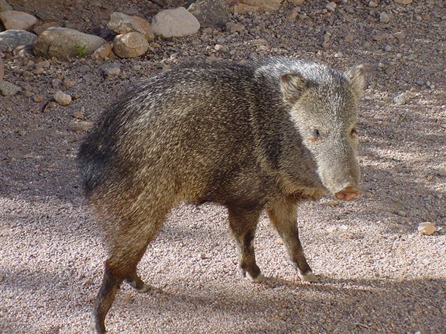
Here's a pic of a real life javelina, so you can see why I don't like the Razorback so much:
__________________
Thinkin' of a master plan 'Cuz ain't nuthin' but sweat inside my hand So I dig into my pocket, all my money is spent So I dig deeper but still comin' up with lint |
|
|
|
12-01-2006, 10:51 AM
|
#98 | |
|
lolzcat
Join Date: May 2001
Location: williamsburg, va
|
I'm still looking for that logo, but I found this:
http://www.javelinaathletics.com/logos.cfm?spcode=logo Apparently Texas A&M: Kingsville uses the Javelina.
__________________
Text Sports Network - Bringing you statistical information for several FOF MP leagues in one convenient site Quote:
|
|
|
|
|
12-01-2006, 11:07 AM
|
#99 | |
|
College Starter
Join Date: Dec 2000
Location: Sweden
|
Quote:
I was thinking of a darker blue, but otherwise the colors are looking good.
__________________
San Diego Chargers (HFL) - Lappland Reindeers (WOOF) - Gothenburg Giants (IHOF) Indiana: A TCY VC - year 2044 - the longest running dynasty ever on FOFC! |
|
|
|
|
12-01-2006, 11:10 AM
|
#100 | |
|
Death Herald
Join Date: Nov 2000
Location: Le stelle la notte sono grandi e luminose nel cuore profondo del Texas
|
Quote:
Interesting. I had forgotten all about them. That school is Eva Longoria's alma mater. But none of their logos really work for me. Now that I'm thinking about it, I think I got that first logo I posted from an ancient clip art pack.
__________________
Thinkin' of a master plan 'Cuz ain't nuthin' but sweat inside my hand So I dig into my pocket, all my money is spent So I dig deeper but still comin' up with lint |
|
|
|
| Currently Active Users Viewing This Thread: 1 (0 members and 1 guests) | |
| Thread Tools | |
|
|


