
 01-04-2011, 04:18 PM
|
#1 | ||
|
College Starter
Join Date: Jun 2003
|
Rate Logo Changes!
Any time a company changes their logo, put the pic in and lets critique!
Apparently this one happened a month ago, but I just noticed: The Comedy Central logo change I rate this one pretty lowly. Around a 2 I would say, their first logo was quite distinctive, this new one is blah, like an incomplete copyright sign. |
||

|

|
|
01-04-2011, 04:21 PM
|
#2 | |||
|
Favored Bitch #2
Join Date: Nov 2007
Location: Here
|
Quote:
My wife and I just noticed this last night and yes, it is awful. What genius decided to change the CC logo anyway? The old one was perfectly fine.
__________________
Quote:
Quote:
|
|||
|
|
|
|
01-04-2011, 04:33 PM
|
#3 |
|
General Manager
Join Date: Oct 2002
Location: The Mountains
|
That looks like the on/off switch, or on/off light, or something, on some electronic device I own, can't put my finger on which one.
|
|
|
|
|
01-04-2011, 04:46 PM
|
#4 | |||
|
Favored Bitch #2
Join Date: Nov 2007
Location: Here
|
Quote:
When I look at it, I see a copyright logo. Meh.
__________________
Quote:
Quote:
|
|||
|
|
|
|
01-04-2011, 04:53 PM
|
#5 |
|
College Starter
Join Date: Oct 2000
|
Who are the ad wizards who came up with this one?!
__________________
... |
|
|
|
|
01-04-2011, 04:56 PM
|
#6 | |
|
Pro Starter
Join Date: Sep 2005
|
Quote:
It does look like the power button on my computer & monitor, just sideways. Screams "comedy" to me. Ha. Ha. |
|
|
|
|
|
01-05-2011, 08:04 AM
|
#7 |
|
Pro Starter
Join Date: Oct 2005
Location: Washington, DC
|
The CC one is definitely bad. I don't have cable, and was at a friend's over new year's and saw it. I was wondering how long it had been changed -- could've been 3 years and I wouldn't know the difference.
 Here's another recent one: 
__________________
Sixteen Colors ANSI/ASCII Art Archive "...the better half of the Moores..." -cthomer5000 |
|
|
|
|
01-05-2011, 01:08 PM
|
#8 |
|
Head Coach
Join Date: Mar 2003
Location: Hometown of Canada
|
Starbucks:
 Don't see the point of this one. And I hate the new Comedy Central one. |
|
|
|
|
01-05-2011, 01:42 PM
|
#9 |
|
College Starter
Join Date: Dec 2006
|
I think the CC logo is really bad...like somebody should lose their dam job bad.
I would think they'd be better off putting the word "Comedy" in a circle. That would be pretty vanilla...but at least it would make some sense. The 2 C's is just horrible. It does look like the copyright logo (which would be ironically funny if they were sued over it...and funny on multiple levels) or the power button. Also kind of reminds me of Comcast too. |
|
|
|
|
01-05-2011, 01:45 PM
|
#10 |
|
Head Coach
Join Date: Mar 2003
Location: Hometown of Canada
|
It actually reminds me of the Creative Commons logo too. Even more so than the Closed Caption.
|
|
|
|
|
01-05-2011, 01:50 PM
|
#11 | |
|
College Starter
Join Date: Jun 2003
|
Quote:
I think taking off the name and having just the logo is a mistake. If someone was walking around with that cup, I am not sure if I would recognize it was from Starbucks or not. I don't think that picture is iconic enough. |
|
|
|
|
|
01-05-2011, 02:09 PM
|
#12 | |
|
Pro Starter
Join Date: Oct 2005
Location: Washington, DC
|
Quote:
That's what I was thinking.
__________________
Sixteen Colors ANSI/ASCII Art Archive "...the better half of the Moores..." -cthomer5000 |
|
|
|
|
|
01-05-2011, 02:21 PM
|
#13 |
|
lolzcat
Join Date: Oct 2000
Location: sans pants
|
Starbucks logo is extremely solid. I give it a 4.5 out of 5. Clean. Still has roots in the old logo, which has massive recognition value.
__________________
Superman was flying around and saw Wonder Woman getting a tan in the nude on her balcony. Superman said I going to hit that real fast. So he flys down toward Wonder Woman to hit it and their is a loud scream. The Invincible Man scream what just hit me in the ass!!!!! I do shit, I take pictures, I write about it: chrisshue.com |
|
|
|
|
01-05-2011, 02:32 PM
|
#14 |
|
Hall Of Famer
Join Date: Dec 2002
Location: Mass.
|
I don't recognize the new logo. I don't think I've even seen it yet. All of the coffee and everything we get for my wife still has the 1992 logo on it here.
If I saw the 2011 logo for them before seeing this thread, I don't think I would have immediately thought Starbucks, I think the 1992 one with their name is much better. |
|
|
|
|
01-05-2011, 02:35 PM
|
#15 |
|
College Benchwarmer
Join Date: Oct 2002
Location: Edmonton, AB
|
Never noticed the "girl" in the Starbucks logo until now. I certainly wouldn't have recognized it as being a cup from Starbucks if I saw somebody walking around with it.
|
|
|
|
|
01-05-2011, 03:14 PM
|
#16 |
|
Coordinator
Join Date: Jan 2001
Location: Keene, NH
|
new Starbucks > new Comedy lartneC by a large margin
__________________
Mile High Hockey |
|
|
|
|
01-05-2011, 03:53 PM
|
#17 | ||
|
Pro Starter
Join Date: Mar 2004
Location: Oakland, CA
|
All of these new logos are terrible.
__________________
Quote:
Quote:
Last edited by Rizon : 01-05-2011 at 03:53 PM. |
||
|
|
|
|
01-05-2011, 05:09 PM
|
#18 |
|
College Starter
Join Date: Dec 2006
|
Seeing the new Starbucks logo makes me think "Gee...Land O Lakes makes coffee now?"
|
|
|
|
|
01-05-2011, 11:05 PM
|
#19 | |
|
Coordinator
Join Date: Aug 2001
Location: Buffalo, NY
|
Quote:
DING! |
|
|
|
|
|
01-05-2011, 11:08 PM
|
#20 | |
|
Pro Starter
Join Date: Sep 2005
|
Quote:
I don't see knees that we can turn into boobs. |
|
|
|
|
|
01-23-2011, 01:01 AM
|
#21 |
|
College Prospect
Join Date: Jul 2001
Location: Newcastle, Australia
|
 |
|
|
|
|
01-23-2011, 01:30 AM
|
#22 |
|
College Benchwarmer
Join Date: Apr 2008
Location: Sterling Heights, Mi
|
If I saw that Starbucks cup, I would have no idea where it is from. To me, the Starbucks Coffee lettering in a circle is their logo. It is what they are known for.
|
|
|
|
|
01-23-2011, 01:40 AM
|
#23 |
|
Hall Of Famer
Join Date: Dec 2003
Location: the yo'
|
 I noticed this in the store the other day. The Vac then Steam logo looks like it says VAG Steam. |
|
|
|
|
01-23-2011, 08:57 AM
|
#24 | |
|
High School Varsity
Join Date: Nov 2006
|
Quote:
|
|
|
|
|
|
01-28-2011, 09:31 AM
|
#25 |
|
College Starter
Join Date: Nov 2002
Location: La Mirada, CA
|
NBC Universal is now NBCUniversal under Comcast with all new logo sans Peacock.

__________________
ABC's Game Giveaway list |
|
|
|
|
01-28-2011, 09:37 AM
|
#26 |
|
Head Coach
Join Date: Dec 2002
Location: Maryland
|
__________________
null |
|
|
|
|
01-28-2011, 10:41 AM
|
#27 |
|
Head Coach
Join Date: Mar 2003
Location: Hometown of Canada
|
Why get rid of the peacock! And thanks for that site link, I find marketing/brand/etc. interesting.
|
|
|
|
|
01-28-2011, 06:24 PM
|
#28 | |
|
Coordinator
Join Date: Nov 2003
Location: The Great Northwest
|
Quote:
Bad decision to toss out the Peacock. I love the font selection very nostalgic, but the Peacock needs to be there. |
|
|
|
|
|
01-28-2011, 07:32 PM
|
#29 |
|
Pro Rookie
Join Date: Oct 2000
Location: Los Angeles
|
i guess this happened at the end of 2010? i missed it
|
|
|
|
|
01-28-2011, 07:57 PM
|
#30 | |
|
Grizzled Veteran
Join Date: Oct 2000
Location: Seattle
|
Quote:
|
|
|
|
|
|
01-28-2011, 11:39 PM
|
#31 |
|
Pro Starter
Join Date: Nov 2002
Location: Winnipeg, MB
|
Yep that Nationals change is a big improvement.
__________________
"Breakfast? Breakfast schmekfast, look at the score for God's sake. It's only the second period and I'm winning 12-2. Breakfasts come and go, Rene, but Hartford, the Whale, they only beat Vancouver maybe once or twice in a lifetime." |
|
|
|
|
02-02-2011, 07:06 PM
|
#32 |
|
Head Coach
Join Date: Dec 2002
Location: Maryland
|
New branding for the TB Lightning:
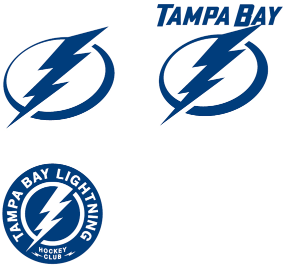 The patch (last one) reminds me a little of a logo I did for NoMyths.
__________________
null Last edited by cuervo72 : 02-02-2011 at 07:07 PM. |
|
|
|
|
02-02-2011, 07:24 PM
|
#33 | |
|
Head Coach
Join Date: Oct 2000
Location: Colorado
|
Quote:
 The trend is to a more descriptive logo (i.e., making sure your name is prominent). What 21C posted would be the trend for Starbucks - to a green circle, which you probably would find solid. The trend is to a more descriptive logo (i.e., making sure your name is prominent). What 21C posted would be the trend for Starbucks - to a green circle, which you probably would find solid. |
|
|
|
|
|
02-02-2011, 07:43 PM
|
#34 |
|
Grizzled Veteran
Join Date: Nov 2003
Location: MA
|
I imagine that Starbucks is big enough to make a less recognized image logo popular at this point. If they have a strategic reason to want the image to stick out over the words they can force feed it in the short term and create the change over a longer term.
This is marketing. It doesn't matter if it's pretty or not, they'll just pump money into marketing to ensure it equates with a product. Remember when everyone was up in arms over the name "Wii"? Comedy Central probably just wanted to change up their logo to appeal to a younger generation that didn't grow up with the original look(let's be honest, it's getting dated). Clean it up and simplify it. I actually don't think it's horrible(not that it's any good), the upside down central bugs me. |
|
|
|
|
06-12-2012, 12:45 PM
|
#35 | ||
|
Pro Starter
Join Date: Mar 2004
Location: Oakland, CA
|
New, alternate Starbucks logo
Somewhat NSFW
Spoiler
__________________
Quote:
Quote:
|
||
|
|
|
|
07-05-2012, 12:17 PM
|
#36 |
|
College Starter
Join Date: Jun 2003
|
 I was recently at Chuck. E Cheese for my niece's birthday. Let me just say this new mascot and logo is one small step in a loooooong list of needed changes for this place. Bring back showbiz pizza and this guy who will never be not cool!!! 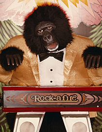 |
|
|
|
|
07-05-2012, 12:54 PM
|
#37 |
|
College Benchwarmer
Join Date: Apr 2008
Location: Sterling Heights, Mi
|
Old mouse makes me think fun for the entire family. New mouse makes me think moshpit, pot, and jailtime. The new logo is probably a better representation of a day at Chuck E. Cheese.
Last edited by fantom1979 : 07-05-2012 at 12:54 PM. |
|
|
|
|
07-05-2012, 03:41 PM
|
#38 | |
|
College Prospect
Join Date: Feb 2001
Location: Bryson Shitty, NC
|
Quote:
There's a pretty good documentary out there about Showbiz Pizza. I will never forget it, and had no idea it became Chuck E Cheese.. Loved that band as a grade school kid. I feel like many of these new logos are just people picking a font and writing their company name. Maybe we should re-design them.
__________________
Recklessly enthused, stubbornly amused. FUCK EA
|
|
|
|
|
|
07-06-2012, 09:20 AM
|
#39 |
|
Coordinator
Join Date: Jul 2003
Location: Here and There
|
 |
|
|
|
|
07-06-2012, 10:11 AM
|
#40 | |
|
Coordinator
Join Date: Apr 2005
|
Quote:
Problably some Ivy League MBA people who have no pulse on taste or design. |
|
|
|
|
|
07-06-2012, 10:12 AM
|
#41 | |
|
Coordinator
Join Date: Apr 2005
|
Quote:
What's the purpose of the girl for a Starbucks logo? |
|
|
|
|
|
07-06-2012, 10:21 AM
|
#42 | |
|
Pro Starter
Join Date: Nov 2011
Location: Lisboa, ME
|
Quote:
I suddenly have the urge to go to Chuck E. Cheese.
__________________
Come On You Irons! West Ham United | Philadelphia Flyers | Cincinnati Bengals | Kansas City Royals FOFC Greatest Band Draft Runner Up FOFC Movie Remake Draft Winner FOFC Movie Comedy Draft Winner |
|
|
|
|
|
07-07-2012, 10:09 PM
|
#43 |
|
Pro Starter
Join Date: Nov 2011
Location: Lisboa, ME
|
Hilariously relevant...
Woman faces charges after attack at Chuck E. Cheese's - Pittsburgh Post-Gazette
__________________
Come On You Irons! West Ham United | Philadelphia Flyers | Cincinnati Bengals | Kansas City Royals FOFC Greatest Band Draft Runner Up FOFC Movie Remake Draft Winner FOFC Movie Comedy Draft Winner |
|
|
|
|
08-14-2012, 07:35 PM
|
#44 |
|
Pro Rookie
Join Date: Oct 2000
Location: Los Angeles
|
|
|
|
|
|
08-14-2012, 07:53 PM
|
#45 |
|
Coordinator
Join Date: Jan 2001
Location: Keene, NH
|
but now it's not a pizza box. I don't know why you would change the old one
__________________
Mile High Hockey |
|
|
|
|
08-14-2012, 08:06 PM
|
#46 |
|
Head Coach
Join Date: Dec 2002
Location: Maryland
|
Well, some (including me, to some extent) think that good logos/iconography can stand on their own without text. Some (like Starbucks above) have moved in this direction. I personally like this one, because it actually accentuates the domino. The old one I actually forgot it was there - I saw a square but not the domino.
__________________
null |
|
|
|
|
08-15-2012, 08:11 AM
|
#47 | |
|
Pro Starter
Join Date: Oct 2005
Location: Washington, DC
|
Quote:
I agree. I never realized it was supposed to be a pizza box.
__________________
Sixteen Colors ANSI/ASCII Art Archive "...the better half of the Moores..." -cthomer5000 |
|
|
|
|
|
08-15-2012, 09:13 AM
|
#48 |
|
Pro Starter
Join Date: Nov 2002
Location: Winnipeg, MB
|
If you just showed me the new one without any context I would have no idea what product it was for.
__________________
"Breakfast? Breakfast schmekfast, look at the score for God's sake. It's only the second period and I'm winning 12-2. Breakfasts come and go, Rene, but Hartford, the Whale, they only beat Vancouver maybe once or twice in a lifetime." |
|
|
|
|
08-15-2012, 09:50 AM
|
#49 |
|
Head Coach
Join Date: Dec 2002
Location: Maryland
|
You wouldn't identify it as a domino? Or you wouldn't make the leap from that to corporate logo?
__________________
null |
|
|
|
|
08-15-2012, 10:29 AM
|
#50 | |
|
Pro Starter
Join Date: Nov 2002
Location: Winnipeg, MB
|
Quote:
I might pick up on the domino shape, it's hard to know because it is so obvious when it's in context. But I probably wouldn't leap to "Domino's pizza joint", at least not without a bit of thinking.
__________________
"Breakfast? Breakfast schmekfast, look at the score for God's sake. It's only the second period and I'm winning 12-2. Breakfasts come and go, Rene, but Hartford, the Whale, they only beat Vancouver maybe once or twice in a lifetime." |
|
|
|
|
 |
| Currently Active Users Viewing This Thread: 1 (0 members and 1 guests) | |
| Thread Tools | |
|
|


