[quote=Iceman87GT;2045150694]
The Adidas Issue:
Adidas is not well-represented in the game, in this section I will explain what appears to be wrong and provide examples of how the uniforms should look. I will be doing this for every such uniform that appears to be misrepresented, which means this list could start to grow, though I'm pretty confident that I have all of them on this list.
*Denotes uniforms whose designs are outdated, this is in addition to them not having the proper Techfit look.
Details of the Issue:
- The mesh is too big, also too prevalent. It should only be noticeable in close-ups, and even then it is still hard to see from time to time depending on the angle, the colors, and the lighting.
- You have the right idea with Texas A&M, Mississippi State, NC State, New Mexico State, Indiana, and UMass.
- I don't doubt that the templates you have for all the school's listed above are the correct ones, but the holes should be smaller, and less noticeable, and it should appear more like solid material.
- Because Adidas's Techfits are super-stretchy, they look most accurate in the game when everyone on the team has their sleeves set to Tight. The problem here is that most school's sleeve designs partially dissappear when this option is selected. Y'all fixed this issue with Nebraska but all the other schools are still subject to it.
Here is an example of how different the uniforms in the game are from their real life counterparts.
EMU Game:
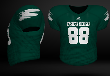
EMU in real life:
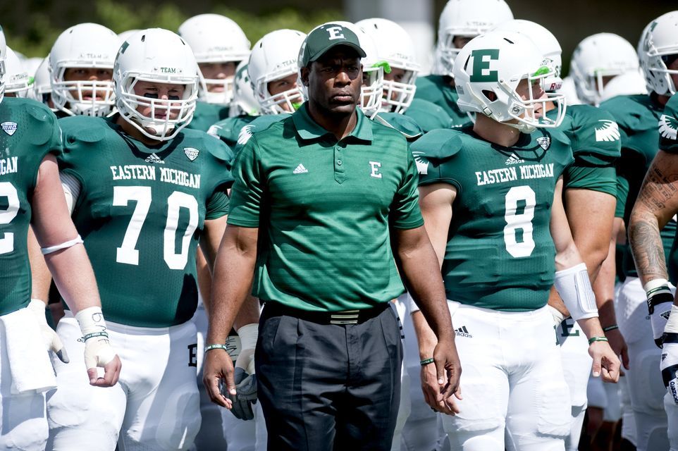
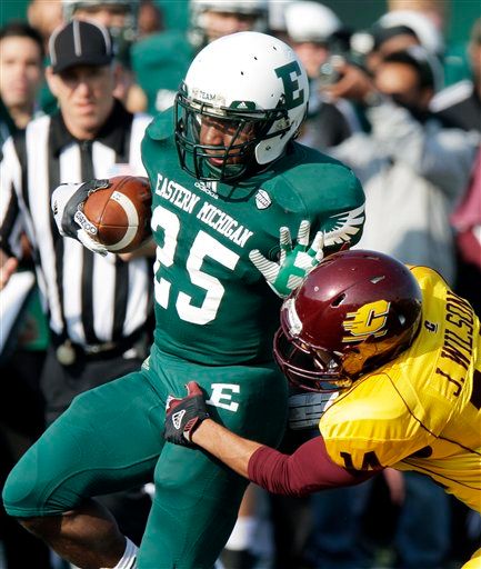
In both examples you can see the holes, but they stand out much more in the game version. Now here's a pic of the jerseys in action, same Green EMU jersey but now you can't notice the holes at all.
And Here's how they look in action in NCAA 14. And keep in mind this if from further out than the real life example and yet, you can still see the mesh design.
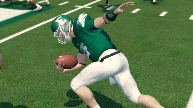
Some are a little more prominent than others (I used EMU because it was one of the better examples of actually seeing the holes in the real life uniforms, most of the time you can't see them, and even when you do they are never as obvious as they are in the top picture). And while this doesn't hurt the gameplay (in fact its hard to notice depending on what camera angles you use), it rears its ugly head after every play when we see the cut-screens, it can thrown off immersion, which is extremely important in this game. Here are 2 examples from that same game
EMU2.
FIU1. With the FIU one it should be ever harder to see the holes, because its a white jersey and the whole only show up in close-ups, yet you can still see the mesh design arguably more so than you can see it in the 2nd green example.
---------------------------------------------------------------------------------------
Kansas does not have a proper techfit look. Very outdated. They should have a * added by their name. Same goes for Notre Dame, Nebraska, and Tennessee .
Also, New Mexico State should be added to that list of techfits. They have an updated template and look as good as Umass/ Arkansas State. But their sleeve design is majorly cut off.
THANK YOU SO MUCH FOR SHINING A LIGHT ON THIS. I love the way the techfits look and think EA could do an awesome job if they cleaned them up.


 07-19-2013, 01:35 AM