Adolis Garcia's glove is a thing of beauty. No way this looks that good on even a PlayStation 4 Pro.
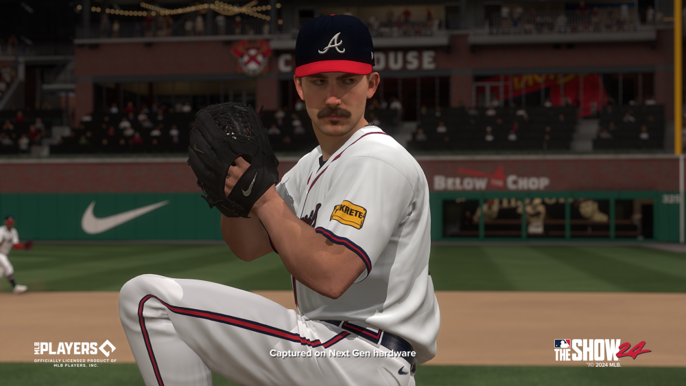
It looks like they may have improved the fielding gloves for non traditional colors. That almost looks like maybe a team color? Would be awesome if they added that to fielding gloves.
I’ve played this game for over a decade and have played it more than any other game, last year I got bored so quick and barely touched it. I have no intention of picking this up this year bc I can’t see a single thing that makes it unique from the last 10 years. Gameplay is always solid but graphics and presentation have gotten so stale it’s not worth it to me. Shame because 20-22 were some great years but man have no intention of getting it this year
I know others hate it, but I am glad the patches are in. Anything that adds to the authenticity. A lot of these shots look rough for a PS5 game for sure, but it is still neat seeing all of the historical stuff like the Negro Leagues. I absolutely love that they've been able to allocate resources there the last couple of years. Now, if they can just invest in a graphical department, that would be nice.
“No one is more hated than he who speaks the truth.”
The fact that they can get the patches in and move the mlb logo down and change the players names yet the teams with no names still have their numbers in the wrong place is baffling. Especially in a year (2 actually) with so much Jeter hype, you’d think they would put his number in the correct spot on the back of his jersey.
Careful, I guessed mlb 16 and was told to go play that lol… but in all honesty the fact that I can’t honestly tell you what year that screen is from speaks volumes


Comment