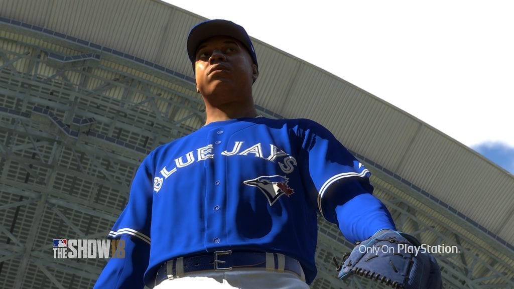
Really need to get those 4/5th sleeves in the game for guys like Stroman, Rizzo etc. because having their sleeves cover their whole arms doesn't look right, but the 3/4 option is too short.
Really need to get those 4/5th sleeves in the game for guys like Stroman, Rizzo etc. because having their sleeves cover their whole arms doesn't look right, but the 3/4 option is too short.
While we are at it we need the correct Nike glove for pitchers as well. They are still using that one with the huge swoosh that no mlb player wears. 4 year in a row with the incorrect one.
Ramone said in the Gamespot video that uniforms were a primary focus this year... So hopefully the colors pop now.
Ramone talked about stitching and textures and how lighting affects the uniforms so while that may include improved colors I'm not 100% confident about that. At least it's not automatic. You could have beautiful textures and stitching and threads and shadows and lighting and still have the Nationals wearing maroon.
Ramone talked about stitching and textures and how lighting affects the uniforms so while that may include improved colors I'm not 100% confident about that. At least it's not automatic. You could have beautiful textures and stitching and threads and shadows and lighting and still have the Nationals wearing maroon.
Yes exactly!
Milwaukee Brewers|Green Bay Packers|North Carolina Tar Heels|Wisconsin Badgers
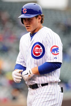
Well judging by the Turner picture, red still looks like burgundy. I hope this is just an early work in progress picture and the color issue will be fixed by launch.
Well judging by the Turner picture, red still looks like burgundy. I hope this is just an early work in progress picture and the color issue will be fixed by launch.
I noticed that as well.
We'll find out I how big a focus uniforms were this year.
I think they need to hire a few more graphics specialists on this game. IMHO. Other areas look to be getting a lot better. Not sure about graphics yet.
If you guys had experience with programming shaders, which are basically instructions ran directly on the GPU, you'd understand why colors can be difficult to convey perfectly in different lighting conditions.
Don't get me wrong though. It isn't impossible and I think the red correction is long overdue.
Sent from my SAMSUNG-SM-N910A using Tapatalk
I definitely know it can be hard. But I been seeing these same fields like everyone else for along time man. It looks okay in closeups, but far too desaturated and blue/red than it should be.
They really need to change the lighting and saturation of colors for dirt and fields to match the real ballparks.
I don't think it is something too crazy to hope is being improved. But it doesn't look improved at all. Which really sucks.


Comment