Boise and VT Unis
Collapse
Recommended Videos
Collapse
X
-
Re: Boise and VT Unis
VT's are great. Boise St's not so much. Not feeling how big that Bronco is on the helmet, its too big. But VT's uniforms are amazing.Comment
-
Re: Boise and VT Unis
Retire Pro Combat jersey and fire NIKE! Those are horrible. Sorry, but I'm so tried of the "all black" uniforms that are so overdone. And Boise State's are just plain horrible. What's wrong with traditional uniforms? Nothing. I hate these throwbacks to the USFL.Check out my updated 2017 blog on building a high school football video game:
http://forums.operationsports.com/th...ame-revisited/Comment
-
Re: Boise and VT Unis
I, for one, love the PCs. They look really cool IMO.Huskers | Chelsea FC | Minnesota United | OmahaComment
-
Comment
-
Re: Boise and VT Unis
Personally, I like the Boise unis. I just think more orange would be prime. People can hate on the unis but they will never go away.
On a side note, if Hawaii was still under Nike, I can only imagine would their unis would look like... Hawai`i WARRIORS
California GOLDEN BEARS
Auburn TIGERS
..***Sh Um...Comment
-
Re: Boise and VT Unis
sorry but these are hot. A lot of people hate on all black uniforms just because a lot of teams do it but the all black unis are always some of the nicest unis. FSU, Maryland, VT... those unis are sweet. I dont like Boise State's because its just too much grey and not enough orange in there.

Virginia Tech: Inspired by VT's relationship with the military, the uniform is all-black with grey accents (symbolic of military dress uniforms) to accompany the team's burgundy and orange. The helmet is a flat black shell with the VT logo in orange outlined in burgundy and white. The uniform numbers feature a computer-chip pattern signifying the school's technological background. The "tech-y" pattern is also used throughout the uniforms on orange accent panels that crop the shoulders and run down the pant legs.

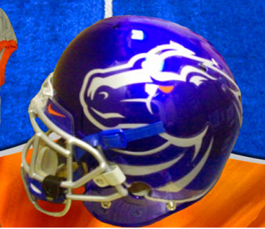
Boise State: Famous for beating Oklahoma in the Fiesta Bowl in 2007 and blue turf, Boise State was selected as one of this year's 10 Pro Combat teams. Their new uniform features a grey jersey with one blue sleeve, which has a large, cropped image of the Boise State Broncos bronco head. The oversized logo theme continues onto the helmet, where the bronco head is displayed proudly… and massively on a blue shell. The pants are, like the jersey, asymmetically designed, complete with another large bronco head on the left hip, the BRONCOS wordmark down the right leg, and a silver B on the left knee.
Ohio State: Like VT, The Ohio State University unveiled its second Pro Combat uniform in as many years. This year's Ohio State uniform looks to honor the 1942 team. The helmet is rather basic, featuring a red shell, grey facemasks, and the Bronze Star of Charles Csuri, the MVP of the 1942 squad. The jerseys are also rather simple, only adorned by an American flag on the right sleeve and stylized jersey numbers that pay homage to the 1942 squad. The pants are simple, as well: grey with the Ohio State O logo on the hips. The under layer shows off a sublimated camouflage pattern to tie the scheme together.
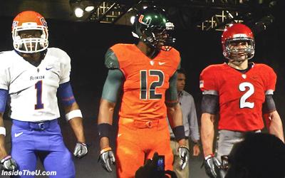
U of Miami: Especially compared to last year's white-out Pro Combat set, this year's uniform is dripping with color. The helmet is a metallic shade of green that falls between Miami's normal forest green and emerald, complete with the U logo on each side. The jersey, by contrast, is bright orange with green sleeves which have a sublimated palm tree pattern on them. The numbers are the same font as last year's model, but instead of being half-green and half-orange, they are half-green and half-black with a white outline. Rounding the set out are orange pants that feature a green stripe that runs across the backside and down each leg. "The U" adorns the top of the pants on the back, while the U logo is placed on the left knee in silver.
Alabama: The Crimson Tide win the "Texas Longhorns Award" for the least change from their regular uniforms to their Pro Combat threads. The only difference between the standard and Pro Combat helmets is the addition of a sublimated houndstooth pattern on the helmet stripe of the Pro Combat version. The new jersey is also incredibly similar to the standard, with the only changes being the addition of an American flag to the right sleeve and (of course) the use of the houndstooth pattern on the numbers. The pants add a logo to the hip where there wasn't previously one, but to the average fan, not much has changed.
Florida: The Gators really adopted the gator skin pattern that Nike experimented with last year. This year's Pro Combat uniform uses said pattern on the helmet, sleeves, numbers, pants, and undershirt. The helmet is different from last year's (which was white), as it is orange and uses the classic Gators script. This year's jersey is white and is paired with blue pants.
Oregon State: To be worn in the "Civil War" (the school's rivalry game against U of Oregon), the Beavers' new pro Combat duds are modeled after the 1967 team known as the "Giant Killers". The uniforms use a black helmet and jersey with off-white pants and feature a consistent striping pattern of off-white/orange/off-white on a black background (black/orange/black on the pants). Other than the stripe, the helmet is solid black. Nike helped push the throwback look to this set by adding the sthttp://www.blogger.com/post-create.g?blogID=3798142622684331953riping pattern to the sleeves of the undershirt, as the jersey sleeves are too small for such a thick stripe, in addition to the jersey number.
Pittsburgh: The Panthers are new to the Pro Combat game, but that didn't stop them from trying something different. The uniform is all navy with black and metallic gold accents and is supposed to represent the steel industry. The PITT wordmark and jerseys numbers are designed to look like they are cut from steel, while the helmet stripe is supposed to look like an I-beam.
West Virginia: Like Pitt, West Virginia is new to the Pro Combat game. The Mountaineers themed their set to honor the coal mining industry. The helmet features a thin strip of yellow to represent the headlamps worn by miners and a smudged black pattern is used throughout the uniform to further convey that message. The jersey and pants are both white, with the thin yellow stripe running down the sides of the pants.
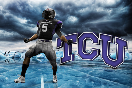
TCU: Ah yes, TCU. They're the ones who trotted out this look last year. They kept the frog skin pattern, although this year it's "icier" to reference a memorable quote from celebrated coach Leo "Dutch" Meyer. ("We'll fight 'em 'til Hell freezes over, then we'll fight 'em on the ice.") This year's version will pair a silver frog skin-patterned helmet with a black jersey and matching silver pants. The jersey features purple side panels and shoulder accents, in addition to frog skin numbers. Overall, not that different than last year's model, but slightly better.


the rest of the pro combats


 Last edited by JerseySuave4; 09-06-2010, 08:13 PM.
Comment


Comment