-
-
Re: NHL 2K10 Screenshots
Screen shots are looking greatComment
-
Faces and graphics look great. Ingame and animation wise the game looks crappy. Cant even finish watching most of the videos of gameplay. The goalies animations are puke! The worst!Comment
-
PLayer models are really good, and more true to realistic sizes than EAs. In EAs game player models in general are too bulky. Goalie models are not up to par with EAs though. It´s hilarious to see the player model hating, delirious....
Really nice to see how good the player faces are, but weird about Ovies face.
Areanas are insanely good!Comment
-
http://getitnext.typepad.com/hockey/images/2007/08/31/islander_jersey_home.jpg
And stop exaggerating about the colours... This is a true shirt...
It´s an insane amount of trolling in here...Comment
-
Re: NHL 2K10 Screenshots
Respectfully I disagree when it comes to player models. Goaltenders in real life these days LOOK bulky due to the size of the equipment and padding. Looking at 2k10's tenders you'd think not only are they not wearing chest protectors but the're not wearing shoulder pads either. The same can be said for the skaters, they appear to have no shoulder pads at all.
While the models themselves look better the equipment looks off. Granted its kind of a nitpicky gripe in the first place.Comment
-
-
Re: NHL 2K10 Screenshots
I see. Others can post pics pulled off the net that show the unis to be a certain color, but they're "wrong" and "trolling." You on the other hand can post pics off the net showing the unis to be a slightly different color, and you're "correct" and "righteous."
Don't mind me, I'm just trying to get the ground rules down, to save you the trouble of having to go all fascist on us next time there's an impressions thread to post in.Comment
-
Re: NHL 2K10 Screenshots
Heck tab babe, let's stop arguing and go to the source, shall we? The NYI's own site should settle this. Okay, let's see, how about these wallpapers:
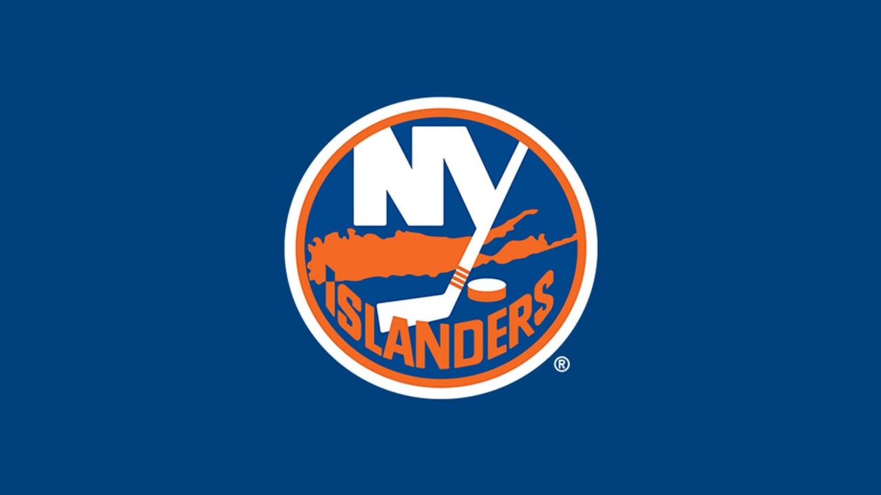
Frans Nielson seems to be saying the same thing I am right now: "Hey, these uni colors don't look anything like that 2K pic!"

Comment
-
"And by the way, you know, when you're telling these little stories? Here's a good idea - have a POINT. It makes it SO much more interesting for the listener!"Comment
-
Re: NHL 2K10 Screenshots
I agree with others here that 2K beats EA in the presentation department. EA hasn't upgraded their presentation since at least NHL07, but their gameplay is tight. I'm more than willing to give 2K10 a shot this year because I feel EA's product is getting stale, due to the lack of presentation (I'm still playing NHL08 and enjoying it and IMO it looks the same as 10). I also agree with Scott and Eddie that 2K has better puck physics than EA's game.
Back on topic, I think the player faces look very good, except for the cover boy which is strange. You'd think 2K would get that right. The goalies don't look realistic either, there appears to be a lack of padding under their unis and the skaters don't appear to be wearing shoulder pads as previously mentioned. Overall though, this game is worth a shot.Comment
-
Re: NHL 2K10 Screenshots
Those arenas look gorgeous.Comment
-
Re: NHL 2K10 Screenshots
My only concerns is that they are only for the playoffs. I hope not. Those are the kinda presentation that can get me fired up for a game, especially at the Tank!Comment


Comment