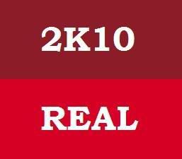
It's cool if it doesn't bother you. Some people are ok with mediocrity, and that's not a shot at you.... but that's what I see when I see this game in these images.
Whoever is doing the art at 2k needs a better eye. NBA 2k players got shafted by the horrible attempt at "pink" for the Philadelphia 76ers.
The game would look YEARS better with an appropriate color palette. And you don't realize that now, but if I showed you the same image with the RIGHT colors, you'd see it.

 Somebody has been paying attention... This game has gone thru so many Color Palette changes since jumping Next-Gen that it's a joke. Either they are too bright (2K9) or they are too dull (2K8) IMO the best color this game has had was 2k7. What bothered me with 2k7 was the Lighting was too strong causing bats too look like light-sabers & scoreboards to look like mirrors.


Comment