-
-
Looks like a jaguar Simba to me.Comment
-
Re: Jacksonville Jaguars New Logo For 2013 Season
It does look feminine. I'm not sure if it's an upgrade or not. The more I look at the old, the more I dislike it. I do like the shield though.Ohio State - Reds - Bengals - Blackhawks - BullsComment
-
This logo, looks like a female Jaguar. I don't think there is any denying that. They should have made a logo of a Jaguar taking down a Buffalo or something. Or at least add some red stains on the tip of the canines, with blood dripping off of them.Green Bay PackersSeattle MarinersNew York Rangers
Syracuse Orange
If walls could talk to spill the lies, we'd see the world through devils eyes
-M. ShadowsComment
-
Eh, it's not too bad. A much-needed upgrade from the mid-90s logo they have been using since their inception. Here's to hoping a new logo brings new uniforms with it. The all-blacks were alright, but I miss the black on teal on black. But, this could also pave the way for new combinations like white helmets.
Unfortunately, none of this can improve the product on the field. It's a good logo for their impending move to LA. (Come on, let's be real here. You really think they are staying in Jacksonville? Right.)Comment
-
@godgers12. Can you apply to be their logo designer? That's hilarious... and bad ***.Comment
-
Re: Jacksonville Jaguars new logo for 2013 season
Nike and the Jags have released info last year that they would have the first complete redesign for the Nike contract. While yes teams and the NFL have final say, I'm sure this came from Nike and not the team designing it.Comment
-
Re: Jacksonville Jaguars New Logo For 2013 Season
i like it. the old logo wasn't too bad, it has just started to look outdated. the jags have good colors though, they should make better use of them in their unis.Comment
-
Re: Jacksonville Jaguars New Logo For 2013 Season
Sorry but you need to stop watching ESPN and actually do some reading yourself. The Jaguars are investing $50 million to build the largest video board in the NFL, it will be larger than even the new Texans one.
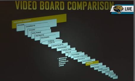
The Jags are not going anywhere and have a very strong lease that in the NFL is almost impossible to get out of.Comment
-
I think it's an improvement."Don't be afraid to go to number 23, he's alright."Comment
-
Re: Jacksonville Jaguars New Logo For 2013 Season
Looks good. Now i wonder what the dolphins new logo is gonne look likeComment
-
Very nice. Massive improvement over the original. Now, let's see if the actual logo colors are incorporated better into the unis... and not so much black.
Sent from my VS840 4G using Tapatalk 2Chicks dig the long ball.
#GBR 8-1
#FEARAMEER
#BEATIOWA
BE ROYAL IN 2015!
"The Notorious" Conor McGregorComment
-
Don't like the eye. I think they need to widen it a little. Also, the hea looks kind of squashed, maybe widen it/make it a little taller.
Also, not a fan of the teal nose, eye & tongue. They could make it a balck nose, hazel eye & make the tongue a more realistic color. There is no need for them to have a teal tongue etcetera. I mean serioulsy, jaguars don't have teal tongues & no other colors in the jaguar are incorporated into the team color scheme.
I say stick with the teal, black & white color scheme & just have the logo colors independant of that scheme.Comment
-
Re: Jacksonville Jaguars New Logo For 2013 Season
I've been looking on the Sportslogo website and some of the members over there made some great concepts on how they would change this logo.
Here are some of them:
Personally, I love the one with a reduced aspect ratio. (the first one)Comment
-
Re: Jacksonville Jaguars New Logo For 2013 Season
Will they change the jerseys to?Comment


Comment