
Haven't messed with relocation but is there a quick way to make the sonics with the jerseys or so you have to customize it to that? If you have to customize it can anyone share their settings for it.
-
PSN - MikeDG719 -
Re: Seattle Sonics Relocation Template
I'm having trouble with the actual jersey. I can't seem to find the arch on the front of it.
Sent from my iPhone using TapatalkCosmetic Guides to the Show v2 Rosters
STANCE GUIDE
http://bit.ly/HtkpmT
MOTION GUIDE
http://bit.ly/IqkdGh
-
Re: Seattle Sonics Relocation Template
Sorry to disappoint you but there is no arch feature for front text. its crazy they overlooked this as its available for text on the back. the only workaround i can find is to use an uploaded logo of sonics wordmark, and put that on it. i havent found any sonics wordmarks from the jerseys yet. I did find the vancouver grizzlies one in community uploads and was able to make a good uni.Comment
-
Re: Seattle Sonics Relocation Template
We should just make a whole topic devoted to sharing designs.
It would also let us share PS4/XB1 usernames so we know what to search for in the 2K image library.
I'm serious--23, get on that! I want a Kentucky Colonels logo with all the necessary transparencies, sort of like those seen here, but without the white square around them on the court...even with Google, I can't figure out how to do that myself.Comment
-
Re: Seattle Sonics Relocation Template
This is what I made Hey
HeyComment
-
Re: Seattle Sonics Relocation Template
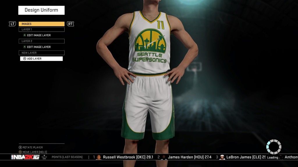
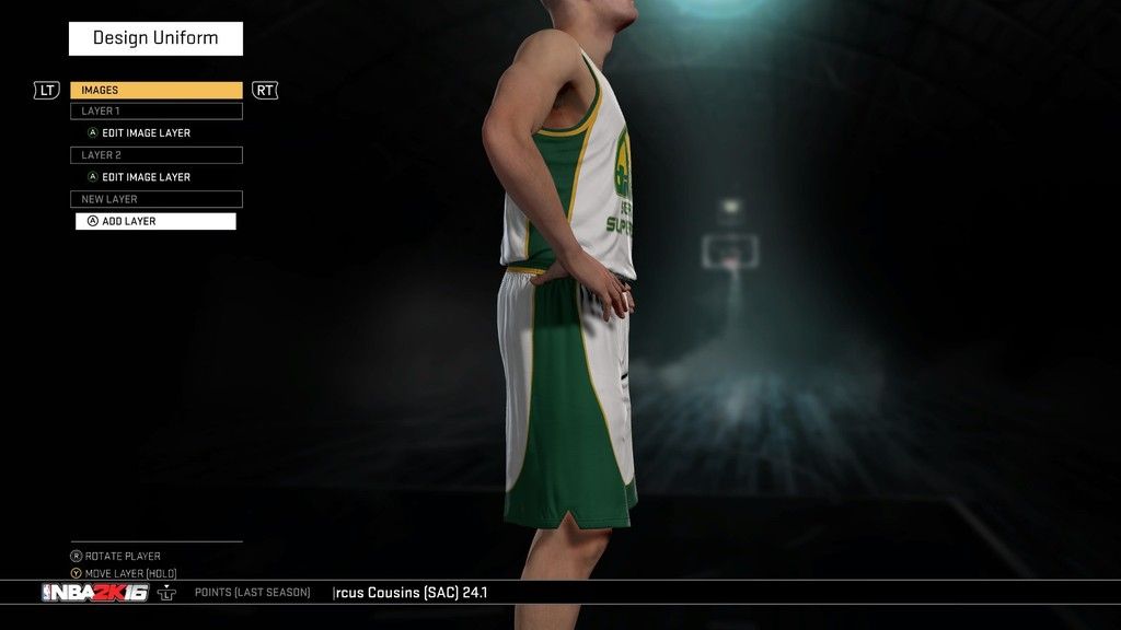
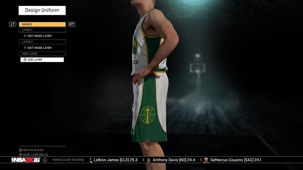
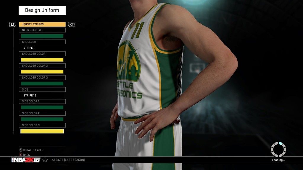
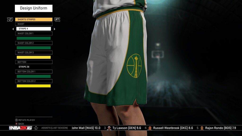
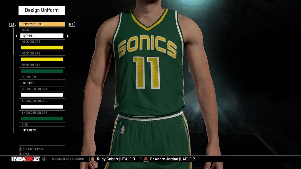
Well, there are a lot of different concepts out there for a future Sonics team, but one of my favorites is this one here. He's got a few different versions of the logos through page three, so check and see which ones you like. I spent a total of eight (maybe more) hours yesterday getting those logos ready for prime-time in Photoshop, then put them to work in the game.
Here are my results. This is by no means a final design but there are a lot of elements I like about it. I'm drawing up another design as we speak that I think will be better.
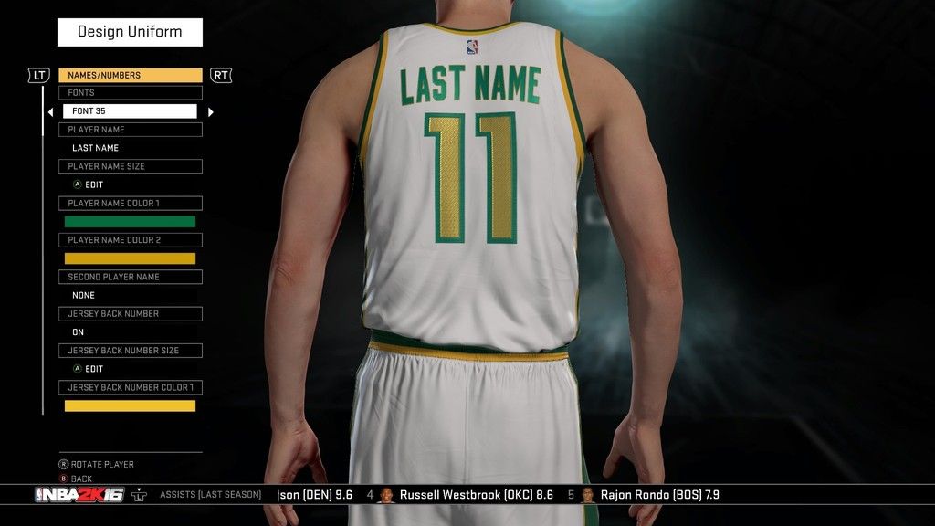
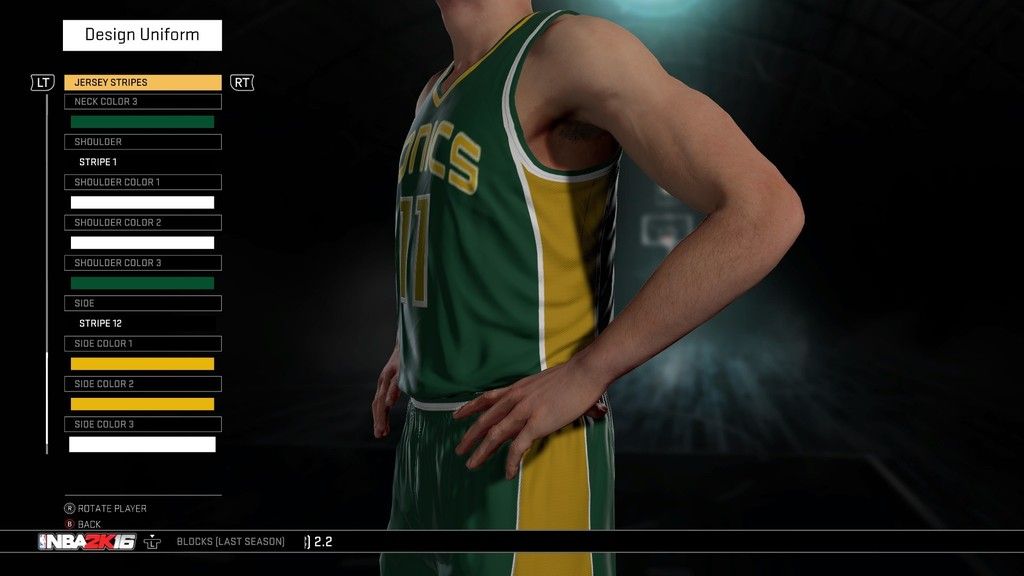
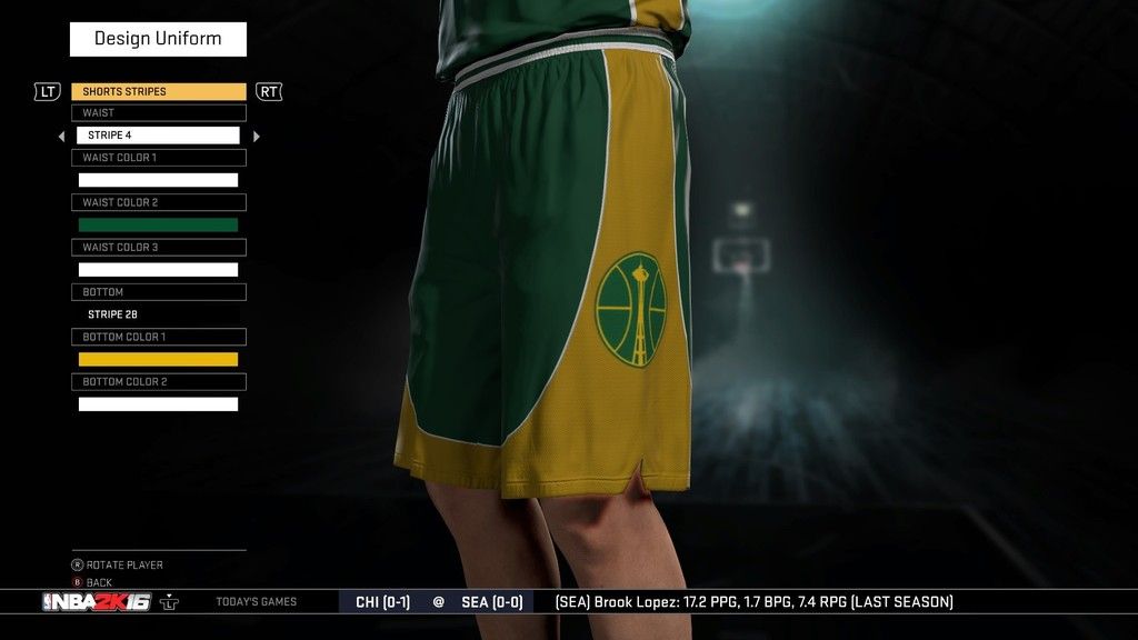
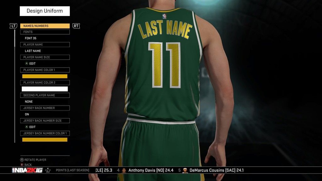
Firstly, the home jerseys:
Right Side:
Left Side:
Front Close:
Left Side Close:
Shorts Close:
Back Close:
*****************
Now, the away jersey I decided to go in a completely different direction. Personally, I find myself bored when teams just switch the colors of their away uniforms (using their secondary as a main or some such) and the design of the uniform is almost exactly the same, minus a different color scheme. Since we can only have two custom jerseys for our relocated teams, I thought it appropriate to just go ahead and create what would be the alternate away jersey on most teams as the Sonics standard away jersey.
I feel this is a decently possible thing that could happen in the future as alternate away jerseys become more popular: plus, I feel like when the Sonics are away they need to communicate a different message (as opposed to the home uniform which very clearly communicates "WE ARE SEATTLE", the away uniform message is all about "SONICS" and is sleeker than the home one, admittedly).
Here's what I did:
Front Close:
Left Side Close:
Shorts Close:
Back Close:
***********************
Now, the only connective tissue between these two uniforms is the color scheme and that snazzy secondary logo (on the side stripe of the shorts). Other than that, these two uniforms are quite different. Overall, I came away very satisfied with the away uniform but the home one felt like it had no life to it -- really reminded me more of a walking billboard for the primary logo than anything, but I like the idea of it so I'm giving it a try again.Comment
-
Re: Seattle Sonics Relocation Template
I seen someone post pics of the Ray Allen-era Sonics jerseys he made and they were pretty accurate.Link to my NBA 2K13 2010-2011 Roster:
http://www.operationsports.com/forum...box-360-a.html
NBA: Bulls (Secondary Team: Hornets)
NFL: Colts
NHL: Blues
MLB: MarinersComment
-
Re: Seattle Sonics Relocation Template
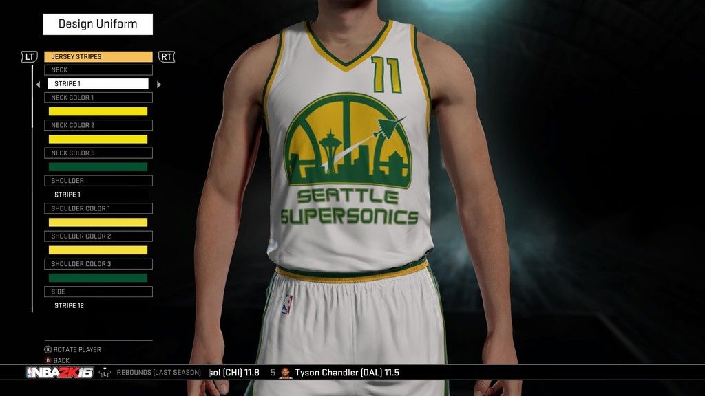
Hey Trek, great work man!!! I love to see the Supersonics being represented properly. I would personally make the logo on the whites a little bit smaller, if at all possible, but I love the overall look of logo. Everything looks really great, from the updated logo (with the jet, so people actually know WTF Supersonic means, lol) to the new text. It all really looks great. I really want to make a Sonics team with the Seahawk/Sounder colors, considering I really love that combo. If you know how to make it happen, let me know via PM. I'm not really any good with photo editing. Once again, great work!Xbox One GT- II McG IIComment
-
Comment
-
Re: Seattle Sonics Relocation Template
Since this is a Sonic specific thread i'll share what i made.:

Here's the Arena:
 HELLO BROOKYLN.
All Black EverythingComment
-
Comment
-
Re: Seattle Sonics Relocation Template
The original image was 512/512 i think. I scaled it to 91 on the floor.HELLO BROOKYLN.
All Black EverythingComment


Comment