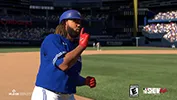
When it comes to stadiums, lighting, player faces, and crowds, MLB The Show 17 is a very good looking game. For many of us, there is one area that doesn't seem to be at quite the same level graphically, and it's one that gets a ton of screen time, and that is the Uniforms. In the new promotional gameplay videos for MLB The Show 18, Ramone says that uniforms were the main focus this year in terms of graphics, but all he goes on to mention is that they added Physically-Based Rendering (PBR) to them. And while that will go a long way to upgrade the look of the materials of the uniforms, and I'm sure it will look great, it ignores almost everything that a lot of us still have issues with regarding them, which I will try to list here with as many examples as I can. I know these changes cannot be introduced in this years game, I just want to have as thorough and constructive of criticism as I can provide so it can be considered for future iterations of the game.
-----
Cloth Physics
When the game was brought over to the PS4, the uniforms had seen an upgrade in style and polygon count that was very noticeable and looks great in still images. However, the way they animate was kept the same. Instead of using a physics-based engine where the clothes would react to the way the player moved, they are simply a series of meshes that would appear based on the position of the player's arms. Once again it looks good in still images, but once the player starts moving around, the fabric simply looks glued in place and doesn't move freely in a natural way when the player runs, jumps, throws, or swings.
Here's a good example of good, natural looking "reactive" cloth physics. With the way i is now, when a player bends over, the jersey doesn't hang, which causes odd
clipping issues with the belt and the bottom of the jersey, and it happens somewhat frequently. It's especially noticeable because baseball jerseys are typically very baggy and loose, so the way they are animated can make the game fall into uncanny valley territory.
Sleeves simply float statically around the arm in an unrealistic way. Wind is something that is hard to visualize in this game because jersey cannot react to it, which can make the game feel like it takes place in a vaccuum. MLB 2k8, while rudimentary and exaggerated in it's execution,
has a form of this and definitely can add to the atmosphere of a game, feeling like it takes place in a real physical place. That game is 10 years old now, I feel this can be implemented in a much more realistic and believable way with current technology, and it would do wonders for the game's look and atmosphere.
Style Templates
There is only one uniform template in the game. It is a modern, button down jersey with somewhat loose-fitting pants. For all current uniforms this is fine. But with the inclusion of throwback uniforms, classic stadiums, and legends, immersion can fall apart when you try to use these in an authentic way. Adding two new templates can resolve this. One would be a late-1800s to early-1900's
baggy uniform and pants style with the old style hats, that could also be used while batting instead of helmets for true authenticity. The other would be a
1980s style
pullovers with tighter pants that have an
elastic waistband and cuffs pulled up half way with stirrups underneath. These templates could also be used in Diamond Dynasty's uniform creator to allow for more diversity.
Number Placement
Number placement has always been a bit of an issue in previous years, but in 17 it was remedied for jerseys with last names by raising the back number to the center of the player's back from the bottom. However it is still not
high enough on
jerseys without names on the back. Numbers on the front of jerseys are
placed too low and small compared to how they
look in real life.
Colors
A lot of the colors on the uniforms come out either washed out or too dark compared to how they look in real life. Reds, Yellows, and Blacks are the most noticable ones. Here are a few examples: Angels Red Alternates (
In Game,
Real Life), Athletic's Gold Alternates (
In Game,
Real Life) , and Pirates Black Alternates (
In Game,
Real Life)
Uniform Slots
Last but not least is the recurring slot issue. We have been told year in and year out that there are only a certain amount of slots for uniforms. This was somewhat remedied last year with slots being taken from teams with fewer alternates and used for teams with more alternates. This is great, but it seems like a workaround of the real issue where there are just too few slots in the game as a whole. Baseball has a very long and storied history with many teams with tons of different looks and it would just be great if we could experience more than just 2 throwback sets per team. And if this is something that cannot be fixed, then at least try to use throwbacks that are actually used by the teams currently. For example, one of the throwback slots for the Angels uses the
1997-2001 Disney era uniforms which have not been worn by the team once since 2001. They commonly use the
early 1990s or
mid 1980s California Angels uniforms for throwback days, neither of which are in the game. I'm sure there are tons of other examples for other teams.
--------
So, in conclusion, I believe that there are enough issues with the current uniforms that warrant at least a decent amount of work to try to improve on. I believe this game looks absolutely incredible on just about all fronts, including the Lighting, PBR, Stadiums, Crowds, Faces, that the uniforms might be the only thing graphically that could still use improvement on this generation. I know there are quite a few people on this board that agree, and we would like to see this game get to the level we all want graphically, and I believe this is the biggest hurdle in the way of making this game the graphical powerhouse it was in the previous generation.
Hopefully this feedback is helpful, if anyone has anything to add, please do.


