

Re: Stadium upgrades for MLB 12
If I could like your post 1 million times I would. These are the exact changes that need to be made to make Target Field spot on. I don't imagine that all of this gets done but I will say as long as some of it is changed for MLB 12 I will be satisfied. In all honesty I would really just like for Blyleven's retired number, darker green walls, new batters eye, and last but most importantly MAKE THE MINNY and PAUL SIGN LIGHT UP
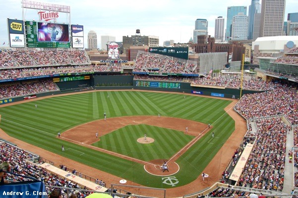
As Blzer and myself have outlined--it was my original thread, which got unfairly locked after it started a storm, that put this to the races, where as he has done all he can to make real world comparisons that truly show the need for change--just making a few changes to grass and walls and even dirt would go A LONG way to extending the realism in this game. I really hope these devs understand and care about this. It is very important that the grass be close to its real world counterpart or else the entire feeling of the stadium is destroyed in many cases. Target Field especially. I cannot reiterate enough on how shoddy the color of the grass is in game compared to real life. Seriously, look at Chase Stadium as well. It is not even funny how wrong it looks in game. Do you think we don't notice this?
And the fact is this isn't some major programming job like your guy completed with ball physics. If you don't have stadium designers who are as dedicated as that then find some new ones! This is a couple guys who gather some pics of each stadium that are reliable and go and change the colors for each stadium. A week's worth of tweaking and this is finished or near so. And it is important, too! This isn't a moving roof or stadium creator we are talking about!
For this not to be changed just kind of says, 'Oh, we care about things that only fans care about like billboards but we don't care about the general accuracy of the colors of the game'. This is absurd IMHO. I love these devs but it is time to realize when things need to move on. You guys strive for realism and yet you overlook one of the most important aspects in this drive for realism. Anyway, I am done bringing it up because it seems like I don't appreciate the game when that is not the case at all. I love the game....
Bert Blyleven's number now retired and numbered with the rest of them.
http://www.flickr.com/photos/benckph...8873/lightbox/
Harmon's number in vertical pinstripes on the water tower, Etc.
http://www.bringmethenews.com/2011/0...ors-killebrew/
And get rid of that PLAYER'S TRUST sign in left field!
The second scoreboard is an inning summary not a mini me of the big one.
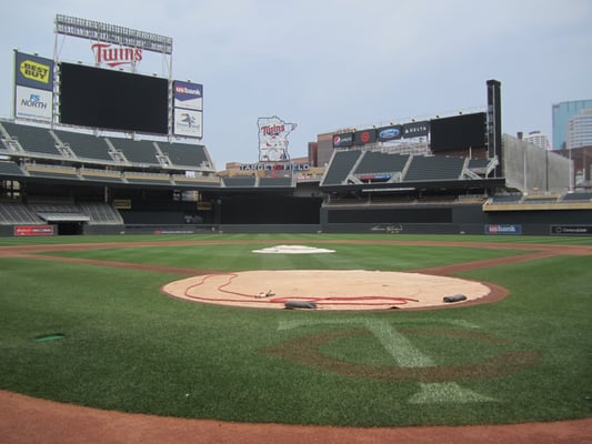
BIG ONE: the shadow is wrong-- it should cut across from first base side, not the third base side.. reason is the sun passes to the south being that we're in the northern hemisphere.
The outfield walls are a darker green
- the gate in target plaza could use more work
- flowers in the planters on the left and right field walls
- you don't really notice this in the game but the lights behind home plate in the "halo" aren't on during the game
- could add different grass cut patterns to choose from
- TC bear shooting t-shirts into the stands between innings
- fighter jet flyovers and 150' flags for opening day
- vendors walking around wear those insanely bright yellow polos, and the hot dog vendors with the red/white striped shirts and red caps.
HOTDOG vendor in striped shirt:
- strobe lights on the perimeter of the minnie and paul sign.
- are the seats in the legends deck the right color?
- smoke rising up from the state fair food stand in center field.
- some seats in right field are also wood backed.
- every game should be a sellout or near sellout.
- kestral flying around eating moths
The TC logo behind homeplate now has the C in red color.
Newer grass cut--it'd be nice if you guys just gave us a choice of 10 or so different cuts--they usually use this one:

And the fact is this isn't some major programming job like your guy completed with ball physics. If you don't have stadium designers who are as dedicated as that then find some new ones! This is a couple guys who gather some pics of each stadium that are reliable and go and change the colors for each stadium. A week's worth of tweaking and this is finished or near so. And it is important, too! This isn't a moving roof or stadium creator we are talking about!
For this not to be changed just kind of says, 'Oh, we care about things that only fans care about like billboards but we don't care about the general accuracy of the colors of the game'. This is absurd IMHO. I love these devs but it is time to realize when things need to move on. You guys strive for realism and yet you overlook one of the most important aspects in this drive for realism. Anyway, I am done bringing it up because it seems like I don't appreciate the game when that is not the case at all. I love the game....
Bert Blyleven's number now retired and numbered with the rest of them.
http://www.flickr.com/photos/benckph...8873/lightbox/
Harmon's number in vertical pinstripes on the water tower, Etc.
http://www.bringmethenews.com/2011/0...ors-killebrew/
And get rid of that PLAYER'S TRUST sign in left field!
The second scoreboard is an inning summary not a mini me of the big one.
BIG ONE: the shadow is wrong-- it should cut across from first base side, not the third base side.. reason is the sun passes to the south being that we're in the northern hemisphere.

The outfield walls are a darker green
- For saturday games the twins mascot in the home run derby... they set up a little rubber home plate in short center and TC crushes softballs into the stands ...
- After the game highlights you hear the announcer talk about light rail options but says they're beyond right field.. they're beyond left field.
- One flaw that I have noticed in the MLB: The Show's Re-Creation of Target Field is the shading during day games. In the day games at Target Field, the shade is shown over the Left Field Bleachers and behind the plate. However, during day games around 1:00 (The standard start time of most Twins day games), the only part of the stadium that is shaded is the right field side, as you'll see in this picture. This is the way it should look at the start of the day: http://4.bp.blogspot.com/_oNq6hi7d3o...dium+10036.jpg
- the gate in target plaza could use more work
- flowers in the planters on the left and right field walls
- you don't really notice this in the game but the lights behind home plate in the "halo" aren't on during the game
- could add different grass cut patterns to choose from
- TC bear shooting t-shirts into the stands between innings
- fighter jet flyovers and 150' flags for opening day
- vendors walking around wear those insanely bright yellow polos, and the hot dog vendors with the red/white striped shirts and red caps.
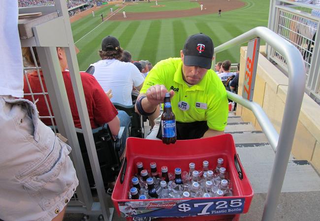
HOTDOG vendor in striped shirt:

- strobe lights on the perimeter of the minnie and paul sign.
- are the seats in the legends deck the right color?
- smoke rising up from the state fair food stand in center field.
- some seats in right field are also wood backed.
- every game should be a sellout or near sellout.
- kestral flying around eating moths
The TC logo behind homeplate now has the C in red color.
Newer grass cut--it'd be nice if you guys just gave us a choice of 10 or so different cuts--they usually use this one:


Comment