I just wanted to post a quick thread on 2 visual adjustments that need to be made for Live 17. Hopefully the team behind Live 17 are made aware of these, fairly minor but important adjustments for accuracy.
The blue is light blue, not the accurate bright deep royal blue.
This is a recent screencap of the Knicks from Live 16

And there's how the blue looks like in real life, with similar lighting
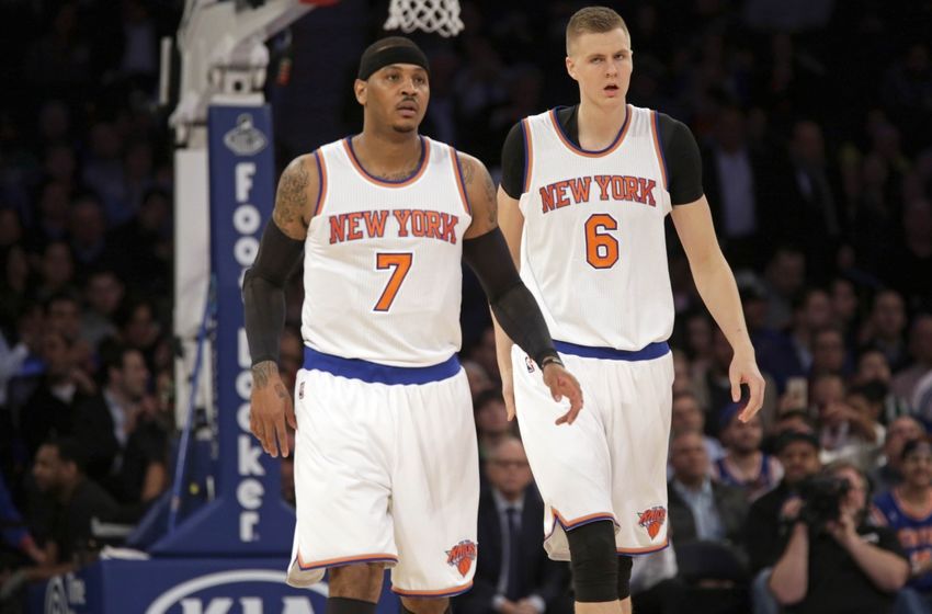
Definitely a deeper darker blue, right?
Same can be said of the Warriors jerseys, which is far more noticeable with their road jerseys
Live 16
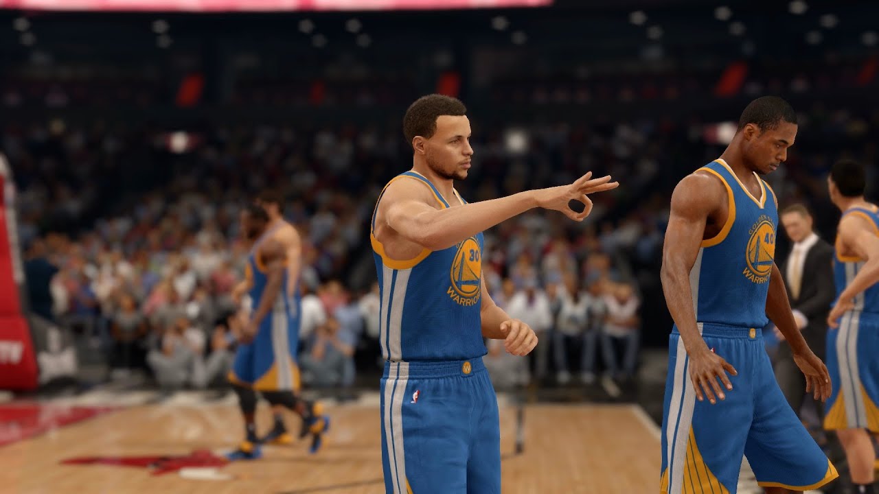 (I absolutely love the color and jersey accuracy overall in this game btw, this is an excellent example of great skin tones.)
And now a real life look at the road jersey

On top of that particular shade of blue another correction I'd like to see made, and they worked on this a bit for Live 16 is the fit of the sleeved jerseys. Imo, they are still too loose and long.
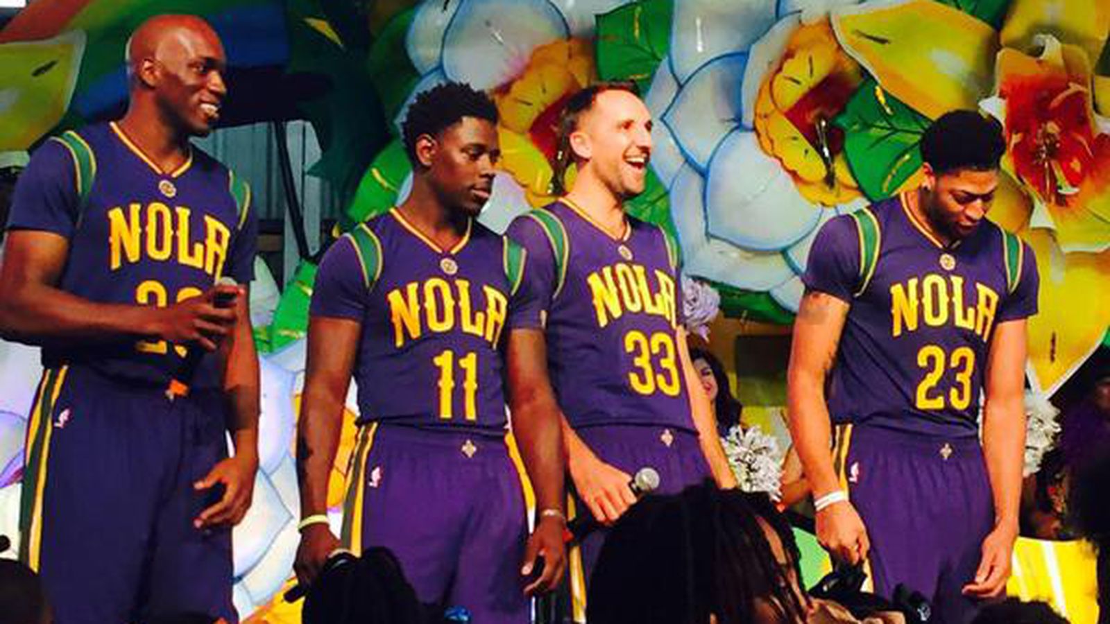
I'll go ahead and use a quick image of the Pelicans NOLA sleeved jerseys
Real life fit
Live 16 fit


Notice how much longer the actual sleeves are compared to the real life fit? Also look at how the jersey reveal so much of the players neck/back on #30 Cole for the Pelicans in that second image. The neck area is still too loose, now mind you it's better than it was on Live 15 for sure but it still needs to improve, especially given that more and more sleeved uniforms are being worn in the NBA.
So EA, and the visuals team behind Live 17 hopefully you can correct these 2 seemingly minor visual inaccuracies for the upcoming game.
The blue is light blue, not the accurate bright deep royal blue.
This is a recent screencap of the Knicks from Live 16
And there's how the blue looks like in real life, with similar lighting
Definitely a deeper darker blue, right?
Same can be said of the Warriors jerseys, which is far more noticeable with their road jerseys
Live 16
(I absolutely love the color and jersey accuracy overall in this game btw, this is an excellent example of great skin tones.)And now a real life look at the road jersey
On top of that particular shade of blue another correction I'd like to see made, and they worked on this a bit for Live 16 is the fit of the sleeved jerseys. Imo, they are still too loose and long.
I'll go ahead and use a quick image of the Pelicans NOLA sleeved jerseys
Real life fit
Live 16 fit
Notice how much longer the actual sleeves are compared to the real life fit? Also look at how the jersey reveal so much of the players neck/back on #30 Cole for the Pelicans in that second image. The neck area is still too loose, now mind you it's better than it was on Live 15 for sure but it still needs to improve, especially given that more and more sleeved uniforms are being worn in the NBA.
So EA, and the visuals team behind Live 17 hopefully you can correct these 2 seemingly minor visual inaccuracies for the upcoming game.

Comment