They are missing a follicle of hair on his head. Also, they are missing about 34,562 skin cells, and about 9,867,410 atoms from his thumb. By the way, I'm not sure they properly captured his tooth enamel, the blood vessels in his right eye, and about 2 creases on the inside of his left index finger.
If they don't fix those things, that's it for me. I can't understand why developers don't just fix stuff like this. Really, 2k!? Is it that hard to determine the exact length of his finger nails. Gimme a break!!
They are gonna get the full force of all the "nitpicks". i hope they're ready. they were barely capable of doing the current nba teams. now they have past stuff?
It's past my time and effort to nitpick so I'll have fun with whatever.
jersey cut especially around the neck is way off. basically its the same as the current stuff. but the older stuff was way more slim fitting. so they can try to make it look like rookie mj all they want, but itll never come close without a different jersey model.
Now that I see it in higher resolution he looks a little too big to be acurate to the time period in 85-86 MJ was pretty slim. Here is a pic from that very game I think it's the shoulders on the player model that is throwing it off at least from that angle. That and I agree that Mike was a little darker skinned.
LOL they should've brought you up there by now for the colors
You had just the right obsession to make it work
Hibernation mode has been in effect it seems from a few weeks after launch of these games, up until about August. The itch is there.
Btw, if that is the Boston Garden, as the half court logo suggests, why is there a lcd ribbon reflection on the court?? I'm telling you, let go of these obsessive nitpicks, because it will just kill any fun you may be wanting to have. Unless of course, it's a static banner but my eyes are telling me thats one of the upper deck lcd animated banners. Era specific art is almost impossible to accomplish without at least 50% errors.
Also during the 63 point game Michael was wearing red shoelaces instead of the black ones featured in the pic. As well as higher socks and shorter shorts (though the shorts in the pic might be the accurate length it could just be the angle it's hard to tell) Also there was no NBA logo on the jerseys at that time, but I'm pretty sure those things are editable with the probable exceptions being the shorts and NBA logo on jerseys.
.....Another thing I noticed the Bulls and number on the jersey apears to be stitched like the current Bulls jerseys when at that time all the way up to 1992 their jerseys had a more glossy ironed on look to the lettering and numbers. Notice the ironed on shiny glare appearence in these pics.
It might be the 1986 Jordan not the rookie The Arrival
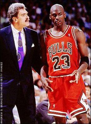
When: April 20, 1986. Game 2, 1st round playoffs vs. Celtics
but either way he should be slimmer from the body and face as well. And legs and arms need to be longer. Face needs to be more narrow. Jerseys should fit tighter and shorts should be a lil shorter.
His body is way to buff for that stage of his carreer that body looks like it should be on the 91-93 jordan not the 84-86 jordan


 08:33 PM - August 11, 2010 by Steve_OS


 .. that suggests to me, we are seeing a mj moments mode character, a true "rookie"