I also wanted to say that I wish the U.C. wouldn't have gotten rid of the Madhouse On Madison sign. Even though I'm a Pacers fan, I always like that sign.
not really. 2k is showing what you will see while playing the game. These screens are from views that dont matter.
Exactly. Yes, the stadiums do look nice, but I don't think anyone is going to be playing with a camera angle from the rafters. At least I hope not. Please stop the teasing, it's getting old now. EA you're just digging yourself a bigger hole.
not really. 2k is showing what you will see while playing the game. These screens are from views that dont matter.
I understand what your saying and I appreciate 2k for the gameplay. Presentation and little details have always really been important to the immersion to me. I guess it's a small detail in the grand scheme of things, but I appreciate the work Live put on the arenas.
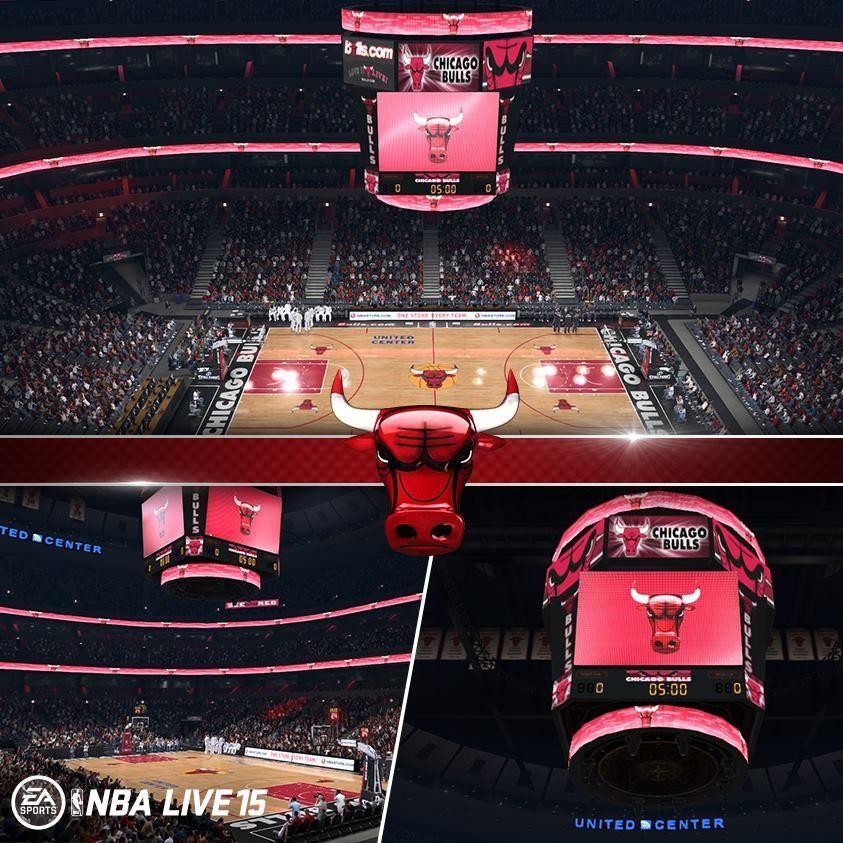
As a Bulls fan, I wish they would use the real logos, more reddish paint rather than pink, and the floor should be more yellow gold like Live 10 and not reddish like on the pic.
Few things wrong with this. First of all, if that's the Bulls in the white, then the benches are wrong.
Secondly, the Bulls would not use that logo on their scoreboard. That is strictly an ESPN logo and the Bulls wouldn't be using it on their board.
Finally, for all the praise Live gets about their colors, that red is not the Bulls' red at all. It looks pink.
Yup, like I said they had it mostly right in Live 10:
red paint, and beautiful vibrant gold wood floors, just like real life. Why change something that wasn't broken?
Quote:
Originally Posted by Jano
Live is still using ESPN this year King.
He's saying the United Center/Bulls wouldn't be using ESPN specific graphics in their jumbotrons/LED screens etc in real life so Live including them in the stadium led screens makes no sense.
Looks really nice, and I don't think any game will ever get any arena 100 perfect. 95% accurate is enough for me, and I don't have any issue with the arenas.
Spoiler
Good news: 26 arenas left, which means that only 26 days until we see the game in motion. Yay!
Agreed that the red is very pinkish. 2K has had this issue for years, sad to see Live may be guilty of it this year too. I also remember that Live 10 had the Bulls red on point.
I think it looks pink just because of a few reasons:
1:the low resolution
2:it's very far away so hard to tell the exact colour
3:the light reflection on the court makes it appear like the colour is lighter
I think it looks pink just because of a few reasons:
1:the low resolution
2:it's very far away so hard to tell the exact colour
3:the light reflection on the court makes it appear like the colour is lighter
Hopefully I'm right.
Sent from my iPhone using Tapatalk
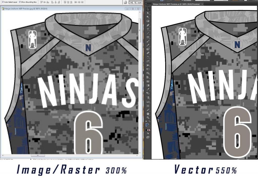
Not quite converting a red from CMYK to and RGB colour format does alter the colours appearance because of the change of formats. RGB is what you see on TV's monitors and traditional images on screen jpg png but CMYK is print format colour scheme for the toner and inks used in printers and also what vector programs use like Adobe Illustrator. Illustrator is what professional design companies and Adidas use to create the logo's and uniform designs as so when sent to factories for production there is no altered colour changes as the material swatches for clothing go by these type of pantone swatches.
Here is a comparison image below from a uniform I have designed for a team. As you can see there are noticeable differences


 05:31 PM - August 19, 2014 by Steve_OS