

Now just need confirmed for MLB The Show and loving the new Mr. Redlegs
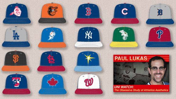
Every three or four years, all 30 MLB teams get new batting practice cap designs. The upcoming season is one of those years, so you'll soon see teams unveiling their new BP caps (which will also be worn throughout spring training, natch). But thanks to an inside source, Uni Watch is now prepared to provide you with an exclusive sneak peek at the new headwear -- 36 new caps in all, because some teams have separate designs for home and away.
The longstanding BP cap trend has been that each design cycle is worse than the previous one. But Uni Watch is happy to report that this streak has finally been broken. The new caps have no silly stretch panels and no extraneous design. So most of the new caps are better than the old ones.
There are a few new trends, however, some of which work better with certain teams than with others:
• Of the 36 new cap designs, 31 of them have contrasting brims (in other words, brim color doesn't match the crown color). Almost all of these also have contrasting squatchees (that's the little button on the top of the cap). For the most part, all of this looks fine, although it's a little weird to see the Yankees with a contrasting brim.
• Remember the 1970s trend of contrast-colored front panels? Nine of the new designs go this route. Occasionally it works really well; more often it crashes and burns.
• The industry-wide trend toward the use of gray has now begun to spread to BP caps. Not a good look.
OK, enough preliminaries. Here's a team-by-team assessment of the new designs:
Angels
<center>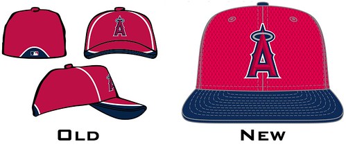 </center>
Uni Watch would rather see the Halos scrap the blue brim and go with solid red, but this is still a respectable design. Grade: B+
<hr style="width:50%;">
Astros
<center> </center>
Did you see what they did there? The circle around the logo has a tequila sunrise gradation -- genius! Grade: A+
<hr style="width:50%;">
Athletics
<center>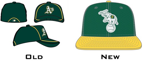 </center>
Always loved that elephant logo (if you're not familiar with the story behind it, look here), and the gold squatchee is the cherry on top. Grade: A
<hr style="width:50%;">
Blue Jays
<center>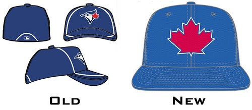 </center>
OK, we get it that they're MLB's only Canadian team. Would prefer to see the jay's head logo instead. Grade: B-
<hr style="width:50%;">
Braves
<center>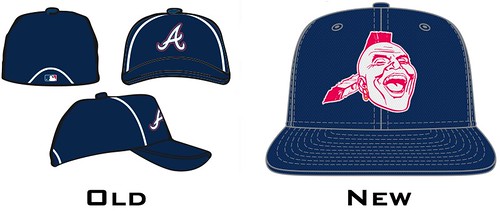 </center>
Last year the Braves conspicuously avoided using their "screaming Indian" logo as a sleeve patch on their retro alternate jersey -- a welcome move for those of us who oppose the appropriation of Native American imagery in sports. Unfortunately, it turns out that the logo hasn't been permanently mothballed. Disappointing. Grade: F
<hr style="width:50%;">
Brewers (primary)
<center>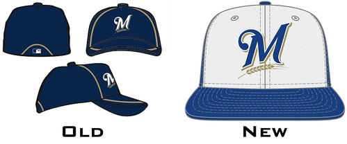 </center>
Look closely and you can see that this cap is white in the front and blue on the sides, a look that doesn't feel right for the Brewers' current design motif. Grade: C
<hr style="width:50%;">
Brewers (alternate)
<center>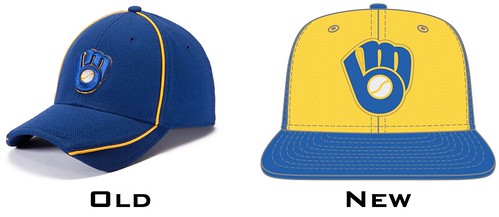 </center>
The contrast-colored front panel works just fine with this throwback logo, however. Much better. Grade: A-
<hr style="width:50%;">
Cardinals
<center>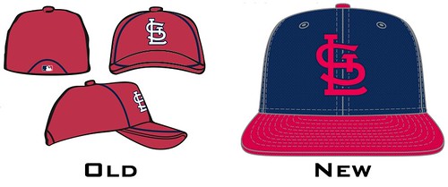 </center>
The Cardinals are going to be wearing their red caps on the road in 2013 (the navy caps are being relegated to alternate status), so it's odd that they're going with a navy BP cap. Grade: B+
<hr style="width:50%;">
Cubs
<center>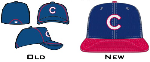 </center>
For people who still miss the old red-brimmed road cap, this design is a reasonable facsimile. Grade: B+
<hr style="width:50%;">
Diamondbacks
<center>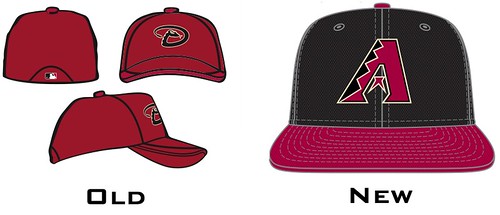 </center>
Really nice mix of the team's original logo and its current color scheme. Well done. Grade: A
<hr style="width:50%;">
Dodgers
<center>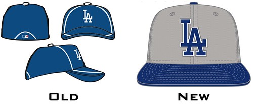 </center>
The current infatuation with gray throughout the sports world continues to confound. Is Uni Watch the only one who thinks this design looks incredibly drab? Grade: C-
<hr style="width:50%;">
Giants
<center>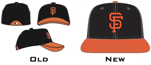 </center>
Perfectly nice design, but the only Giants BP cap design that really matters is the one that Willie Mays always wears. Grade: A
<hr style="width:50%;">
Indians
<center>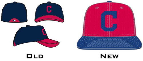 </center>
This team's chromatic identity crisis shows no signs of abating: Are they blue with red trim or red with blue trim? (Answer: Yes.) And while it's nice that they're keeping Chief Wahoo off their BP caps, the block "C" logo feels way too generic. Grade: C
<hr style="width:50%;">
Mariners
<center>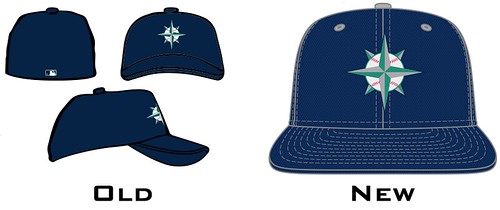 </center>
Nothing to complain about here, although a green cap would've been a more interesting route to take. Grade: B+
<hr style="width:50%;">
Marlins (home)
<center>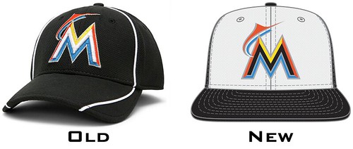 </center>
A black cap with a white front panel? Yeesh. It's a shame, too, because the Marlins are also adding a sharp-looking road BP cap. They'd have been better off using that one full-time. Grades: C (home) and A (road)
<hr style="width:50%;">
Mets
<center>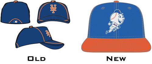 </center>
Mr. Met has appeared only one time on a Mets uni component (he was a sleeve patch for a fauxback that was worn three times in 2009), so it's cool to see him on the BP cap. One quibble, though: The cap has an orange brim, but the Mr. Met shown on the cap has a blue brim. This isn't just an inconsistency -- it's inappropriate because the original Mr. Met cartoon character always wore an orange-brimmed cap. Grade: A-
<hr style="width:50%;">
Nationals
<center>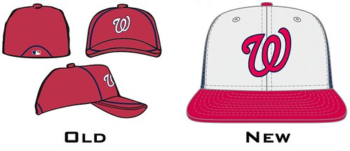 </center>
The multi-colored panel treatment totally works here, because the red-white-blue effect seems appropriate for a team in Washington. Grade: A-
<hr style="width:50%;">
Orioles
<center>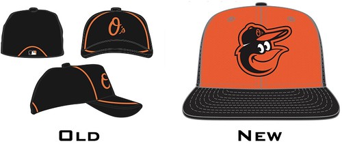 </center>
Great to see the cartoon bird ruling the roost on Baltimore's BP cap. Never liked the orange front panel, though (a look that dates back to the mid-1970s). Grade: B-
<hr style="width:50%;">
Padres
<center>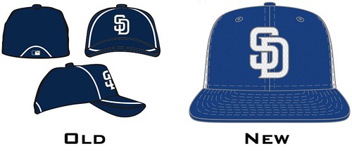 </center>
A white cap with a navy front panel? Woof! Further evidence that this franchise has completely lost its way design-wise. Grade: D
<hr style="width:50%;">
Phillies
<center>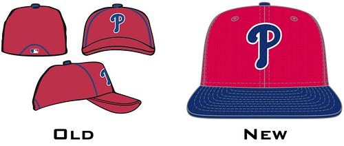 </center>
Now that's how it's done. Basically an inverse version of their alternate cap. Very nice. Grade: A
<hr style="width:50%;">
Pirates
<center>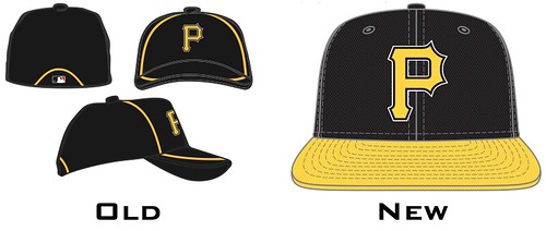 </center>
Unusual approach here: a contrasting brim but a non-contrasting squatchee. No other new BP cap fits that description. Meanwhile, is anyone else bothered by the fact that the Pirates' logo doesn't have one of those pointy serifs at the top-left corner? Makes the whole thing feel out of balance. Grade: B
<hr style="width:50%;">
Rangers
<center>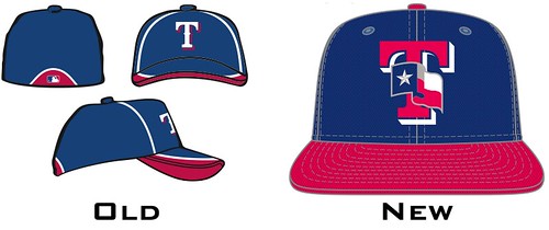 </center>
The Rangers wore this same BP cap logo, with the Texas state flag, from 2003 through 2006. Felt too busy then, still feels too busy now, and the red brim on this version adds to the overkill. Grade: C+
<hr style="width:50%;">
Rays
<center>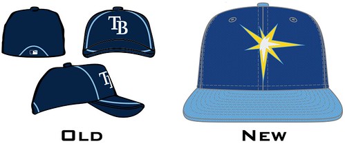 </center>
Been wondering when the Rays would start using the sunburst logo on a cap. Not a bad look. Feels sort of Friday casual, which is what a BP cap should be. Grade: A-
<hr style="width:50%;">
Red Sox
<center>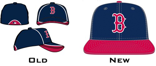 </center>
Kind of surprised they're not using the hanging Sox logo for this cap. Surprised, but not disappointed. Grade: A-
<hr style="width:50%;">
Reds (home)
<center>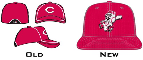 </center>
The Mets aren't the only team putting a baseball-headed mascot character on their BP cap. Everyone likes Mr. Redlegs (depicted on the cap with one upturned collar point, as per his longstanding style), but it's a shame they felt the need to add a black road version. Grades: A- (home) and C+ (road)
<hr style="width:50%;">
Rockies
<center>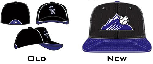 </center>
The Rockies wore this logo on their futuristic jerseys in 1999, but they've never worn it on a cap before. Does it work, or will it just look like a smudge when rendered in cloth and thread? Too soon to say, but at least it's more interesting than their generic "CR" logo. Grade: Incomplete
<hr style="width:50%;">
Royals
<center>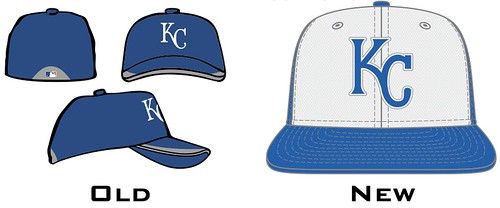 </center>
The Royals came into existence at just the right time to wear a multicolored crown, but they've never worn one -- until now. Not awful, but it feels a tad rinky-dink, especially for a franchise that needs all the gravitas it can get. Grade: B
<hr style="width:50%;">
Tigers (home)
<center>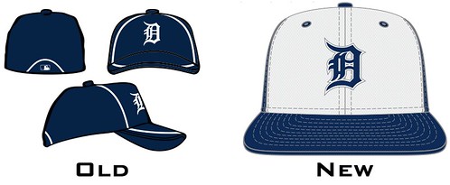 </center>
A white front panel? For the Tigers? Just the thought of Jim Leyland wearing this is embarrassing. Actually, he looked pretty embarrassing (and embarrassed) in last year's BP cap design, too. Grade: C-
<hr style="width:50%;">
Tigers (road)
<center>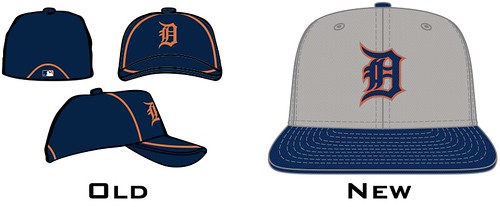 </center>
At least the crown is all one color. But gray? Snoozers. Which rhymes with "losers." Grade: C-
<hr style="width:50%;">
Twins (home)
<center>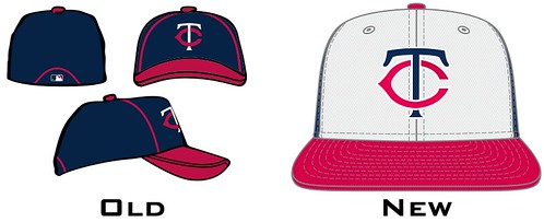 </center>
The white front panel makes sense for the Twins, because they've worn that style before as a batting helmet. They're also adding a road design, which seems like a bit much. Like, the Twins, of all teams, really need separate home and road BP caps? Grades: A (home) and B- (road)
<hr style="width:50%;">
White Sox
<center>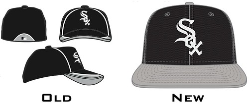 </center>
Not bad. But given how everyone else is using those white front panels, this might've been a good time for the Sox to revive this design. Grade: B+
<hr style="width:50%;">
Yankees (home)
<center>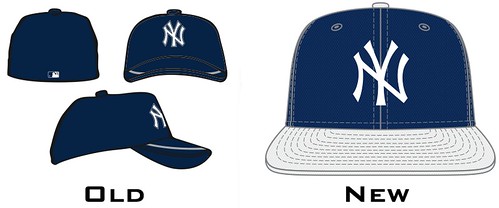 </center>
A white brim for the Bronx Bombers? Say it ain't so. Even the white squatchee feels un-Yankees-like. Grade: C-
<hr style="width:50%;">
Yankees (road)
<center>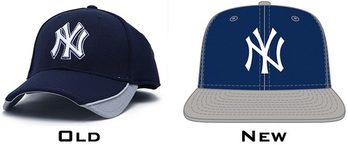 </center>
At least the gray brim and squatchee don't stand out as glaringly as their white counterparts. Still pretty bad, though. Grade: C+
And there you have it. How many days until pitchers and catchers?
The longstanding BP cap trend has been that each design cycle is worse than the previous one. But Uni Watch is happy to report that this streak has finally been broken. The new caps have no silly stretch panels and no extraneous design. So most of the new caps are better than the old ones.
There are a few new trends, however, some of which work better with certain teams than with others:
• Of the 36 new cap designs, 31 of them have contrasting brims (in other words, brim color doesn't match the crown color). Almost all of these also have contrasting squatchees (that's the little button on the top of the cap). For the most part, all of this looks fine, although it's a little weird to see the Yankees with a contrasting brim.
• Remember the 1970s trend of contrast-colored front panels? Nine of the new designs go this route. Occasionally it works really well; more often it crashes and burns.
• The industry-wide trend toward the use of gray has now begun to spread to BP caps. Not a good look.
OK, enough preliminaries. Here's a team-by-team assessment of the new designs:
Angels
<center>
</center> Uni Watch would rather see the Halos scrap the blue brim and go with solid red, but this is still a respectable design. Grade: B+
<hr style="width:50%;">
Astros
<center>
</center> Did you see what they did there? The circle around the logo has a tequila sunrise gradation -- genius! Grade: A+
<hr style="width:50%;">
Athletics
<center>
</center> Always loved that elephant logo (if you're not familiar with the story behind it, look here), and the gold squatchee is the cherry on top. Grade: A
<hr style="width:50%;">
Blue Jays
<center>
</center> OK, we get it that they're MLB's only Canadian team. Would prefer to see the jay's head logo instead. Grade: B-
<hr style="width:50%;">
Braves
<center>
</center> Last year the Braves conspicuously avoided using their "screaming Indian" logo as a sleeve patch on their retro alternate jersey -- a welcome move for those of us who oppose the appropriation of Native American imagery in sports. Unfortunately, it turns out that the logo hasn't been permanently mothballed. Disappointing. Grade: F
<hr style="width:50%;">
Brewers (primary)
<center>
</center> Look closely and you can see that this cap is white in the front and blue on the sides, a look that doesn't feel right for the Brewers' current design motif. Grade: C
<hr style="width:50%;">
Brewers (alternate)
<center>
</center> The contrast-colored front panel works just fine with this throwback logo, however. Much better. Grade: A-
<hr style="width:50%;">
Cardinals
<center>
</center> The Cardinals are going to be wearing their red caps on the road in 2013 (the navy caps are being relegated to alternate status), so it's odd that they're going with a navy BP cap. Grade: B+
<hr style="width:50%;">
Cubs
<center>
</center> For people who still miss the old red-brimmed road cap, this design is a reasonable facsimile. Grade: B+
<hr style="width:50%;">
Diamondbacks
<center>
</center> Really nice mix of the team's original logo and its current color scheme. Well done. Grade: A
<hr style="width:50%;">
Dodgers
<center>
</center> The current infatuation with gray throughout the sports world continues to confound. Is Uni Watch the only one who thinks this design looks incredibly drab? Grade: C-
<hr style="width:50%;">
Giants
<center>
</center> Perfectly nice design, but the only Giants BP cap design that really matters is the one that Willie Mays always wears. Grade: A
<hr style="width:50%;">
Indians
<center>
</center> This team's chromatic identity crisis shows no signs of abating: Are they blue with red trim or red with blue trim? (Answer: Yes.) And while it's nice that they're keeping Chief Wahoo off their BP caps, the block "C" logo feels way too generic. Grade: C
<hr style="width:50%;">
Mariners
<center>
</center> Nothing to complain about here, although a green cap would've been a more interesting route to take. Grade: B+
<hr style="width:50%;">
Marlins (home)
<center>
</center> A black cap with a white front panel? Yeesh. It's a shame, too, because the Marlins are also adding a sharp-looking road BP cap. They'd have been better off using that one full-time. Grades: C (home) and A (road)
<hr style="width:50%;">
Mets
<center>
</center> Mr. Met has appeared only one time on a Mets uni component (he was a sleeve patch for a fauxback that was worn three times in 2009), so it's cool to see him on the BP cap. One quibble, though: The cap has an orange brim, but the Mr. Met shown on the cap has a blue brim. This isn't just an inconsistency -- it's inappropriate because the original Mr. Met cartoon character always wore an orange-brimmed cap. Grade: A-
<hr style="width:50%;">
Nationals
<center>
</center> The multi-colored panel treatment totally works here, because the red-white-blue effect seems appropriate for a team in Washington. Grade: A-
<hr style="width:50%;">
Orioles
<center>
</center> Great to see the cartoon bird ruling the roost on Baltimore's BP cap. Never liked the orange front panel, though (a look that dates back to the mid-1970s). Grade: B-
<hr style="width:50%;">
Padres
<center>
</center> A white cap with a navy front panel? Woof! Further evidence that this franchise has completely lost its way design-wise. Grade: D
<hr style="width:50%;">
Phillies
<center>
</center> Now that's how it's done. Basically an inverse version of their alternate cap. Very nice. Grade: A
<hr style="width:50%;">
Pirates
<center>
</center> Unusual approach here: a contrasting brim but a non-contrasting squatchee. No other new BP cap fits that description. Meanwhile, is anyone else bothered by the fact that the Pirates' logo doesn't have one of those pointy serifs at the top-left corner? Makes the whole thing feel out of balance. Grade: B
<hr style="width:50%;">
Rangers
<center>
</center> The Rangers wore this same BP cap logo, with the Texas state flag, from 2003 through 2006. Felt too busy then, still feels too busy now, and the red brim on this version adds to the overkill. Grade: C+
<hr style="width:50%;">
Rays
<center>
</center> Been wondering when the Rays would start using the sunburst logo on a cap. Not a bad look. Feels sort of Friday casual, which is what a BP cap should be. Grade: A-
<hr style="width:50%;">
Red Sox
<center>
</center> Kind of surprised they're not using the hanging Sox logo for this cap. Surprised, but not disappointed. Grade: A-
<hr style="width:50%;">
Reds (home)
<center>
</center> The Mets aren't the only team putting a baseball-headed mascot character on their BP cap. Everyone likes Mr. Redlegs (depicted on the cap with one upturned collar point, as per his longstanding style), but it's a shame they felt the need to add a black road version. Grades: A- (home) and C+ (road)
<hr style="width:50%;">
Rockies
<center>
</center> The Rockies wore this logo on their futuristic jerseys in 1999, but they've never worn it on a cap before. Does it work, or will it just look like a smudge when rendered in cloth and thread? Too soon to say, but at least it's more interesting than their generic "CR" logo. Grade: Incomplete
<hr style="width:50%;">
Royals
<center>
</center> The Royals came into existence at just the right time to wear a multicolored crown, but they've never worn one -- until now. Not awful, but it feels a tad rinky-dink, especially for a franchise that needs all the gravitas it can get. Grade: B
<hr style="width:50%;">
Tigers (home)
<center>
</center> A white front panel? For the Tigers? Just the thought of Jim Leyland wearing this is embarrassing. Actually, he looked pretty embarrassing (and embarrassed) in last year's BP cap design, too. Grade: C-
<hr style="width:50%;">
Tigers (road)
<center>
</center> At least the crown is all one color. But gray? Snoozers. Which rhymes with "losers." Grade: C-
<hr style="width:50%;">
Twins (home)
<center>
</center> The white front panel makes sense for the Twins, because they've worn that style before as a batting helmet. They're also adding a road design, which seems like a bit much. Like, the Twins, of all teams, really need separate home and road BP caps? Grades: A (home) and B- (road)
<hr style="width:50%;">
White Sox
<center>
</center> Not bad. But given how everyone else is using those white front panels, this might've been a good time for the Sox to revive this design. Grade: B+
<hr style="width:50%;">
Yankees (home)
<center>
</center> A white brim for the Bronx Bombers? Say it ain't so. Even the white squatchee feels un-Yankees-like. Grade: C-
<hr style="width:50%;">
Yankees (road)
<center>
</center> At least the gray brim and squatchee don't stand out as glaringly as their white counterparts. Still pretty bad, though. Grade: C+
And there you have it. How many days until pitchers and catchers?


Comment