
Re: OS Uni Snob Thread
Not a fan of those mocks at all.
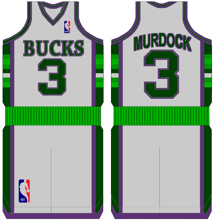
The 2nd once is nice, but it's basically their throwback. I don't like the logo, I don't like the Bucks font and I hate the alternate. The lack of purple is horrifying and I would much rather them use the throwback that they are alluding to with the alternate jersey.
The logo is just too... "New-age sleek"-y for me, I don't know how to describe it. My favorite Bucks logo is still this one.
That being said, if the logo were changed to something decent and the script/number color on the first one were changed... I'd be all for those jerseys. I still dislike the lack of purple though.

Not a fan of those mocks at all.
The 2nd once is nice, but it's basically their throwback. I don't like the logo, I don't like the Bucks font and I hate the alternate. The lack of purple is horrifying and I would much rather them use the throwback that they are alluding to with the alternate jersey.
The logo is just too... "New-age sleek"-y for me, I don't know how to describe it. My favorite Bucks logo is still this one.
That being said, if the logo were changed to something decent and the script/number color on the first one were changed... I'd be all for those jerseys. I still dislike the lack of purple though.


Comment