
-
Chicago Bulls | Chicago Bears | Chicago White Sox | Chicago Blackhawks -
Re: OS Uni Snob Thread
The Nets nailed their redesign IMO.
I'm looking forward to the Raptors redesign but I'd be lying if I said I don't miss the old purple color scheme.Originally posted by bradtxmale
Comment
-
Re: OS Uni Snob Thread
I dont mind the Nets colors (although those colors arent necessarily reflective of the borough), as the merch is pretty badass. I just think the uni design is super basic. Like the first template for jerseys ever made level of basic.Comment
-
Re: OS Uni Snob Thread
 Originally posted by BlueNGold
Comment
-
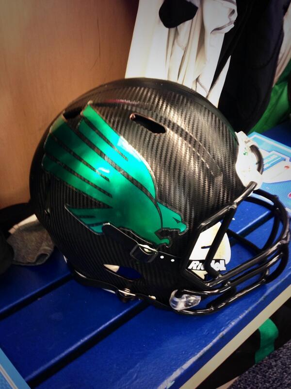
Re: OS Uni Snob Thread
Guys, there is a MASSIVE difference.
Those are owl feathers.Boston Red Sox
1903 1912 1915 1916 1918 2004 2007 2013 2018
9 4 1 8 27 6 14 45 26 34
Comment
-
Re: OS Uni Snob Thread
Too bad their execution is mostly better than Oregon's.
Sent from my HTC One using TapatalkComment
-
Re: OS Uni Snob Thread
They should just go back to this

Comment
-
Comment
-
Member of the Official OS Bills Backers Club
"Baseball is the most important thing that doesn't matter at all" - Robert B. ParkerComment
-
Re: OS Uni Snob Thread
OK. This is starting to get out of hand
 Last edited by Watson; 01-01-2014, 12:40 PM.And may thy spirit live in us, Forever LSU
@AdamdotHComment
-
Re: OS Uni Snob Thread
I like it. A lot. Originally posted by BlueNGold
Comment


Comment