
-
Member of the Official OS Bills Backers Club
"Baseball is the most important thing that doesn't matter at all" - Robert B. Parker -
Re: OS Uni Snob Thread
Another edition of "Uniforms JJ Misses":


Comment
-
Re: OS Uni Snob Thread
Those old Tampa Bay uniforms were some of the most bland uniforms around so i'm glad it's gone. Okay, I also don't miss it as much because the Rays embrace the baby/powder blue look so much. In fact the team wore these blazers last year:

How can you not like that?!
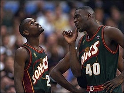
BTW here's a uniform I miss

Those old Sonics uniforms were great though the home version was a bit better. I couldn't quickly find a real good pic of them though.Member of the Official OS Bills Backers Club
"Baseball is the most important thing that doesn't matter at all" - Robert B. ParkerComment
-
Note: ryan is not a recognized member of the OSUSAAnd may thy spirit live in us, Forever LSU
@AdamdotHComment
-
Re: OS Uni Snob Thread
That Mighty Ducks logo on the sweater JJ posted is one of my least favorite logos of all time.Comment
-
Re: OS Uni Snob Thread
The old Arizona unis were awful IMO. The new look with the red is much better.Originally posted by bradtxmale
Comment
-
Re: OS Uni Snob Thread
Both teams had unique color schemes and the jersey designs were awesome. Now they both have generic color schemes that nearly match other teams (and actually IIRC the Rays blue now is the same exact shade as the Yankees).Comment
-
Re: OS Uni Snob Thread
I don't really like the Rays unis, although they are 10 steps above what they had before lol.
I do think the Diamondbacks jerseys are good though. What team do they look similar to?
Anyways, IMO this is much better than the ugly, old looking purple and teal (or whatever it was) with pinstripes:

I don't know if I really like "D-Backs" across the chest, but I like this color scheme way better than the old one.Originally posted by bradtxmale
Comment
-
I love these hats.
I took it from my iPhone, so its sideways. And may thy spirit live in us, Forever LSU
@AdamdotHComment
-
Re: OS Uni Snob Thread
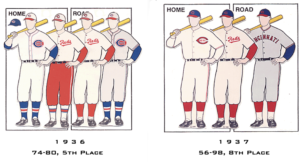
Some of my fav Reds Jersey's:
 I also like these Dodger plaids
 Last edited by Sabo's corked Bat; 04-03-2011, 05:57 PM.
Comment


Comment