
-
-
Re: Official 2016 uniform errors and omissions
I'd love to but I think that would be a slippery slope for us fans clamoring for a change or info on this topic and definitely for the person who gave it to me. It's nothing earth shattering. Just .png files of the jerseys, all 10 digits for each, and all 26 letters.
Oh...and the Mariners cream IS in this years guide and was last year too. Maybe Scea gets something different, but I can say this wasn't the case for my info. Not calling scea liars or whatever, just reported something I discovered that I'd never thought I'd get my hands on.
I'm done with anything more on the topic except for listing our errors we observe.Last edited by cherman24; 04-20-2016, 08:04 PM.Comment
-
Re: Official 2016 uniform errors and omissions
SCEA uses the style guide excuse every year when they are just not good at jersey implementation whatsoever.Comment
-
Re: Official 2016 uniform errors and omissions
mmm ok. Found this......Orioles 2012 Style Guide online video. Interesting to see it in action.
Comment
-
Comment
-
Re: Official 2016 uniform errors and omissions
I mean the style guide does not stop them from making these jerseys look like actual jerseys.. I mean MLB 2k7 had realistic staining.. sleeve length options, Jersey fit options... and the wind and movement would ripple your jersey... the only time I see jerseys move in the show is one a player raises his arms to the sky... the game is phenomenal.. but the jerseys are very, very lackluster.Comment
-
Re: Official 2016 uniform errors and omissions
Indianapolis Indians (Pirates AAA).
The home white uniform is perfect.
The road greys do not have names on the back in real life, but do in game.University of Louisville '18
University of Tennessee '22
Naptown born and raised.
Colts, Pacers, White Sox, Blackhawks, Cards, VolsComment
-
Re: Official 2016 uniform errors and omissions
So I have had this gripe for some time. But for some reason the Mariners alternate teal jerseys simply do not look 'teal'. More an off-green type color which I cannot even place. Which it has been this way since I started playing MLB 11 The Show.
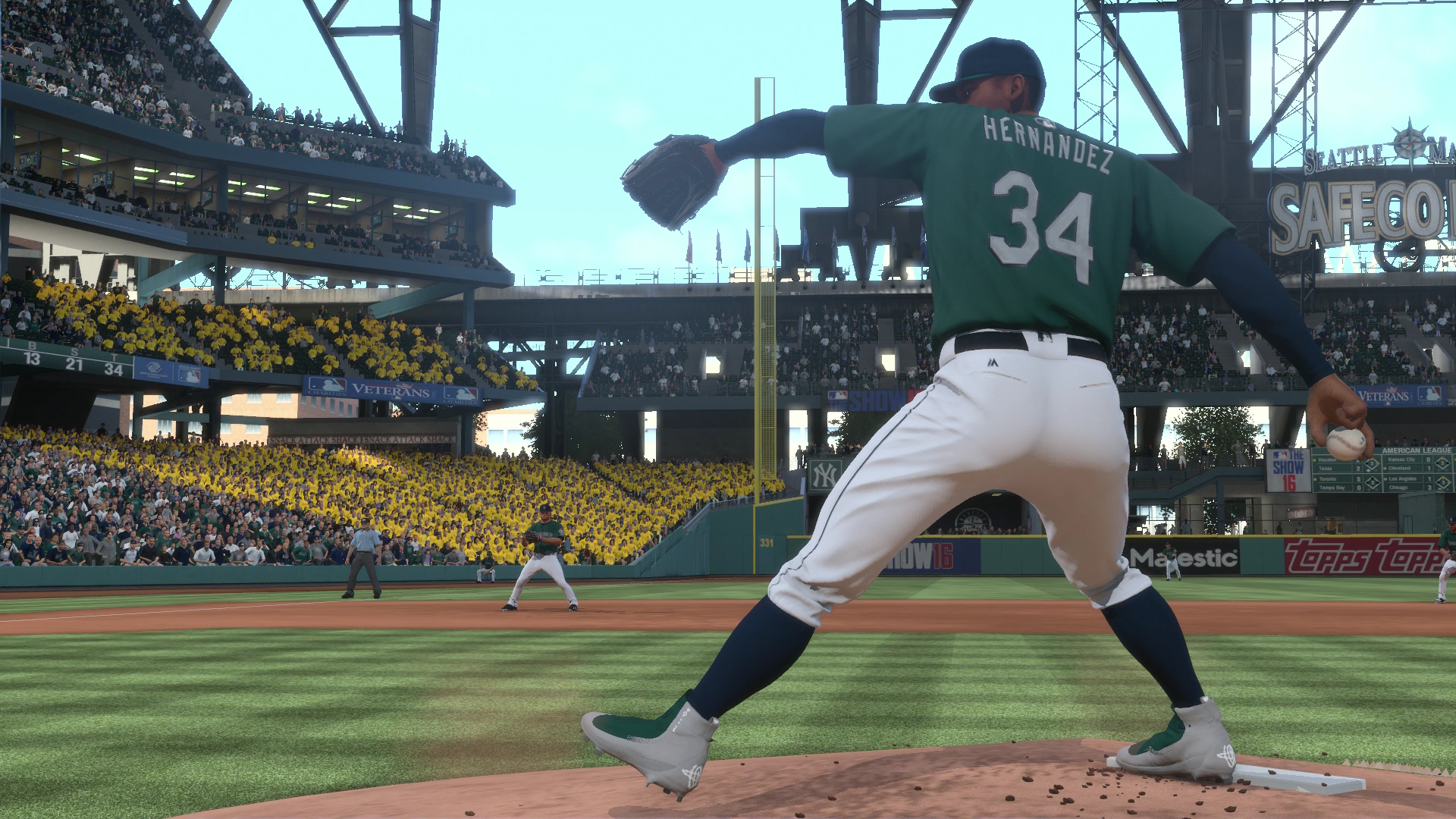
I remember it took them quite a while to get the correct color 'blue' for the Blue Jays. Anyway I'm okay with the Sunday blue Mariners jerseys missing. But I was hoping this year they finally got the teal correct. Either I'm color blind for noticing the difference. I can't be the only one that thinks it looks green in the game. Definitely not teal though.
Color-wise I noticed other discrepancies as well. Like the Pirates black jerseys. Which is way too bright I feel. It's not my TV-settings btw. I checked.
I'm hoping someone from SCEA is aware of this. So it can be addressed for next years game. This game is amazing. I still play my Mariners franchise and enjoying it a lot. Just trying to give some feedback for making this game even better.
 PBR is a great addition. Maybe look into making colors even more pop for future versions. I'm sorry if this post got way too lengthy btw.
Last edited by Longoria333; 05-03-2016, 07:06 PM.
PBR is a great addition. Maybe look into making colors even more pop for future versions. I'm sorry if this post got way too lengthy btw.
Last edited by Longoria333; 05-03-2016, 07:06 PM.Comment
-
Re: Official 2016 uniform errors and omissions
The Mariners shade, like a lot of color shading in game, is off to me. Same with grass, some field infrastructure, and many jerseys. Some things seem too pale, too dark, too light, et cetera. I'm hoping lighting and colors get a look for 17 as well uniform accuracy gets even better. They are doing pretty well so far.Comment
-
Re: Official 2016 uniform errors and omissions
Does any know if they corrected the batting helmets the Brewers wear with their navy "Ball in Glove" alternates? Last I checked it was still the M when it should be the Ball in Glove logo.Comment
-
Re: Official 2016 uniform errors and omissions
They added matte helmets for the Rockies, Dodgers, and Giants in the last patch so that's not an accurate statement.
But to the question they have not corrected them. It's possible they fix them in the next patch though. I did notice that they fixed the "Get up, Get Outta Here, Gone" signs in the patch though. They were much too dull upon release. You now notice them more as they light upComment


Comment