Official 2016 uniform errors and omissions

Collapse

Recommended Videos

Collapse
X
 
  • Time
  • Show
Clear All
new posts
  • SFNiners816
    Pro
    • Aug 2008
    • 613

    #61
    Re: Official 2016 uniform errors and omissions

    Originally posted by PredatorKingdom
    I loved those uniforms and the Cubbies looked real good in them back in the 80s when they wore them with white pants on the road. Back then you weren't exclusive to wearing gray pants like teams are now. Although this jersey would look sweet like their current alts with the road gray pants. Their current blue alts seem like their primary road jersey since they started using them in 1998 as I see them wearing those jerseys more than the grays.

    I actually wanted the Cubs to adopt a second colored alternate jersey and make it a dark blue one or the same shade as their 80s one or adopt baby blue like their road uniforms back in the 70s with the pinstripes. I remembered when the new blue ones first came in 1998 I saw in EA's Triple Play Baseball 1999 I believe that year that the color was dark blue and it looked cool with the white pants so I've always wanted to see them come out with that version ever since.

    I was disappointed when they came out with that stupid gray alternate a couple of years ago and they barely wore those and I heard they might've gotten rid of them this season but not real sure just yet.

    Cubs should bring back a new version of those 80s blue road jerseys. They could make a lot of money off of those.
    I just want the 80s angry bear patch back on the sleeve. I think switching from the walking bear logo to the 80s angry bear would be a great nod to the 84 & 89 teams.

    In game, I wore the red billed BP hat with the 80s road uni and the now grey pants with the red stripe and it looked really nice. The red really popped. I'm in year 2019, so this is my pseudo way to have "new" unis.
    Last edited by SFNiners816; 03-31-2016, 12:59 AM.

    Comment

    • jeffmanqb3
      Rookie
      • Mar 2008
      • 325

      #62
      Re: Official 2016 uniform errors and omissions

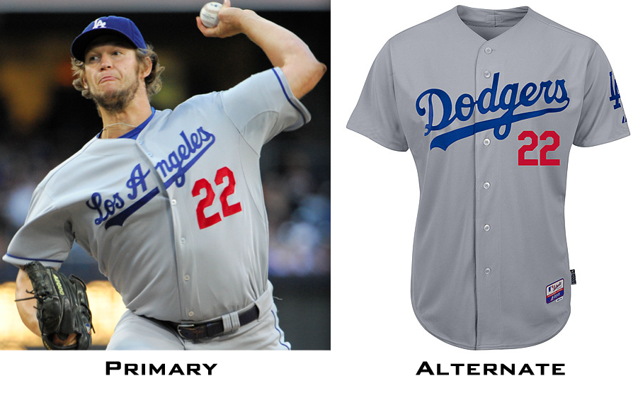
      The Dodgers road alternate jersey should not have the piping on the sleeves like the primary road jerseys do.

      Comment

      • dran1984
        MVP
        • Mar 2011
        • 1221

        #63
        Re: Official 2016 uniform errors and omissions

        Originally posted by PredatorKingdom
        It's funny how the crowd wears the jerseys that aren't in the game like I play with the Brewers and was hoping to see the beer colored gold jerseys but they didn't have them but a majority of the crowd was wearing the jerseys. So for now I have worn the baby blue batting practice jerseys as my second alternates behind the navy blue jerseys.


        I agree bro plus it gives some teams that don't have alternates a chance to use those during the regular season.
        Another thing I noticed yesterday was that the jerseys that the crowd wears, have the front numbers in the right place. They use the template system for all the players so every teams front jersey number is a bit too low.

        Comment

        • TripleCrown9
          Keep the Faith
          • May 2010
          • 23674

          #64
          Re: Official 2016 uniform errors and omissions

          There's also jerseys in the stands of teams not playing.

          Sox-Orioles at Fenway, and there's a few Padres jerseys sprinkled in the crowd.
          Boston Red Sox
          1903 1912 1915 1916 1918 2004 2007 2013 2018
          9 4 1 8 27 6 14 45 26 34

          Comment

          • Neil33
            Rookie
            • Apr 2004
            • 92

            #65
            Re: Official 2016 uniform errors and omissions

            Originally posted by 41_Tom_Seaver_Fan
            An in-game uniform editor would solve ALL of this. It exists for Diamond Dynasty...if they would only allow us to use it for our own private use.

            I also wish sometimes people wouldn't complain, as I LOVE;
            *Marlins teal helmet
            *Rockies purple under black with white arm hole-loops (the black-under black of this is just stupid...at least the purple gives the most ridiculous uniform ever some personality...and with purple it actually looks kind of good)
            *Devil Rays green undershirts are awesome; again, gives personality

            ...and pray severely that they do not change these at all!
            Been a season ticket holder from their beginning and the Rockies have never had purple sleeves under their black vest jersey.

            Comment

            • Jimbo Slice
              Rookie
              • Mar 2012
              • 70

              #66
              Re: Official 2016 uniform errors and omissions

              Originally posted by Neil33
              Been a season ticket holder from their beginning and the Rockies have never had purple sleeves under their black vest jersey.
              Interesting...

              Comment

              • Powerplay17
                Banned
                • Mar 2014
                • 29

                #67
                Re: Official 2016 uniform errors and omissions

                Rays traditional catcher gear in the Columbia blue as the default and no way to correct to the dark blue. Yuk.

                Comment

                • RizzobiOne
                  Rookie
                  • Mar 2016
                  • 29

                  #68
                  Re: Official 2016 uniform errors and omissions

                  Seattle Mariners missing their Sunday Alternate Cream jerseys and hat.
                  MLB - Cubs, Mariners
                  NHL - Blackhawks
                  NFL - Seahawks
                  NBA - Warriors

                  Comment

                  • mbergh22
                    MVP
                    • Mar 2007
                    • 1380

                    #69
                    Re: Official 2016 uniform errors and omissions

                    Originally posted by Jimbo Slice
                    Interesting...
                    Ohh burn

                    Sent from my SM-T810 using Tapatalk

                    Comment

                    • Efbomb
                      Rookie
                      • Oct 2013
                      • 171

                      #70
                      Re: Official 2016 uniform errors and omissions

                      Not sure if this has been mentioned or not because I really don't want to scan through 9 pages to find out but...

                      The Mets' 1986 throwback jerseys are a bit off. The orange and blue stripe is so thin in the game. It's crammed into one pinstripe space, whereas on the real jerseys, it spans three pinstripe spaces.

                      It's because it's so huge and gaudy is what made them awesome. I never use them in this game because they just don't stand out and don't look realistic.

                      Also, and this has been mentioned, the jackets are the wrong color. They haven't worn black in years (thank god).

                      Comment

                      • Pelli16
                        Just started!
                        • Mar 2016
                        • 4

                        #71
                        Re: Official 2016 uniform errors and omissions

                        Pirates black alternates are dark gray instead of black. Also, their throwbacks and Sunday alternates should be block lettering, not the home/away/black alt font. Additionally, their camo jerseys aren't in the game.

                        Comment

                        • johnnyg83
                          MVP
                          • Jul 2002
                          • 1060

                          #72
                          Re: Official 2016 uniform errors and omissions

                          White Sox early 70s light blues should have white trim around the numbers. 1983 jerseys are pullovers, not button up and they had the number on the upper thigh of the pants.

                          Comment

                          • TripleCrown9
                            Keep the Faith
                            • May 2010
                            • 23674

                            #73
                            Re: Official 2016 uniform errors and omissions

                            Originally posted by Pelli16
                            Pirates black alternates are dark gray instead of black. Also, their throwbacks and Sunday alternates should be block lettering, not the home/away/black alt font. Additionally, their camo jerseys aren't in the game.
                            Every team except San Diego aren't wearing camo jerseys this year.

                            Originally posted by johnnyg83
                            White Sox early 70s light blues should have white trim around the numbers. 1983 jerseys are pullovers, not button up and they had the number on the upper thigh of the pants.
                            There are no pullovers in the game. They only use a button template.
                            Boston Red Sox
                            1903 1912 1915 1916 1918 2004 2007 2013 2018
                            9 4 1 8 27 6 14 45 26 34

                            Comment

                            • cherman24
                              Pro
                              • Mar 2008
                              • 565

                              #74
                              Re: Official 2016 uniform errors and omissions

                              Just a quick reminder...I check and update this thread regularly. You don't have to sift through all the pages. Check the first post and if there's an omission or error, pm me or add to the thread (unlike whoever didn't take credit for the free preorder code I posted). I will update the master post. I'm a jersey nerd. I will gladly talk uniforms and such whenever you want. I don't want this to be clogged up with stuff like "I can't believe the Mariners don't have a Sunday jersey." Personally I can't either, but I can only list this as an omission rather than they look better than the teal ones or they should take the place of the pilots.

                              Thanks again for the contributions. Maybe it can help scea get more freedom or corrections or the mlb can loosen up a bit. Maybe it won't, but neither property can say they didn't hear it from us, the fans/consumers.

                              Comment

                              • philmnn
                                Rookie
                                • Mar 2011
                                • 93

                                #75
                                Re: Official 2016 uniform errors and omissions

                                This is more of a question than an error/omission, but does anyone know if there are any players in the league who wear matte helmets when the team does not?

                                Currently watching the O's game and saw Adam Jones wearing a matte helmet so I was going to make an error post, but he seems to be the only one on the team wearing it. I assumed it was an all or nothing for teams.

                                Comment

                                Working...