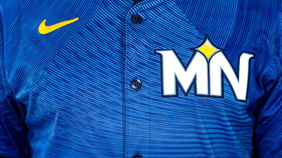
I like that they went with black undershirt and sleeves for the Giants' City Connects. Some guys wore orange last night, other guys wore purple. Black works for everyone and doesn't look out of place in general.
Official 2025 Uniform Errors and Omissions:
Collapse
Recommended Videos
Collapse
X
-
Re: Official 2025 Uniform Errors and Omissions:
I like that they went with black undershirt and sleeves for the Giants' City Connects. Some guys wore orange last night, other guys wore purple. Black works for everyone and doesn't look out of place in general.
The orange and white was a very clean combo, I just didn't like the orange-to-white gradient on the logo and numbers.Originally posted by bronxbombers21325
If they don't have things set up to model 3D logos across a helmet that's understandable (it's such a specific case), but how bad could a flat bridge really look there? I think it'd be fine.Originally posted by TripleCrown -
Re: Official 2025 Uniform Errors and Omissions:
It would blend in with the main logo, that’s the issue.Originally posted by SmashManI like that they went with black undershirt and sleeves for the Giants' City Connects. Some guys wore orange last night, other guys wore purple. Black works for everyone and doesn't look out of place in general.
The orange and white was a very clean combo, I just didn't like the orange-to-white gradient on the logo and numbers.
If they don't have things set up to model 3D logos across a helmet that's understandable (it's such a specific case), but how bad could a flat bridge really look there? I think it'd be fine.Comment
-
Re: Official 2025 Uniform Errors and Omissions:
I agree as it’s definitely a nice option to have, but yeah—it kind of sucks that certain Stance socks are locked to specific pant colors. It’d be way better if every sock design were available as an option for every pant variation (home pinstripes, plain whites, plain grays, etc.), just like how some teams—like the Cardinals or Blue Jays—have alternate caps that can be paired with their standard unis.Originally posted by MiracleMet718It seems like where teams use multiple stance socks and the pants are the same for two different uniforms, they are making both different so you can mix and match since there isn’t an option to make it player dependent. I don’t mind that as a solution for now.
The reason I say this is because with teams like the Braves, their plain navy Stance socks are only available with gray pants, so we can’t wear them with their home unis. Or teams like the Padres, where their plain brown Stance socks only come with the plain white pants or plain sand pantsComment
-
Re: Official 2025 Uniform Errors and Omissions:
to my knowledge, yes. this cap and the corresponding jersey from last year were both dropped for the return of the red altsComment
-
Re: Official 2025 Uniform Errors and Omissions:
My thinking was that they could, for lack of a better description, have the NY logo and bridge as one PNG just slapped on the helmet.Originally posted by MiracleMet718It would blend in with the main logo, that’s the issue.
I’m sure there’s more to it but in my head it makes sense.
Comment
-
Re: Official 2025 Uniform Errors and Omissions:
I know but I’m saying they are the same color so it would all blend together and look weird. I was a fan of the 2D method until I thought about it and realized it would be all jacked up.Originally posted by SmashManMy thinking was that they could, for lack of a better description, have the NY logo and bridge as one PNG just slapped on the helmet.
I’m sure there’s more to it but in my head it makes sense.
Comment
-
Re: Official 2025 Uniform Errors and Omissions:
Wish they’d tie team color 3 to the pants and not the tops you pick. Can’t really do grey shoes etc with the grey they have as it’s too dark.Comment
-
Re: Official 2025 Uniform Errors and Omissions:
I hope they keep it as is and make it 2000 just because that alt home/road cap from 98 never really matched that uniform and the alt 2000 cap is so much better and what they wore for every other year other than 98.Originally posted by Rays39For this Mets error:
“ERROR: Alt Home 1998 cap/helmet should be the Home 1998 ones.”
They could also just rename the uniform “Alt Home 2000.” In order to keep the cap and jersey paired.
I’d also like to see the “ice cream man” uniforms added from 97 (without the black outline) as well as the 2015 home and road alts. Then I think the Mets uniforms would be complete for me.Comment
-
Re: Official 2025 Uniform Errors and Omissions:
I wish they’d just give us the option to select socks when we pick uniforms pre game.Comment
-
Re: Official 2025 Uniform Errors and Omissions:
Nationals city connect batting helmet needs a 3D logo.Comment
-
Re: Official 2025 Uniform Errors and Omissions:
Nice to see they fixed the numbers on the 1980 Mariners uniforms. Hope they do the same for the 1978 Padres unis. And add the halo to the 1961 Angels batting helmets to match the caps.Comment
-
Re: Official 2025 Uniform Errors and Omissions:
Number fonts on helmets are correct now. Cubs even have the Red Sox font like they do in real life. It's a little touch I just happened to notice.Comment
-
Re: Official 2025 Uniform Errors and Omissions:
News Rockies City Connect
https://news.sportslogos.net/2025/04...orms/baseball/
It sounds like designers realized dark pants is not the way to go in most cases.
Love those BTW….Comment


Comment