Uniforms Need to be Overhauled
Collapse
Recommended Videos
Collapse
X
-
-
Re: Uniforms Need to be Overhauled
Style Guide doesn't govern belts.Can you confirm that the Angels belts are still black in the style guide? I emailed the team a couple weeks ago about updating the belts to red in the style guide, but never got a response. Since apparently socks and undergarments aren't, are belts actually governed by the style guide?
Only hats, jerseys and pants.
Here's the original post:
Every year there are discussions about incorrect uniforms and style guide restrictions. The rockies with purple sleeves, this year the indians red sleeves and socks for their home and home alt uniforms. Well i contacted indians fan services asking if they could update their style guide so that the indians uniform would be correct in '17. Below is a copy of the email i received back from indians fan services. The styoe guide only pertains to the hats, jerseys and pants. Undershirts and socks are governed by the style guide. So hapefully now uniforms can be updated and corrected.
Good afternoon Colin,*
Thank you for your email. I assure you, we take every email and phone call seriously and try our best to assist with every fan request. The style guide you reference is sanctioned by MLB, and only effects the jersey, pants and hat. It does not reflect any change made of under dressings, including shirts and socks. I am not sure of the problem you reference in the video game, but will be happy to look into it further. Ultimately, there are a number of color combinations that are permitted by MLB and those are set to the discretion of the player at the time of the game.*
Thank you again,*
Craig
Fan Services
So it's up to the Show team to correct it on their own.NFL : Atlanta Falcons
MLB : Toronto Blue Jays
Comment
-
Comment
-
Re: Uniforms Need to be Overhauled
I also highly doubt the style guide governs placement of numbers and such, as then there would be no way some of them in the Show could be so wrong.Honest question and not trying to come off condescending. Are front numbers, and their placement on the the jersey governed by the style guide as well? So many of them are too large, and not even close to where they actually are located in real life. The most obvious example is the Milwaukee Brewers.
Sent from my iPhone using Operation Sports
That comes down to the one template they use for all jerseys.
Ultimately, they just need to get rid of the template and create all jerseys individually, but that would probably take too long, so a realistic option would be to have 4 or 5 jersey templates to use.
Or they could just move the front numbers up on the default template right now for all teams like they did with the numbers on the back last year.NFL : Atlanta Falcons
MLB : Toronto Blue Jays
Comment
-
Re: Uniforms Need to be Overhauled
Can someone pull up a shot of retro mode in 2017 with the Red Sox in the field (clear skies day game). That way we can directly compare it to the latest picture from the retro mode trailer.
I don’t believe they’ll look the same (and as everyone as expressed appreciation for the tweaking of the colors), but if they do then at least we have a direct comparison to snow that.
This should clear the lighting debate.Last edited by bp4baseball; 02-22-2018, 04:49 PM."Life is like baseball, it's the number of times you arrive home safely that counts"Comment
-
Re: Uniforms Need to be Overhauled
We've no idea what is in the contract and what specifically SCEA is bound to. Working in finance, I've learned that companies don't take too kindly (i.e. expect retribution) for any deviation from contractual requirements, regardless of whether it's logical to do so.Originally posted by Gibson88Anyone who asked for an ETA is not being Master of their Domain.
It's hard though...especially when I got my neighbor playing their franchise across the street...maybe I will occupy myself with Glamore Magazine.Comment
-
Re: Uniforms Need to be Overhauled
I'm speaking in theory here, as we obviously can't say anything for sure, but...
If the Show is contractually obligated to follow the style guide (as they've said thousands of times),
And this email response is accurate, and the style guide only governs jerseys, pants and hats,
Then the Show is only responsible for following directions on jerseys, pants and hats.
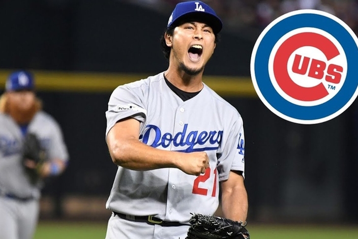
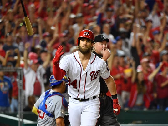
Not undershirts, socks, or belts. Which also makes sense in real life, as i've seen plenty of players wear black undershirts like Yu Darvish, or no undershirts like Bryce Harper, so it'd make sense that undershirts aren't governed by the style guide.
Spoiler
Socks are probably governed by stance, and it looks SCEA has to follow that now since we saw Adam Eaton's socks in that one video.
And for belts, i now realized that belts could potentially be considered part of the pants, so if that was the case, it could still be governed by the style guide. But again, obviously we don't know anything for sure.NFL : Atlanta Falcons
MLB : Toronto Blue Jays
Comment
-
Re: Uniforms Need to be Overhauled
It was hard trying to get the exact lighting used in the trailer, but here are my results. The difference when the players aren't in shadows do make a big difference clearly.Can someone pull up a shot of retro mode in 2017 with the Red Sox in the field (clear skies day game). That way we can directly compare it to the latest picture from the retro mode trailer.
I don’t believe they’ll look the same (and as everyone as expressed appreciation for the tweaking of the colors), but if they do then fair enough.
This should clear the lighting debate because I think it’s being used as a cop out right now and shouldn’t be.
MLB 17:


MLB 18:

The shadow coverage is different, but that's the best i could do.
The grass and dirt colours look a lot better evidently.NFL : Atlanta Falcons
MLB : Toronto Blue Jays
Comment
-
Re: Uniforms Need to be Overhauled
It was hard trying to get the exact lighting used in the trailer, but here are my results. The difference when the players aren't in shadows do make a big difference clearly.
SpoilerMLB 17:


MLB 18:

The shadow coverage is different, but that's the best i could do.
The grass and dirt colours look a lot better evidently.
Wow, great post. There really isn't much of a difference in the red jerseys that I can see. It is a little better now, but not by as much as what I would've thought. I think what's happening is that in the 17 shots, the grass and dirt look so light and washed out that the jerseys look dark in comparison. In the 18 shot, the grass is a darker, greener shade, so the red jersey in comparison looks a lot brighter.
I hadn't realized how much better the grass looks now until I saw this. I think this will go a long way toward making colors look better in the game. It's not gonna fix everything color-wise, but it'll do more than we probably would've thought.Comment
-
Re: Uniforms Need to be Overhauled
Great comparison. Thanks Factzzz.
Woodweavee, you’ve been very kind with all the posts recently, here’s another if you have time to answer:
In years past we’ve seen a lot of detail on the work that goes into the lighting system. It’s very impressive and takes into account all the surfaces. I assume it’s trying to model real life lighting, but has any thought gone into that technically it seems the game is trying to replicate a telecast which is viewed through a camera lense? I don’t know how our eyes depict lighting versus a camera, so maybe modeling one is the same as modeling the other, but just curious if the team has ever explored the possible differences.
Thanks."Life is like baseball, it's the number of times you arrive home safely that counts"Comment
-
Re: Uniforms Need to be Overhauled
That just sent a chill down my spine. I hope that doesn’t mean that red is only fixed on the Pro. It better be fixed for regular PS4, too.Originally posted by Jon ArbuckleThe grass and Royals unis in that last shot look very much like what I've been seeing since upgrading to the Pro and a HDR 4KTV recently. They've been capturing the recent streams/previews on the Pro (using high frame rate) so that could be why you're seeing the improvement. By contrast, Ramone repeatedly emphasized during last year's streams that everything was running on a regular PS4.#LFC
#ChiefsKingdom
#STLCards
#WeAreNDComment
-
Re: Uniforms Need to be Overhauled
I’m starting to get the feeling that the red has always looked right on the Pro Using HDR. I remember it looking correct when I played on on hdr 4k tv. Basically those bright colors can’t look the same color on both settings. Just my theory.
Sent from my iPhone using Operation SportsComment
-
Re: Uniforms Need to be Overhauled
Numbers on the Giants home unis have always been too small also compared to the real unis.Comment
-
Re: Uniforms Need to be Overhauled
You won't be able to see HDR settings on a non-HDR stream or display. What we see on these Twitch streams are non HDR feeds.I’m starting to get the feeling that the red has always looked right on the Pro Using HDR. I remember it looking correct when I played on on hdr 4k tv. Basically those bright colors can’t look the same color on both settings. Just my theory.
Sent from my iPhone using Operation Sports
Sent from Tatooine using TapatalkⓋ Boston Red Sox | Miami DolphinsComment


Comment