Uniforms Need to be Overhauled

Collapse

Recommended Videos

Collapse
X
 
  • Time
  • Show
Clear All
new posts
  • MLB14
    Pro
    • May 2014
    • 636

    #601
    Re: Uniforms Need to be Overhauled

    Originally posted by Jon Arbuckle
    That really should be fixed this year if the developers spend any time on here. The edited photos you posted last year put the game's evening skies to shame.
    It's probably controlled by an array of hex color codes or RGBA colors. It wouldn't take much to correct it.
    Do it. (Release The Show for PC)

    Comment

    • PPerfect_CJ
      MVP
      • Oct 2011
      • 3693

      #602
      Re: Uniforms Need to be Overhauled

      Phillies batting helmets are now red, too. 👏🏻
      Attached Files
      #LFC
      #ChiefsKingdom
      #STLCards
      #WeAreND

      Comment

      • PPerfect_CJ
        MVP
        • Oct 2011
        • 3693

        #603
        Re: Uniforms Need to be Overhauled

        Looks like the NY on the Yankees batting helmets is still not fixed. Side view, but looks too big, again.
        Attached Files
        #LFC
        #ChiefsKingdom
        #STLCards
        #WeAreND

        Comment

        • The Kid 24
          It's Show Time!
          • Jan 2007
          • 14766

          #604
          Re: Uniforms Need to be Overhauled

          I saw Realmuto in generic catchers equipment.

          But I'm thinking if Nike catchers equipment was added to the game, they wouldnt show off in the trailer.
          Milwaukee Brewers | Green Bay Packers | North Carolina Tar Heels | Wisconsin Badgers

          Comment

          • kingmason13
            Rookie
            • Mar 2013
            • 270

            #605
            Re: Uniforms Need to be Overhauled

            IMG_8681.jpg numbers have to be thinner and bigger


            Sent from my iPhone using Operation Sports

            Comment

            • tnixen
              MVP
              • Oct 2011
              • 3184

              #606
              Re: Uniforms Need to be Overhauled

              Originally posted by kingmason13
              [ATTACH]161132[/ATTACH] numbers have to be thinner and bigger


              Sent from my iPhone using Operation Sports
              Yep this is an issue I think for all the teams jerseys.

              In MLB The Show 18 they finally made the numbers on the back higher. In MLB The Show 19 it looks like they made the numbers on the front higher. So hopefully in MLB The Show 20 they make the back numbers thinner and bigger. And last I think some teams logos on the Hats need to be fixed.

              Were getting there

              Comment

              • sva91
                MVP
                • Feb 2005
                • 2019

                #607
                Re: Uniforms Need to be Overhauled

                Originally posted by baxtercherry
                You know, 2K really took this to the next level when they actually scanned in the jerseys. With MLB going Nike next year, I wonder if we can expect the same from SDS?


                Sent from my iPhone using Operation Sports


                That was a gimmick. Any decent graphic designer can make any video game uniform look perfect. People do it for free for PES. MLB 18 took a step forward with colors, but still a lot of mistakes w retros and font/number sizes.


                Sent from my iPhone using Operation Sports

                Comment

                • TripleCrown9
                  Keep the Faith
                  • May 2010
                  • 23705

                  #608
                  Re: Uniforms Need to be Overhauled

                  Looks like they expanded the Stance socks. There were two different pairs for the Padres, and new socks for the Brewers.
                  Boston Red Sox
                  1903 1912 1915 1916 1918 2004 2007 2013 2018
                  9 4 1 8 27 6 14 45 26 34

                  Comment

                  • KingOfLanglade
                    Pro
                    • Feb 2018
                    • 706

                    #609
                    Re: Uniforms Need to be Overhauled

                    Originally posted by sva91
                    That was a gimmick. Any decent graphic designer can make any video game uniform look perfect. People do it for free for PES. MLB 18 took a step forward with colors, but still a lot of mistakes w retros and font/number sizes.


                    Sent from my iPhone using Operation Sports


                    Can you show me where it was a gimmick? They had a whole partnered segment with Nike explaining the technology of scanning them into the game.


                    Sent from my iPhone using Operation Sports

                    Comment

                    • breakfastcat
                      MVP
                      • Jan 2013
                      • 1018

                      #610
                      Re: Uniforms Need to be Overhauled

                      I've been scouring the new trailer for new uniform related improvements but unfortunately for the most part it looks like its pretty much the same as last year apart from the few things we've already noticed. One thing I wanted to point out though is that the Pirates' black and yellow really pop in this Cutch pic. Much more than I've seen in the game in the past.

                      Comment

                      • Bartolo Colon
                        MVP
                        • Mar 2015
                        • 1234

                        #611
                        Re: Uniforms Need to be Overhauled

                        Originally posted by breakfastcat
                        I've been scouring the new trailer for new uniform related improvements but unfortunately for the most part it looks like its pretty much the same as last year apart from the few things we've already noticed. One thing I wanted to point out though is that the Pirates' black and yellow really pop in this Cutch pic. Much more than I've seen in the game in the past.


                        Still could be an old build for some of the trailer. Ramone was responding on twitter about the Marlins stadium and crowd being part of an old build.

                        Comment

                        • breakfastcat
                          MVP
                          • Jan 2013
                          • 1018

                          #612
                          Re: Uniforms Need to be Overhauled

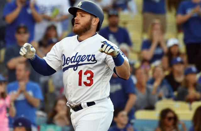
                          It's not the best pic, but the Dodgers front numeral is thicker in addition to being higher. First pic is from the new trailer, second is from 18. Looks much more accurate now.


                          Comment

                          • kingmason13
                            Rookie
                            • Mar 2013
                            • 270

                            #613
                            Re: Uniforms Need to be Overhauled

                            Originally posted by breakfastcat
                            I've been scouring the new trailer for new uniform related improvements but unfortunately for the most part it looks like its pretty much the same as last year apart from the few things we've already noticed. One thing I wanted to point out though is that the Pirates' black and yellow really pop in this Cutch pic. Much more than I've seen in the game in the past.


                            And they actually got the right jersey font for the numbers on the yellow jersey


                            Sent from my iPhone using Operation Sports

                            Comment

                            • tnixen
                              MVP
                              • Oct 2011
                              • 3184

                              #614
                              Re: Uniforms Need to be Overhauled

                              Originally posted by Blzer
                              At this point we'll have to wait for PS5 to get any major graphics overhauls, including the bone I have to pick with night skies. That's just a realistic expectation.
                              The night skies are much improved in 19.

                              Comment

                              • Blzer
                                Resident film pundit
                                • Mar 2004
                                • 42526

                                #615
                                Re: Uniforms Need to be Overhauled

                                Originally posted by tnixen
                                The night skies are much improved in 19.
                                I agree and bit my tongue seeing that. Still a long way to go though, but at least "war-sky brown" looks to be out for the most part.
                                Samsung PN60F8500 PDP / Anthem MRX 720 / Klipsch RC-62 II / Klipsch RF-82 II (x2) / Insignia NS-B2111 (x2) / SVS PC13-Ultra / SVS SB-2000 / Sony MDR-7506 Professional / Audio-Technica ATH-R70x / Sony PS3 & PS4 / DirecTV HR44-500 / DarbeeVision DVP-5000 / Panamax M5400-PM / Elgato HD60

                                Comment

                                Working...