
-
-
Re: Official 2024 Uniform Errors and Omissions:
It just kinda hit me today and here are my thoughts on the city connects, especially the recent Philly, Mets and the Rays. I'm almost 55 so I'm not some young fella.
For a long time I've felt MLB uniforms are quite boring, especially the road uniforms. These latest options are much more lively and entertaining looking. They really pop, like them or not, there is no denying that they at least make you notice them. I may not like every one of the city connects, but at least they're not boring AF.
Miami's really pop out , the colors are bright and fun. SD gets a lot of criticism but man do they stand out. I guess I'm saying I like the attempts at being unique and fun, instead of boring and the same old thing for 80 years.JUUUUUUUST A BIT OUTSIDEComment
-
Re: Official 2024 Uniform Errors and Omissions:
Things like this need to happen to keep younger people interested honestly. Just the typical white and gray with an alternate mixed in isn't going to make kids notice. They want the crazy cleats and the bright colors that don't match anything on the uniform. So if these things get a younger generation interested in baseball I guess I'm all for it.Comment
-
Re: Official 2024 Uniform Errors and Omissions:
I didn't even think of it appealing to the "younger" people, its probably true. I just like the fact that they're branching out and trying new things. MLB needs new colors. The amount of red white and blue styles is crazy. And the greys are just bleeeh.JUUUUUUUST A BIT OUTSIDEComment
-
Re: Official 2024 Uniform Errors and Omissions:
A couple of my nephews play in high school and grade school. Every kid has some crazy neon colored fielding glove, or crazy cleats and batting gloves, or off the wall looking compression sleeves. Everyone has something from the Absolutely Ridiculous brand. So that's why I kind of feel like they're using these to keep younger people interested.Comment
-
Re: Official 2024 Uniform Errors and Omissions:
I generally really like alternate uniforms, but I think they should have some level of connection. I really don't like the sore thumb uniforms. So, I actually dig the Rays, because they look like a Rays alternate. As opposed to the Phillies, which don't resemble the Phillies at all.
But I absolutely agree about the red/blue thing. Just way too many. There are only 7 teams in baseball that don't use blue or red in their uniforms (there are 9 in the NBA and 12 in the NFL). I was really disappointed when Cleveland kept the same colors on their rebrand.
Sent from my Pixel 6 using TapatalkComment
-
Re: Official 2024 Uniform Errors and Omissions:
I mean this not to sound like jerky at all, but I think the whole idea of city connects is they are SUPPOSED to look different from the team's normal uniforms. That's why so many of them are a complete departure from the team's normal uniforms. That's the fun of it.JUUUUUUUST A BIT OUTSIDEComment
-
Re: Official 2024 Uniform Errors and Omissions:
Noticed that the Nationals are using a 3D logo. At least on their navy helmets. Hopefully they update that at some point.Comment
-
Re: Official 2024 Uniform Errors and Omissions:
Few uni errors I've noted:- Nationals' Home unis should use the Alternate 1 (Capital W) cap
- Brewers' Road unis should use Alternate Road (yellow panel) cap and helmet
- Rockies' Alternate 1 unis should use Home (black) cap
- Rockies' Road unis should use Alternate 1 (purple brim) cap
- Padres' Road and Alternate Road unis should be swapped (Road should be the sand pinstripes and Alternate Road should be the brown jersey)
- Red Sox' Alternate Home unis should use Home cap (standard B) cap
- Red Sox' Alternate Road unis should use Road cap (standard B) cap
- Rays' Alternate 2 unis incorrectly use the Alternate 3 (Retro) helmets and should be the standard 'TB' ones to match the hat
- Twins' Alternate Road unis should use Road pants (gray pinstripes)
Technically, these errors are easily solvable for guys that play offline where you can just mess around in the uniform selection screen to have the correct combos, but correcting these errors would be great for DD players who use the MLB uniforms for their teams, or for when you get put into a game where you weren't able to change the uniform combos yourselfComment
-
Re: Official 2024 Uniform Errors and Omissions:
They have the 3D logo on their red helmets too
CJ Abrams.jpgComment
-
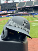
Re: Official 2024 Uniform Errors and Omissions:
Reporting this here since another member said that’s a good idea to get it fixed:
Mets City Connect batting helmets need to be updated to matte with the bridge logo. They are currently shiny with no bridge.
url=https://postimg.cc/ZC0HDp0R]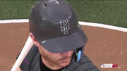 [/url]
Comment


Comment