Official 2025 Uniform Errors and Omissions:

Collapse

Recommended Videos

Collapse
X
 
  • Time
  • Show
Clear All
new posts
  • laguna_bob
    Rookie
    • Sep 2019
    • 375

    #226
    Re: Official 2024 Uniform Errors and Omissions:

    Originally posted by desouza7
    They have two different types. Which one is in game? The one with the mountains or the one with the two white stripes?
    The striped one is the one they have in-game

    Comment

    • laguna_bob
      Rookie
      • Sep 2019
      • 375

      #227
      Re: Official 2024 Uniform Errors and Omissions:

      Mets' City Connect helmet should be a matte finish rather than a glossy finish, and should also include a 3D logo with a 3D Queensboro Bridge on it as well. The number on the back of the helmet should also be 3D
      Mets CC Helmet.jpg

      Mets-CC-helmet1.jpg

      Comment

      • Bartolo Colon
        MVP
        • Mar 2015
        • 1234

        #228
        Re: Official 2024 Uniform Errors and Omissions:

        Uniforms in real life are going to be fixed, including the return of larger letters of name on back. I’m glad SDS never put in the smaller letters since it seemed like only a matter of time until Nike rolled back their changes.

        https://t.co/4CQuaCuRgc

        Comment

        • bronxbombers21325
          MVP
          • Mar 2012
          • 3058

          #229
          Re: Official 2024 Uniform Errors and Omissions:

          Originally posted by laguna_bob
          Mets' City Connect helmet should be a matte finish rather than a glossy finish, and should also include a 3D logo with a 3D Queensboro Bridge on it as well. The number on the back of the helmet should also be 3D
          [ATTACH]211562[/ATTACH]

          [ATTACH]211563[/ATTACH]
          I’m guessing that will be fixed in the next patch. I don’t know about all the 3D stuff but I would guess they’ll make it look as close as possible. I doubt they knew what the helmets would look like before the debut.

          Comment

          • Bartolo Colon
            MVP
            • Mar 2015
            • 1234

            #230
            Re: Official 2024 Uniform Errors and Omissions:

            Originally posted by bronxbombers21325
            I’m guessing that will be fixed in the next patch. I don’t know about all the 3D stuff but I would guess they’ll make it look as close as possible. I doubt they knew what the helmets would look like before the debut.


            It could be a couple of patches away I think for this. I’m assuming we’re getting one this week with the Rays revealing their CC I believe tomorrow.

            Comment

            • bronxbombers21325
              MVP
              • Mar 2012
              • 3058

              #231
              Re: Official 2024 Uniform Errors and Omissions:

              Well those are sure……something.

              Comment

              • jcar0725
                "ADAPT OR DIE"
                • Aug 2010
                • 3818

                #232
                Re: Official 2024 Uniform Errors and Omissions:

                Originally posted by bronxbombers21325
                Well those are sure……something.

                https://uni-watch.com/2024/04/29/tam...nnect-costume/
                I like the neon green highlight that's cool
                JUUUUUUUST A BIT OUTSIDE

                Comment

                • SmashMan
                  All Star
                  • Dec 2004
                  • 9698

                  #233
                  Re: Official 2024 Uniform Errors and Omissions:

                  For anyone who wants to read what the uniform is supposed to be without having to get around a ton of whining:
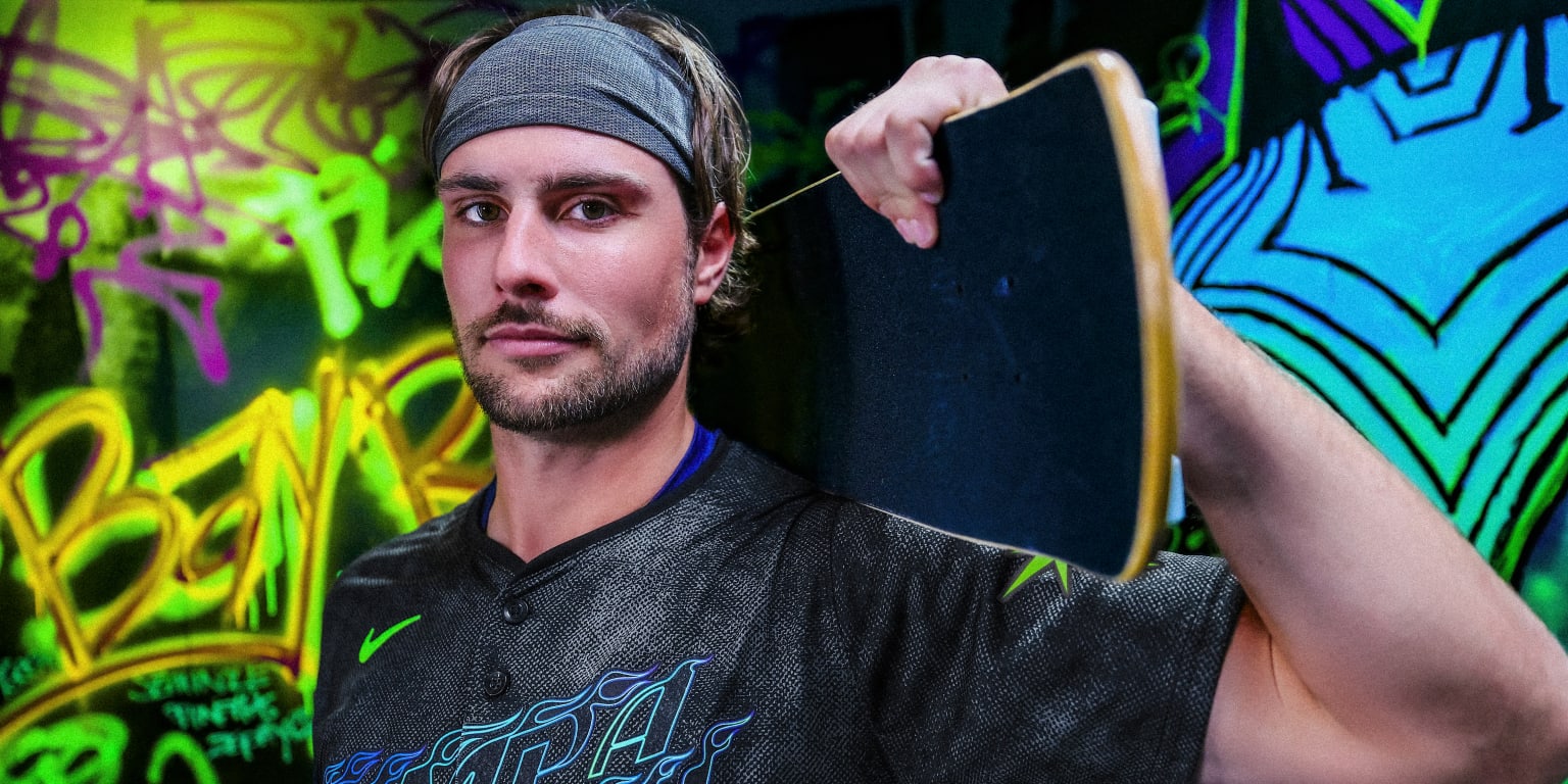
                  ST. PETERSBURG -- On and off the field, the Rays dare to be different. They have become the modern example of small-market success by creatively defying conventional thinking, boldly going against the grain and unapologetically embracing what makes them unique. That attitude inspired the theme and design of their City

                  Comment

                  • DonkeyJote
                    All Star
                    • Jul 2003
                    • 9161

                    #234
                    Re: Official 2024 Uniform Errors and Omissions:

                    Originally posted by SmashMan
                    For anyone who wants to read what the uniform is supposed to be without having to get around a ton of whining:


                    https://www.mlb.com/news/rays-unveil...nnect-uniforms
                    I'm not sure anyone hates uniforms more than Paul Lukas.

                    I actually kinda like these. They at least still somewhat look like the rays. Goes well with their Devil Rays alts (which, imo, should be their full time look).

                    Sent from my Pixel 6 using Tapatalk

                    Comment

                    • laguna_bob
                      Rookie
                      • Sep 2019
                      • 375

                      #235
                      Re: Official 2024 Uniform Errors and Omissions:

                      Originally posted by DonkeyJote
                      I'm not sure anyone hates uniforms more than Paul Lukas.

                      I actually kinda like these. They at least still somewhat look like the rays. Goes well with their Devil Rays alts (which, imo, should be their full time look).

                      Sent from my Pixel 6 using Tapatalk
                      I really like these, and definitely agree that the Devil Rays alts should be their full time look. I usually agree with Paul's takes, but man, he sometimes has bad takes like this about the Rays CC

                      Comment

                      • Bartolo Colon
                        MVP
                        • Mar 2015
                        • 1234

                        #236
                        Official 2024 Uniform Errors and Omissions:

                        Originally posted by DonkeyJote
                        I'm not sure anyone hates uniforms more than Paul Lukas.

                        I actually kinda like these. They at least still somewhat look like the rays. Goes well with their Devil Rays alts (which, imo, should be their full time look).

                        Sent from my Pixel 6 using Tapatalk


                        I think Paul does great work however you’re right that it seems like he hates most unis. I feel like I’m the opposite lol, I like about 99% of teams standard sets of unis; CC’s are hit or miss for me.
                        Last edited by Bartolo Colon; 04-29-2024, 07:29 PM.

                        Comment

                        • bronxbombers21325
                          MVP
                          • Mar 2012
                          • 3058

                          #237
                          Re: Official 2024 Uniform Errors and Omissions:

                          Originally posted by jcar0725
                          I like the neon green highlight that's cool
                          They’re growing on me the more I look at them.

                          Comment

                          • SmashMan
                            All Star
                            • Dec 2004
                            • 9698

                            #238
                            Re: Official 2024 Uniform Errors and Omissions:

                            Originally posted by DonkeyJote
                            I'm not sure anyone hates uniforms more than Paul Lukas.
                            I don't know. His comment section there has a lot of contenders.

                            Which is fine, art's subjective and we all have opinions on what looks good or bad. I just thought the way he went about it made his post unreadable. But I haven't read Uniwatch in a while so I guess I forgot how it was.

                            Having said that...the jerseys themselves I generally like, but I would've made some other decisions. The Tampa Bay on the front? The outline is too thin. I think they should've made it thicker or just fill the entire thing with that blue/green gradient. The back, maybe should've used more of the green to outline the numbers.

                            Looking forward to checking them out in The Show though. Might try them with white pants as an alt. I already do that with the Cubs' City Connects.

                            Comment

                            • bronxbombers21325
                              MVP
                              • Mar 2012
                              • 3058

                              #239
                              Re: Official 2024 Uniform Errors and Omissions:

                              Originally posted by SmashMan
                              I don't know. His comment section there has a lot of contenders.

                              Which is fine, art's subjective and we all have opinions on what looks good or bad. I just thought the way he went about it made his post unreadable. But I haven't read Uniwatch in a while so I guess I forgot how it was.

                              Having said that...the jerseys themselves I generally like, but I would've made some other decisions. The Tampa Bay on the front? The outline is too thin. I think they should've made it thicker or just fill the entire thing with that blue/green gradient. The back, maybe should've used more of the green to outline the numbers.

                              Looking forward to checking them out in The Show though. Might try them with white pants as an alt. I already do that with the Cubs' City Connects.
                              I think if the lettering and numbers were the neon green instead of the darker color they would look great.

                              Comment

                              • Bartolo Colon
                                MVP
                                • Mar 2015
                                • 1234

                                #240
                                Re: Official 2024 Uniform Errors and Omissions:

                                Todays update fixed:
                                1. Phillies Jackie Robinson Day uni is now the home pinstripes
                                2. Diamondbacks city connect batting helmet updated
                                3. Diamondbacks city connect pants fixed
                                4. Rangers helmet with powder blue uni logo was fixed

                                Wondering if anyone thinks the Braves navy alternate looks like it was darkened, I can’t tell?

                                Comment

                                Working...