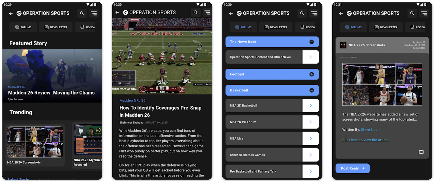
OS Uni Snob Thread
				
					Collapse


	Recommended Videos
				
					Collapse


	X
- 


 Originally posted by BlzerLet me assure you that I am a huge proponent of size, and it greatly matters. Don't ever let anyone tell you otherwise.
 
 If I went any bigger, it would not have properly fit with my equipment, so I had to optimize. I'm okay with it, but I also know what I'm missing with those five inches. :)Comment
- 


 Originally posted by bradtxmaleI like 6 inches. Its not too thin and not too thick. You get the support your body needs.
 
 
 Comment
- 


 Re: OS Uni Snob Thread
 
 Justin, **** off, I know you'll see this and say something so I'll just get it out before you get in here. 
 
 I don't actually hate the snakeskin, but the giant logo wasn't my favorite last year either. Plus they got rid of the white and green stripes on the helmet. Preferred the older one and the non-black unis. Though the unis before the black ones had some of the ****tiest pants ever. Originally posted by BlueNGoldI feel weird for liking a post about exposed penises. Originally posted by BlueNGoldI feel weird for liking a post about exposed penises.Comment
- 


 Re: OS Uni Snob Thread
 
 BTW, you forgot their other two helmets, Watson:


  Originally posted by BlueNGoldI feel weird for liking a post about exposed penises. Originally posted by BlueNGoldI feel weird for liking a post about exposed penises.Comment
- 


 Re: OS Uni Snob Thread
 
 The Christmas lookin one is by far the worst, but I actually don't mind the others. I think the snake skin design is kinda cool. Reminds me of Maryland with the terrapin shell design.
 
 Sent from my HTC One using TapatalkComment
- 


 Re: OS Uni Snob Thread
 
 Okay we were talking about this at dinner/happy hour today and I haven't seen them until now.
 
 I like the 3rd one, but it's Florida A&M University, so I hate it.
 
 The other two just suck.Lions, Tigers, Pistons, Michigan
 
 OS Uni Snob Association Member
 
 OS's most random Twitter account: @JustinTrenell
 
 Originally posted by BruinsWhite doesn't clash with dark colors. Or most colors. That's the point of white.Originally posted by gordogg24pI think most of American history would disagree with you on that one.Comment
- 


 Re: OS Uni Snob Thread
 
 The first helmet is just um....There are no words but the other two are pretty decent. I like the 2nd one best.Member of the Official OS Bills Backers Club
 
 "Baseball is the most important thing that doesn't matter at all" - Robert B. ParkerComment
- 


 Re: OS Uni Snob Thread
 
 The 3rd one is good, the 1st is bad, and the 2nd is an abomination. Though I've never liked FAMU's color scheme as those particular shades of orange and green just don't go together in my opinion.Steelers : IX, X, XIII, XIV, XL, XLIII
 Penguins : 1990/91, 1991/92, 2008/09, 20015/16, 2016/17
 Pirates : 1909, 1925, 1960, 1971, 1979
 Panthers (FB): 1915, 1916, 1918, 1929, 1931, 1934, 1936, 1937, 1976
 Panthers (MBB): 1927/28, 1929/30Comment
- 


 Lions, Tigers, Pistons, Michigan
 
 OS Uni Snob Association Member
 
 OS's most random Twitter account: @JustinTrenell
 
 Originally posted by BruinsWhite doesn't clash with dark colors. Or most colors. That's the point of white.Originally posted by gordogg24pI think most of American history would disagree with you on that one.Comment


Comment